Among today’s most popular eCommerce platforms, Wix often stands out for being “easier to use” than many of its competitors. Nevertheless, ease of use does not mean limited capability. In fact, the 25+ Wix online store examples in the following fields show that Wix is fully capable of powering visually stunning, highly engaging, and conversion-focused online stores:
Let's look into each!
25+ Wix Online Store Examples
Below are the best Wix eCommerce website examples spanning across six different industries: Fashion & Apparel, Jewelry, Beauty & Wellness, Fitness, Food & Drink, and Art & Crafts.
A. Art & Crafts
Art and crafts stores and shops built with Wix, such as Papier Patate, Hydrascape, Beck & Cap, and Sena Runa, illustrate how creative brands use thoughtful layout, color harmony, and clear product storytelling to elevate handcrafted products and artistic works online.
Since Art & Crafts products are often unique, giftable, and driven by personal taste, they naturally fit the kind of “high-appeal” category that can perform well in a dropshipping business. If you are still deciding what to sell and want a clearer direction, the ebook below breaks down the most profitable dropshipping niches to consider.
1. Papier Patate
Papier Patate sells playful, customizable stickers and paper goods, and its website design reinforces that joyful, handcrafted identity from the first moment visitors arrive. The homepage features a pastel color palette that invites people to let their creativity spark to life, aligning perfectly with children’s stationery and sticker packs.
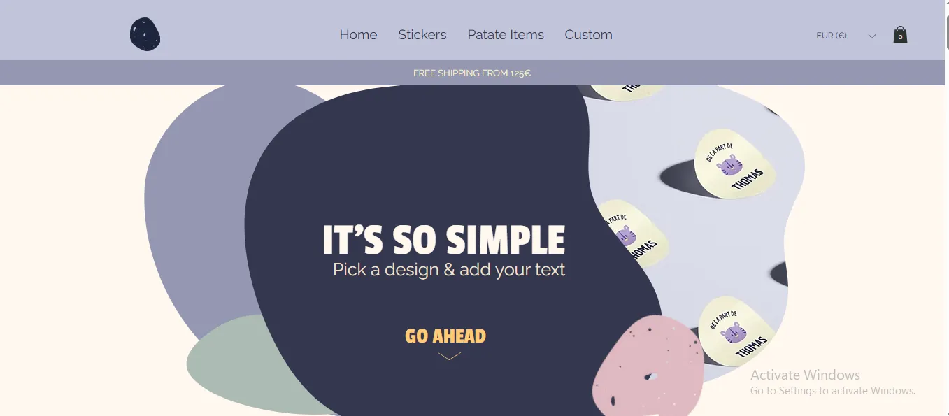
Such layout simplicity allows products to take center stage without visual noise, using ample whitespace to make each item feel distinct and inviting. Product listings are presented with consistent image sizes and gentle shadows, helping to maintain visual rhythm as shoppers scroll.
2. Hydrascape
Hydrascape’s website strongly reflects the artistic roots of its founder and the creative energy of its products.
The brand specializes in stickers and art pieces inspired by outdoor life, and the homepage opens with rich, multidimensional visuals that mirror the artistic style of the work itself: bold colors, layered imagery, and dynamic compositions capture attention instantly.
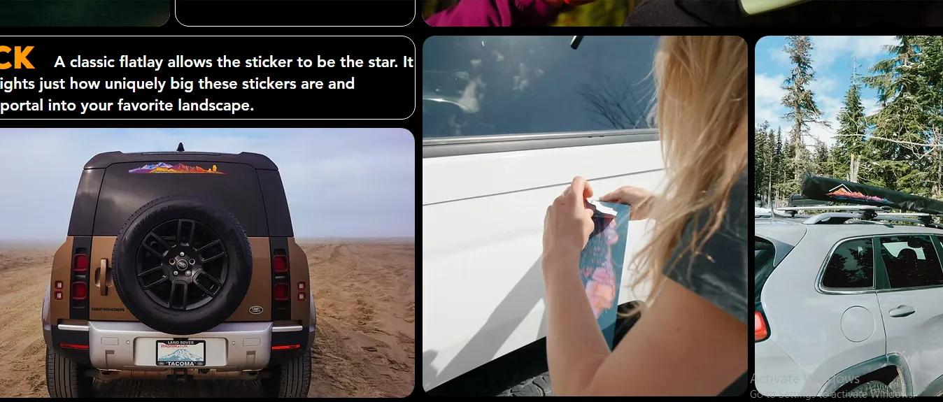
In addition, sections like “Inspiration” highlight real-world applications of the products on water bottles, laptops, and gear. This real-use photography helps potential buyers visualize how the art can become part of their daily lives, which builds emotional connection and increases the likelihood of exploration and purchase.
3. Beck & Cap
Beck & Cap’s site is designed to reflect the handcrafted nature and refined aesthetic of its furniture and signage creations. The homepage features a grid-style gallery of featured works set against neutral backgrounds that allow each handcrafted piece to stand out. Images of finished furniture and custom signs are crisp and beautifully composed, helping visitors appreciate texture, craftsmanship, and scale.
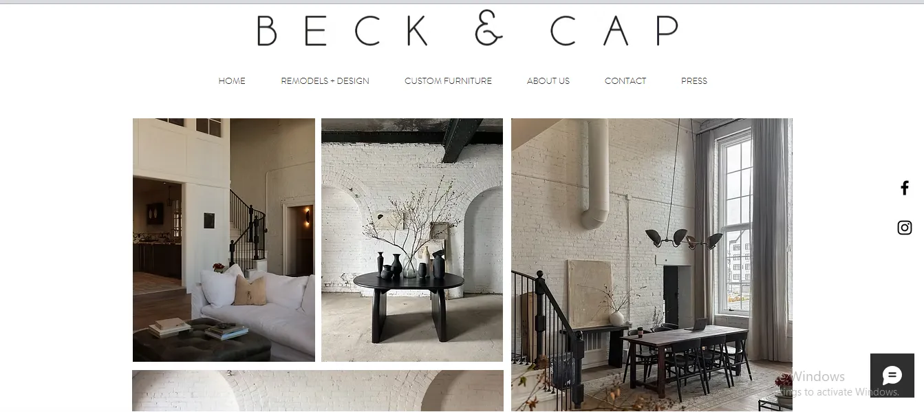
In addition, typography choices lean toward clean, fine-weight fonts that convey a sense of sophistication. Throughout the site, content blocks are balanced between visuals and supporting text, so the storytelling about materials, process, and custom options remains clear without detracting from the work itself.
4. Sena Runa
Finally, Sena Runa’s website blends portfolio and shop in a way that celebrates the artistry behind each piece. This one-page site immerses visitors in vibrant colors and crisp photography that capture the nuances of the paper art, creating a visual experience that feels as expressive as the craft itself.
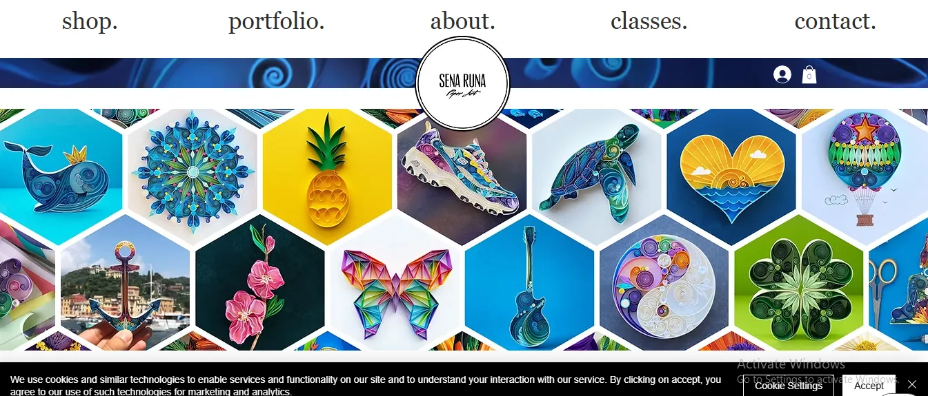
Lower on the page, an “About” section provides context for the artist’s vision and process, reinforcing authenticity and building a personal connection with visitors. The inclusion of project galleries and collaboration highlights adds a documentary feel that further enriches the brand narrative, which makes browsing feel like exploring an artist’s studio rather than a conventional eCommerce catalog.
B. Fashion & Apparel
Fashion brands on Wix tend to prioritize strong visual storytelling, clean product hierarchy, and brand-first layouts over heavy functionality. Wix eCommerce stores like A Toe Fashion, My Vintage, Retro Garms, Ogi Eyewear, and Tach are good examples of how Wix can be used to build fashion websites.
5. A Toe Fashion
As one of the most famous fashion stores using Wix, A Toe Fashion leans heavily into editorial minimalism, which allows the brand’s aesthetic to speak louder to customers than any aggressive eCommerce messaging.
The homepage opens with a large hero image that spans almost the full viewport, immediately immersing visitors in the brand’s world rather than pushing products upfront. This choice is deliberate: instead of treating the homepage like a catalog, Fresh Prints treats it like a lookbook.
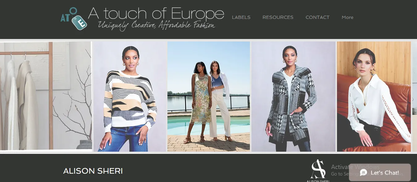
In addition, color usage is restrained, with muted, eye-pleasing tones that stay consistent across imagery, background, and typography. As a result, the products feel cohesive, even when collections vary in style. Text is kept minimal and lightweight, often secondary to imagery, which reinforces a premium, slow-fashion positioning.
6. My Vintage
Similarly, My Vintage’s Wix store stands out due to its strong sense of structure and rhythm.
The layout alternates between full-width image sections and neatly aligned content blocks, which creates a steady visual cadence as users scroll. As a result, browsing feels calm and intentional, which aligns well with the brand’s refined, understated fashion identity.
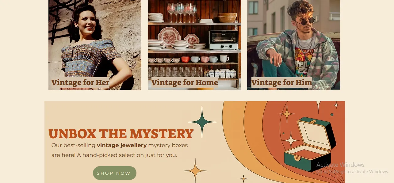
In addition, typography plays a major role here. Serif and clean sans-serif fonts are paired carefully to give the site an editorial, almost magazine-like feel. Product images are large and consistently styled, often shot against neutral backgrounds, resulting in similarly consistent collections that feel curated rather than crowded.
7. Retro Garms
Retro Garms’ design succeeds because of its clear visual hierarchy and confident use of contrast.
The homepage typically leads with bold imagery paired with concise, high-impact text, so that customers are immediately clear on what the brand represents. Plus, instead of overwhelming visitors with too many product options, the site highlights key collections first, guiding users step-by-step deeper into the catalog.
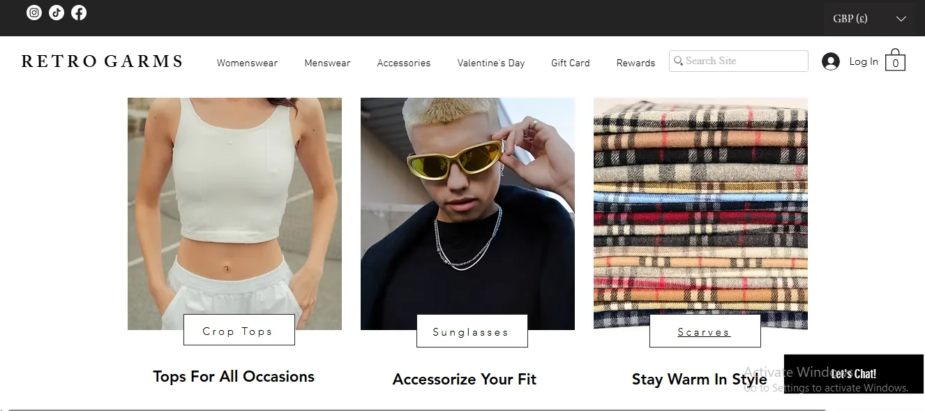
Call-to-action buttons are placed strategically and consistently, usually below hero images or collection highlights, which makes navigation feel intuitive rather than forced. On top of that, since the product grid itself is clean and symmetrical, shoppers find it easy to scan quickly without visual fatigue.
8. Ogi Eyewear
Ogi Eyewear takes a more expressive approach, as it uses bold visuals and dynamic layout sections to reflect its creative identity.
The homepage often mixes full-bleed images with layered text and graphic accents, giving the site an energetic, almost gallery-like feel. Accent colors are often drawn directly from the eyeglasses collections themselves to reinforce brand cohesion.
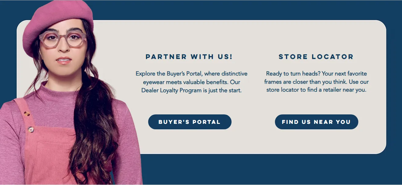
And yet, despite the expressive design, usability remains intact thanks to a fixed navigation bar and clearly labeled categories. Users can explore freely without ever feeling lost, which is crucial for visually dense fashion sites.
9. Tach
Tach focuses on product clarity and conversion-friendly layout, proving that fashion sites don’t need to be overly complex to look premium. Its homepage consists of models wearing the latest items through large, high-resolution images that highlight texture, shape, and detail.
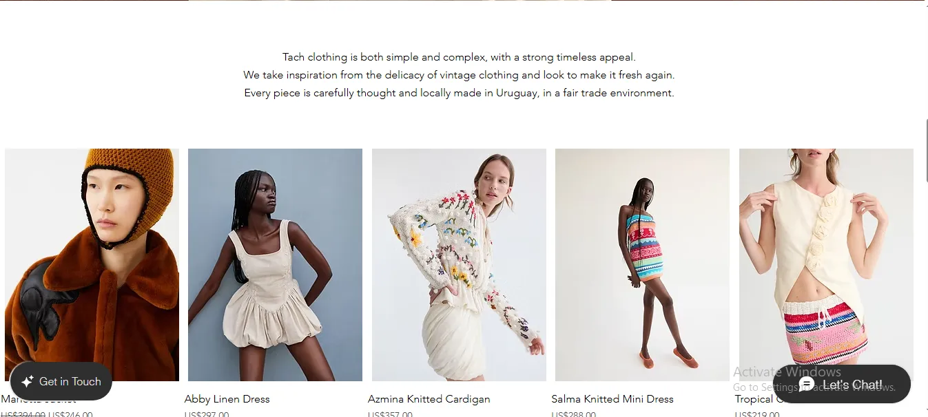
Sections like “Best Sellers” or seasonal edits are clearly separated, helping shoppers quickly identify popular or relevant products. At the same time, the sticky header keeps navigation, search, and cart access visible at all times, reducing friction during browsing.
In addition, you will find the color usage to be quite minimal here, with subtle accent tones guiding attention toward prices, CTAs, or promotional elements. This clean, product-first approach makes the shopping journey efficient while still maintaining all the aesthetics.
C. Jewelry
Jewelry stores built on Wix, like International Diamond Importers, Haig’s of Rochester, Zemil Jewelers, and Michal Oren Jewelry, show how the platform can support very different selling styles:
10. International Diamond Importers
International Diamond Importers leans into a “high-trust retail” structure, as the top navigation immediately exposes:
- Core buying intents (Shop)
- High-value categories via a clear dropdown (Engagement Rings, Men’s Rings, Lab-Grown Diamond
- Education, Custom Designs, Services, Blog).
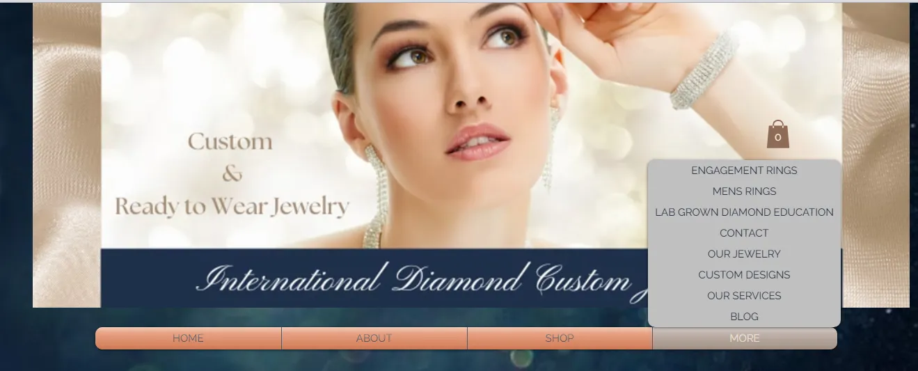
This menu architecture works well for jewelry since shoppers often arrive with a specific mission (ring shopping, learning, or custom work). In simple words, the site reduces friction by making those paths visible early.
In addition, the page uses multiple promotional image tiles (including lab-grown messaging and collection highlights). It keeps attention moving and also signals “active inventory and active offers,” which suits a retail jeweler more than a minimalist boutique brand.
11. Haig’s of Rochester
Haig’s of Rochester is a great example of mega-navigation done right for jewelry and antiques.
The header breaks “Jewelry” down into highly scannable subcategories (Bracelets, Brooches & Pins, Earrings, Necklaces & Pendants, Rings, Watches, Men’s Wear, Engagement & Bridal). Plus, it also separates “Antiques” and adds “Services,” “Designers,” and a “Learning Center,” which positions the business as both a retailer and an expert. That's exactly the type of structure that builds credibility in fine jewelry!
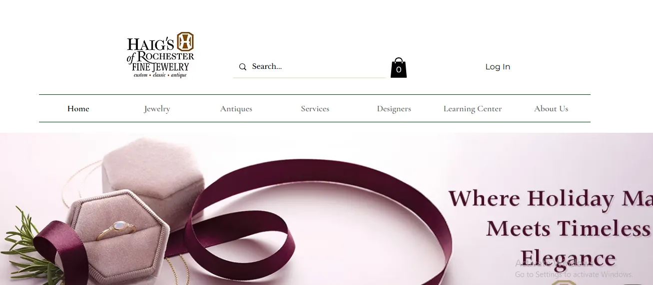
On the homepage, the layout balances commerce and service. You get product-led blocks like “What’s New” and “New Gallery Items,” each using product images with pricing plus an immediate add-to-cart flow, which is very conversion-forward.
Then the page shifts to an “Our Services” section (Custom Jewelry, Estate Buys, Repairs, Appraisals) with short explanatory copy and “Learn More” links. It captures the large segment of jewelry customers who aren’t only browsing products, but also looking for customization, repairs, and valuation.
12. Zemil Jewelers
Similarly, Zemil Jewelers’ site stands out for acting like a true online catalog. The navigation is product-first, with major material/collection groupings right in the top menu (Diamonds, Gemstones, Sealife, Estate Jewelry), plus utility categories like “We Buy,” “Custom Design,” and “Education.” Such a blend is important, as jewelry shoppers often want reassurance that the brand has expertise and real-world services behind the products.
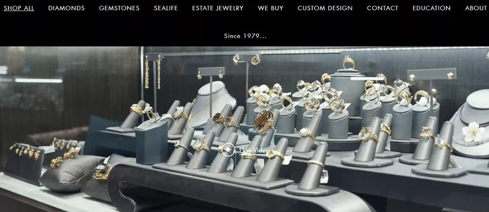
From a UX standpoint, Zemil’s store pages are optimized for fast scanning: you see “Sort By,” “Quick View” on items, clear price display, and a “Load more” flow that encourages continuous browsing without forcing multiple page loads. The presence of the “Quick View” option is especially helpful in jewelry, as customers need to compare many similar-looking items (stone size, metal, setting) and want to check details quickly before committing to a product page.
13. Michal Oren Jewelry
Another standout is Michal Oren Jewelry, a strong example of a Wix store that feels more like an artist’s gallery than a traditional jewelry retailer.
The navigation structure is unusually detailed and concept-driven: the “Shop” menu expands into named collections and body-based categories (Gold, Wedding Rings, then Tears/Ears/Neck/Fingers/Wrists/Chest). This smart approach encourages browsing by aesthetic theme and usage, not just by generic “rings/necklaces.”
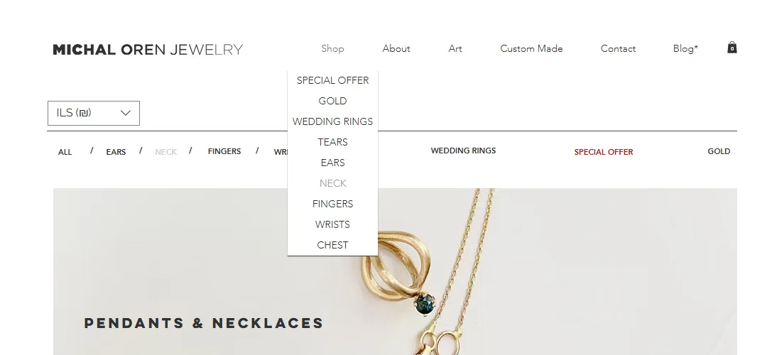
The site also utilizes category tiles (rings, earrings, necklaces, bracelets) as visual entry points, which reduces reliance on lengthy text and allows product photography to do the selling.
Lastly, in the footer, the store reinforces shopping support with practical links like FAQ, Shipping, and Ring Sizing. Small as they are, these are all crucial in jewelry, where sizing and delivery confidence can make or break conversion.
D. Beauty & Wellness
Beauty and wellness businesses on Wix often win by combining instant credibility, clear pathways, and visual proof. Examples in this space include House of Suppliez, Makeup Partner, BeauTy Neta, and Artiste Studios – L’Orthodontiste:
14. House of Suppliez
House of Suppliez is built to serve two user intents at once: buy supplies and level up skills.
That's why the top menu doesn’t just say “Shop”. In fact, it also foregrounds “Monthly Boxes,” “Academy,” “Videos,” and “Online Courses,” which is a smart layout choice for a beauty brand targeting working artists who not only want products but also training and ongoing education.
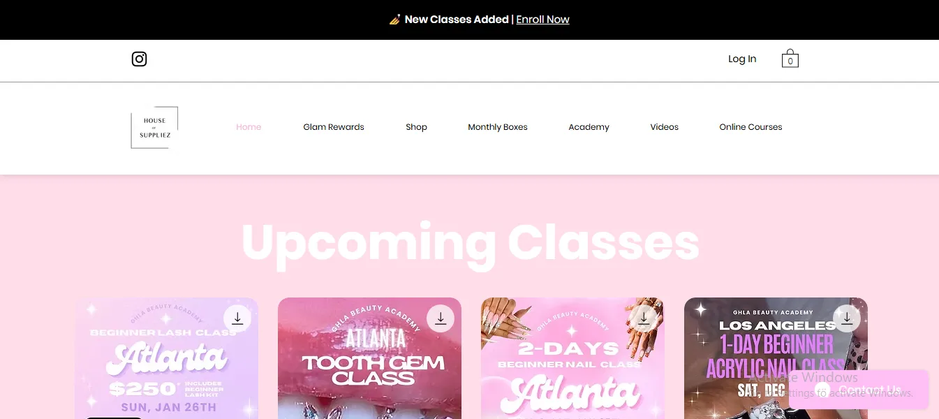
Plus, the homepage is also extremely conversion-driven. It pushes “Upcoming Classes” right near the top with Quick View cards for class deposits while still keeping product discovery visible through product grids that include badges such as “Exclusive offer,” “Next day shipping,” etc.
15. Makeup Partner
Makeup Partner’s design is built like a clean, modern “beauty retail” landing page. It opens with a short, punchy hero line (“Wir bringen die Schönheit zu dir” – We Bring Beauty to You) and immediately follows with a Featured products grid that emphasizes promotions.
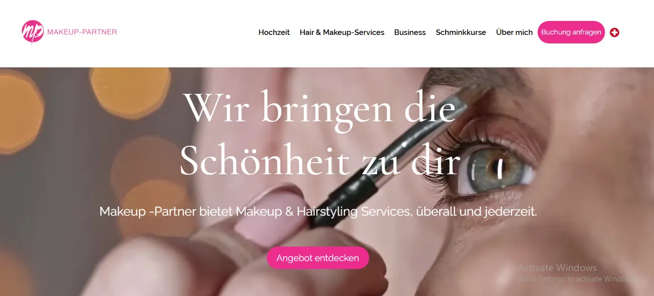
Lower on the page, the Services section is also doing more than it looks. Each service gets a one-line positioning statement (for example, “Clean, effective Haircare essentials” or sustainability cues like “certified B Corp”).
That’s effective for beauty because shoppers frequently buy based on values and results, not just product type. Also, ending with a simple email capture keeps the page focused and avoids the “too many pop-ups” problem that can cheapen a premium feel.
16. BeauTy Neta
On the same vein, BeauTy Neta’s experience is designed like a premium brand catalog with a professional gate and structured browsing.
It prompts account actions up front (sign in / create account), then guides users into tightly defined category paths: Nails & Manicure, Lashes, and HydraFacial. That kind of menu architecture fits beauty/wellness products where shoppers often know the method they want and don’t want to “hunt” through generic categories.
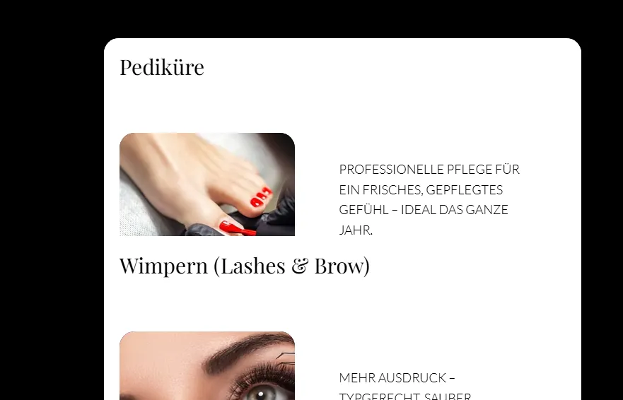
On-page composition also matches the category. It uses a strong headline rhythm (“Premium Beauty Studio”) followed by educational copy explaining the system, and then a sequence of large category tiles with clear “Shop now” CTAs. As you can see, the flow clearly mirrors how people evaluate beauty solutions: they want reassurance and explanation first, then they want a clean entry into the right collection.
17. Artiste Studios – L’Orthodontiste
Artiste Studios is wellness in the “high-trust clinic” sense, and the design choices reflect that. The homepage leads with credibility language (“The Art & Science of Dentistry”) and then reinforces trust immediately using a long testimonial quote positioned high on the page before a visitor ever needs to click into services. That’s a classic conversion move for healthcare/wellness: you’re selling reassurance first, treatments second.

In addition, the layout repeatedly reduces friction for appointment intent. “Contact Us Today” and “Call Us Today!” with a prominent phone number are placed in the main flow, not buried in the footer, and imagery is used to signal a calm, premium environment rather than showing clinical equipment.
Further down, the page shifts into a structured “approach” narrative with steps (“Step 1: Healthy Teeth, Bone, and Gums”), which is essentially long-form sales copy broken into digestible sections. We strongly recommend such designs or services where the buyer needs to understand methodology and outcomes, not just pricing.
E. Fitness
Fitness sites and stores built on Wix include Athlete Framework, Affronti Fitness, Aly Gray Fitness, and Stax Cycle Club, each using a distinct layout and content strategy to convert visitors:
18. Athlete Framework
Athlete Framework leads with an education-and-product hybrid layout designed for professionals.
The homepage opens with a clear value proposition and an immediately visible course/product hierarchy (courses → tools → blog), which helps visitors self-segment quickly (coach vs. athlete vs. practitioner). Plus, it also uses large editorial hero images combined with compact content cards for courses and tools. This combination of editorial photography and succinct card copy gives the brand authority while still making complex offerings scannable.
19. Affronti Fitness
Next, Affronti Fitness is organized like a boutique studio site that also sells programs and nutrition guidance.
The visual strategy relies on real-client imagery (transformations, in-studio shots) and a warm, human tone, which quickly communicates credibility for one-to-one training services.
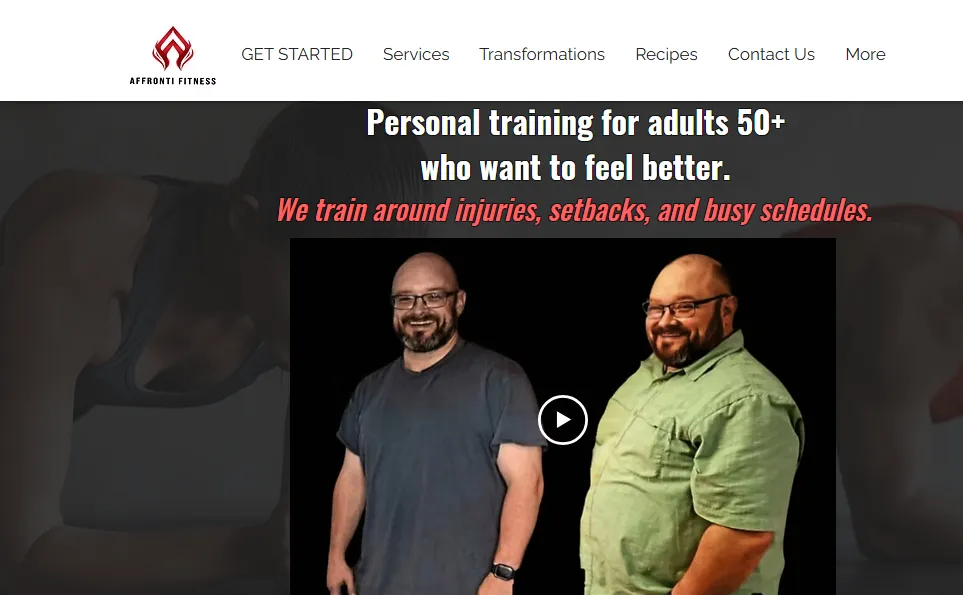
In addition, there are some smart design moves that convert here, including:
- Prominent CTAs for booking or free consults
- Transformation photo blocks placed above the fold to act as social proof
- A blog/news section that feeds credibility while improving SEO and repeat visits.
All in all, the site’s composition favors action (book, call, read a case study) rather than deep eCommerce browsing, which is a smart choice for service-led fitness businesses.
20. Aly Gray Fitness
Similarly, Aly Gray Fitness is set up as a membership and commerce experience, as the hero messaging (“Join the AGFitFam”) immediately funnels visitors to subscription plans or class bundles. The homepage and shop pages place subscription tiers and program bundles directly in the shopping flow (prices, features, “Add to cart” actions), which reduces the friction between discovery and signup.
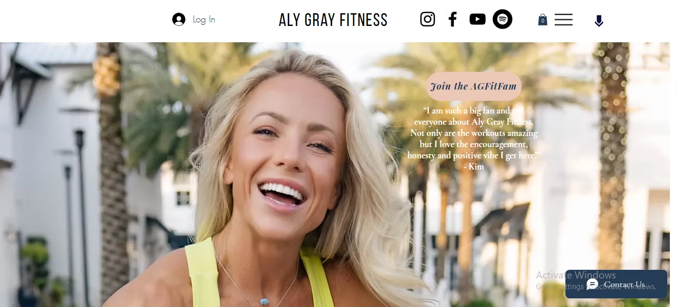
Some other key micro-UX details:
- Clear pricing blocks with short benefit bullets (what members get)
- Multiple entry points to “Join” (hero CTA, shop product, and dedicated membership page)
- Testimonial snippets next to pricing
Together, these elements increase conversion by answering value, logistics, and social proof at just one glance.
21. Stax Cycle Club
Stax Cycle Club uses energetic, community-first design to sell the boutique fitness lifestyle (online classes, memberships, and merch). The homepage combines bold, action-oriented headlines (“Start your free trial”) with class highlights and large imagery of instructors in motion — a visual shorthand that sells experience and not just a product.
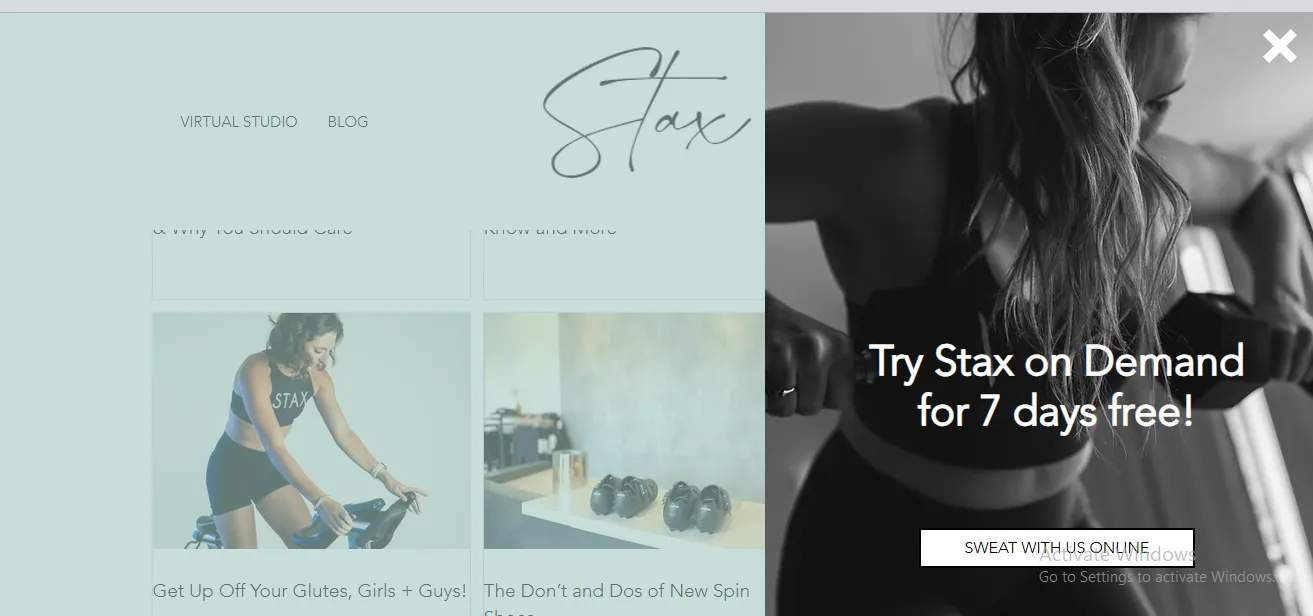
At the same time, conversion-focused features include a prominent free-trial CTA, well-structured class/category tiles (spin, strength, mobility), and an easy signup flow for membership access.
The site also uses editorial content (blog posts and class guides) to educate users and improve SEO. Meanwhile, testimonials (“Stax love”) are interspersed to reduce signup anxiety. This blend of strong, kinetic visuals and friction-free membership CTAs is a textbook example for fitness brands selling subscriptions and virtual classes.
F. Food & Drink
Next, Food and drink websites built on Wix, like Yang’s Place, Campione, Chickpea, and Red Bamboo, showcase how restaurant and café brands use strong visuals, clear navigation, and intuitive layout to attract guests:
22. Yang’s Place
Yang’s Place uses a geometric, image-forward layout that immediately draws visitors into the culinary experience.
At the top of the homepage, large, high-quality food photography paired with concise navigation links (“Order online,” “Menu,” “About”) works to hook users quickly and guide them to key actions. This visual strategy keeps visitors engaged while showcasing signature dishes before any text appears, which is especially important for a restaurant that wants to convert casual browsers into diners.
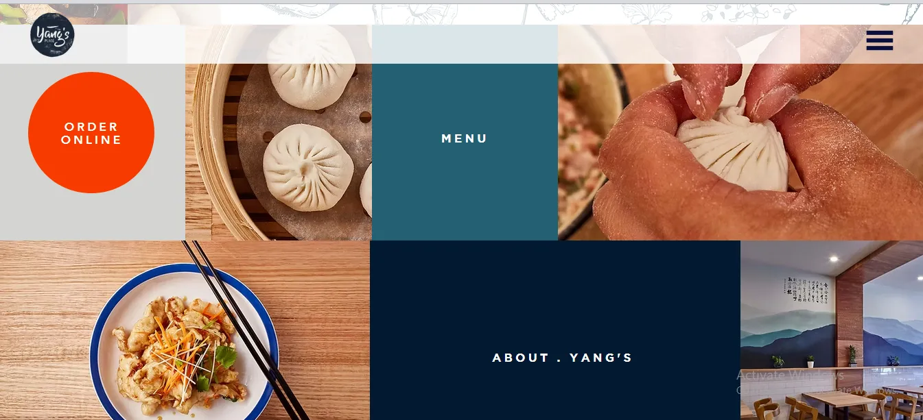
The placement of the online ordering button above the fold, along with a clear “menu” link, makes it easy for customers to get what they want without extra scrolling. Below that, the site uses structured sections that break down the menu categories with strong imagery and readable typography, while still incorporating subtle whitespace and simple color blocks to give breathing room between sections.
23. Campione
Campione’s website uses clean lines and well-organized navigation to reflect the restaurant’s sophisticated Italian cuisine. The top menu divides the experience into logical sections such as “Brunch,” “Dinner,” “Take Out,” “Wine,” and “Family Style,” which lets visitors quickly find the part of the menu most relevant to their needs.
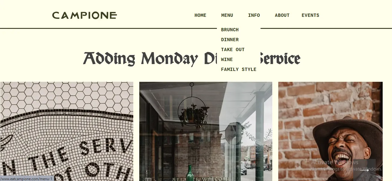
Visually, the homepage focuses on atmosphere first and details second. Large, elegant photography evokes a cozy yet upscale dining feel that matches the restaurant’s farm-to-table ethos. Sections introducing the restaurant’s story and seasonal dining approach are balanced with easy access to location and contact information, so users never have to hunt for booking or reservation details.
24. Chickpea
On the same vein, Chickpea’s website uses bold and playful visual energy to reflect its plant-based food truck and café ethos.
From the moment you arrive, the menu structure is clear and inviting, with sections such as “Truck Menu,” “Restaurant Menu,” “Drinks,” and “Desserts” presented prominently in the navigation. Organizing content this way makes it effortless for visitors to explore the menu by category, which is ideal for food establishments with varied offerings.
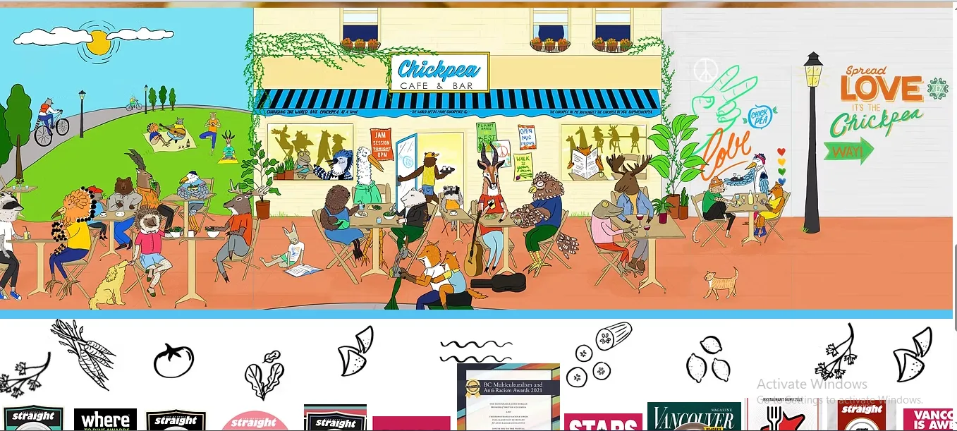
In addition, the visual strategy centers on large, engaging photography that captures the personality of the brand. Bright, colorful food images punctuate each section to help prospective diners imagine the meals before they walk through the door. Typography is clear and approachable, and the overall color palette stays friendly and warm as it mirrors the brand’s casual, community-focused vibe.
25. Red Bamboo
Another successful store made using Wix, Red Bamboo’s website uses vertical scrolling and a layered navigation system to balance a lot of content without overwhelming visitors.
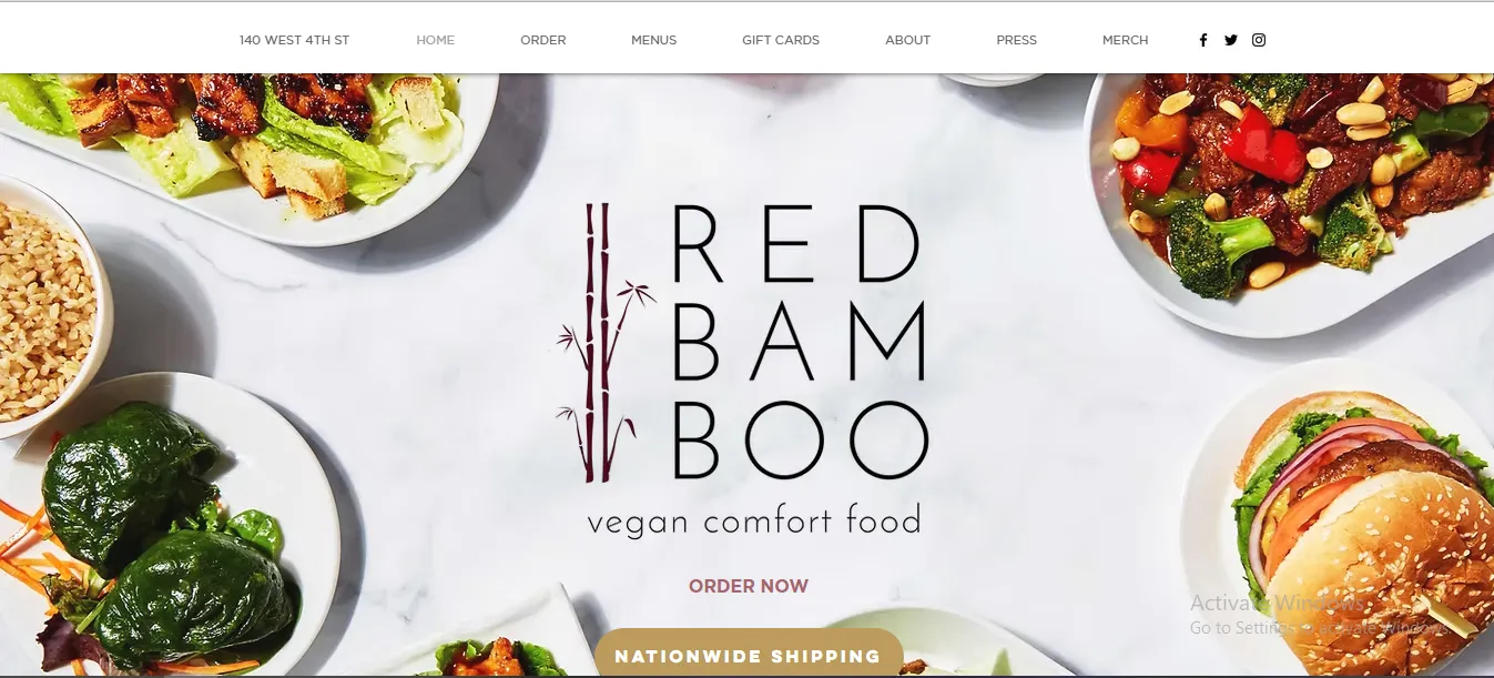
Just like other brands, Red Bamboo also leans into rich imagery and strategic spacing. Photos of dishes and interiors are integrated into the layout at multiple points to give prospective customers a sense of atmosphere and quality.
Meanwhile, the color treatment across the site is subtle, allowing the food visuals to be the star. Additionally, practical elements such as pickup and delivery details are kept prominent in the header, which improves usability for both local diners and online visitors.
Why We Choose These Examples
The Wix stores featured in this list were not selected at random. We consider them the best Wix eCommerce store examples because of the following reasons:
- They are real, live businesses built on Wix: Every store included here is an active brand or business using Wix in a real commercial context, not a demo site or template. Hence, what you see is practical, proven, and grounded in real customer interactions.
- They reflect a strong understanding of audience behavior: Each example shows clear intent in how content is structured. Plus, the layouts are designed around how customers in that specific industry browse, compare, and make decisions.
- They balance visual appeal with functional usability: While these sites are visually engaging, none of them sacrifice clarity or ease of use for aesthetics. Typography, spacing, and imagery are used to guide attention and reduce friction, helping visitors move naturally from discovery to action.
- They demonstrate the flexibility of Wix across industries: Taken together, these examples show how Wix can adapt to very different business models, including product-focused ecommerce, service-based fitness brands, restaurants, and creative studios.
3 Basic Steps to Start Building Your Wix Online Store
1. Choose a template and set your site structure
First, select a Wix ecommerce template that closely matches your industry and selling model. When you click “Edit” on a template, Wix automatically loads a pre-built structure that includes essential pages such as Home, Shop, Product Pages, Cart, and Checkout.
At this stage, you should focus less on colors and images and more on layout logic. Make sure to review the existing menu items, section order, page hierarchy, etc.
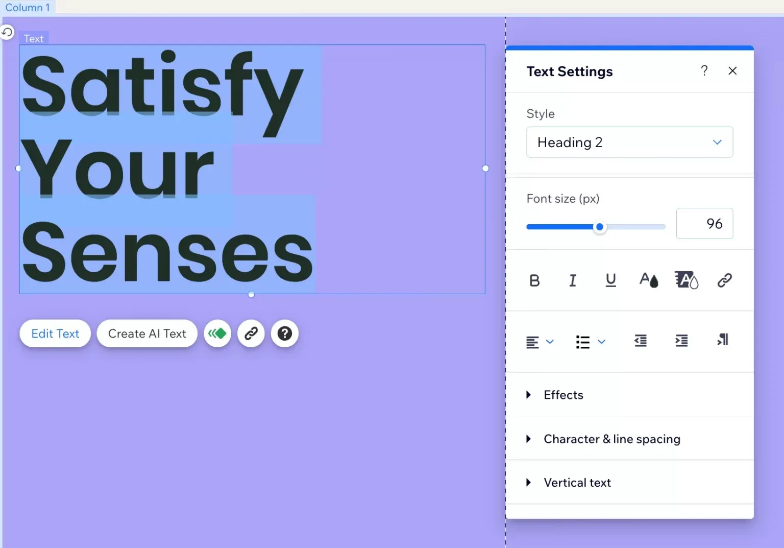
2. Customize design elements using the Wix Editor
Once the structure is in place, begin tailoring the design to match your brand.
In the Wix Editor, you can click directly on any section to adjust background colors, spacing, and alignment, or use the Design and Theme Manager panels to control fonts and color palettes globally.
In addition, you can replace placeholder images by clicking “Change Image” and uploading your own visuals, or selecting from Wix’s media library. Similarly, buttons can be customized by selecting them and editing text, hover states, and styles to create clear calls to action such as “Shop Now,” “View Menu,” or “Book a Class.”
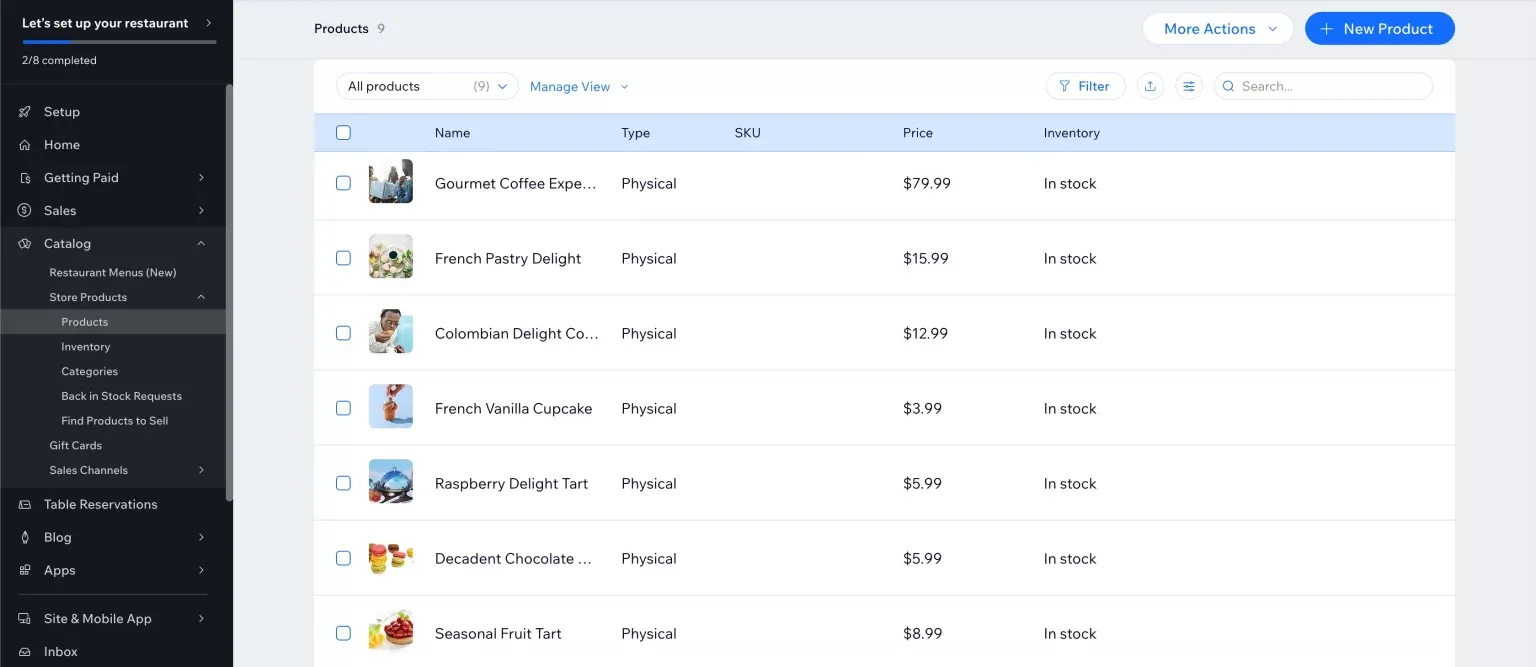
3. Add products and configure store functionality
Now, open Wix Stores from the dashboard and start adding products by clicking “Add Product.”
For each product, upload multiple images, write clear descriptions, set prices, and configure options such as sizes, flavors, or variants. If you offer services or memberships, Wix allows you to add those through dedicated apps like Wix Bookings or Wix Pricing Plans.
Then, move on to configure essential store settings. Connect payment methods by going to Settings → Accept Payments, set up shipping or pickup rules under Shipping & Fulfillment, and review tax settings based on your region. These controls are all accessible through the Wix dashboard and ensure that your store is ready to handle real transactions.
For more information and detailed guidance, check out our Wix beginner tutorial.
FAQs
Can I build an online store with Wix?
Yes, you absolutely can build a fully functional online store with Wix, using its drag-and-drop builder, customizable templates, and built-in features for products, payments, shipping, marketing, etc.
What is the downside of using Wix?
The main downsides of Wix include template lock-in (can't switch easily), potential slower site performance, and limited customization compared to open platforms like WordPress.
What products are best to sell on Wix?
The best products to sell on Wix often fall into niches with high demand, like fashion/accessories, health & wellness, home goods, and digital items.
How much does it cost to start a Wix store?
Starting a Wix store costs $0 to test and build. However, you'll need a paid plan (starting around $29/month for "Core" for basic eCommerce) to accept payments and use custom domains.
Final Words
A great Wix online store is not defined by flashy visuals or trendy effects alone. As the Wix online store examples above show, the most effective stores combine thoughtful design with clear structure, intuitive navigation, and a deep understanding of how customers browse and make decisions.
And if you haven't moved to Wix but plan to do so now, LitExtension can help you migrate your store safely and accurately. Backed by 12+ years of experience, our migration service transfers products, customers, orders, and essential data with minimal downtime, so you can focus on building a better storefront without starting from scratch!
For more Wix tips, check out our Wix blogs or join our Facebook Community.