With over 300 Squarespace templates to choose from, picking the right one can be overwhelming. Since different layouts serve different needs, we did the heavy lifting for you. To save you time, we narrowed it down to the 25+ best Squarespace templates based on how well they actually work, including:
and more.
Let’s get started!
Best Squarespace Templates for Any Website
1. Hester
We recommend Hester for any website that needs a clean and flexible layout. It works well for small businesses, personal brands, or even general websites with mixed content.
In terms of presentation, Hester feels structured and easy to follow. The homepage, product pages, and blog pages all use clear sections, consistent spacing, and simple typography. This makes every page feel calm, readable, and visually balanced.
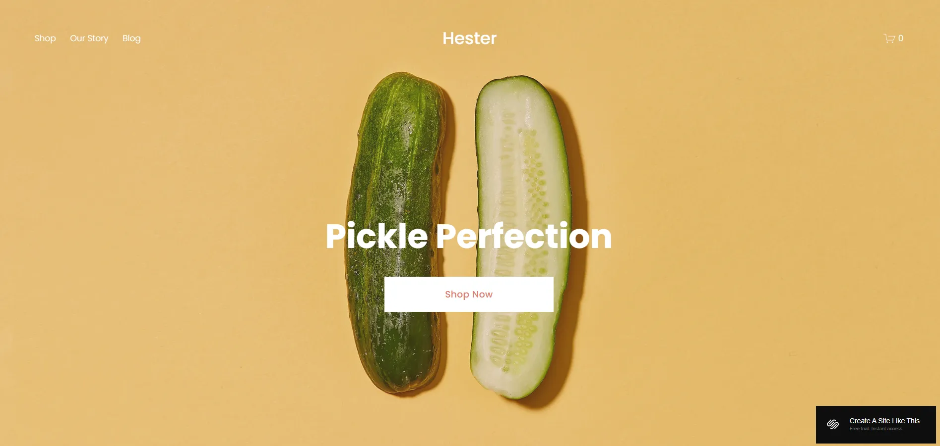
One small downside is that the layout feels quite safe. If you want bold visuals or more experimental page designs, Hester may need extra customization to stand out.
2. Myhra
If you want a template that feels more modern and expressive at first glance, Myhra is worth considering. This template is flexible enough to work across different niches, from creative portfolios and content-driven sites to small businesses and brand-focused websites.
Looking at the layout, Myhra plays with larger text, bold spacing, and clear visual contrast between sections. The homepage sets the tone with strong spacing and clear sections, while inner pages like Services or Coaching follow the same layout rhythm. This makes the whole site feel connected and easy to browse, even when switching between pages.
That said, Myhra is not really a great fit for visual portfolios or creative studios that need to showcase many projects. If you try to place too many images on one page, the layout can start to feel dense and lose its clean structure.
3. Paloma
With Paloma, you get a template that is easy to adapt to different website needs. Although the original design is built around podcasts, blogs, and image-led content, the overall structure is flexible enough for many other purposes. It fits personal brands, creatives, service websites, blogs, and even simple product sites.
When you look at how the pages are presented, Paloma is clean and well-organized. You’ll notice generous spacing, light typography, and large hero sections that clearly separate content blocks. This helps you guide visitors through the page and keep the focus on what matters most.
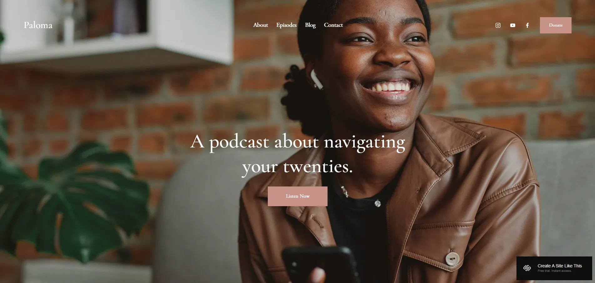
The trade-off comes when you want to scale selling. You can add simple product pages, but if your site depends on a large store or complex product structure, you’ll need extra customization or a more eCommerce-focused template.
4. Bailard
The next template we want to mention is Bailard. It was originally designed for non-profits, but the structure is neutral enough that you can adapt it to many website types just by changing the content and page labels.
Bailard works especially well for storytelling and mission-driven websites. Each page starts with a large image banner paired with short, focused text, which helps you highlight your mission, values, or key message clearly. This layout is ideal if you want to guide visitors through your story while still leading them toward a clear next action.
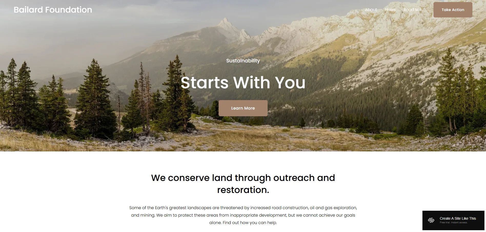
Compared to others, Bailard has a more serious and structured tone. So, if your brand is more fashion-led, playful, or highly creative, you’ll need to spend more time adjusting colors, fonts, and imagery to change the overall look.
Best Squarespace Templates for Creative & Portfolio
5. Elliot
Elliot is great for photographers and artists who prioritize visual storytelling. The template is clearly built for visual impact, with very little getting in the way of the work itself.
The homepage uses full-screen, full-width image slideshows to create a cinematic, gallery-like experience. This way, your visitors can see the work immediately without having to scroll through text.
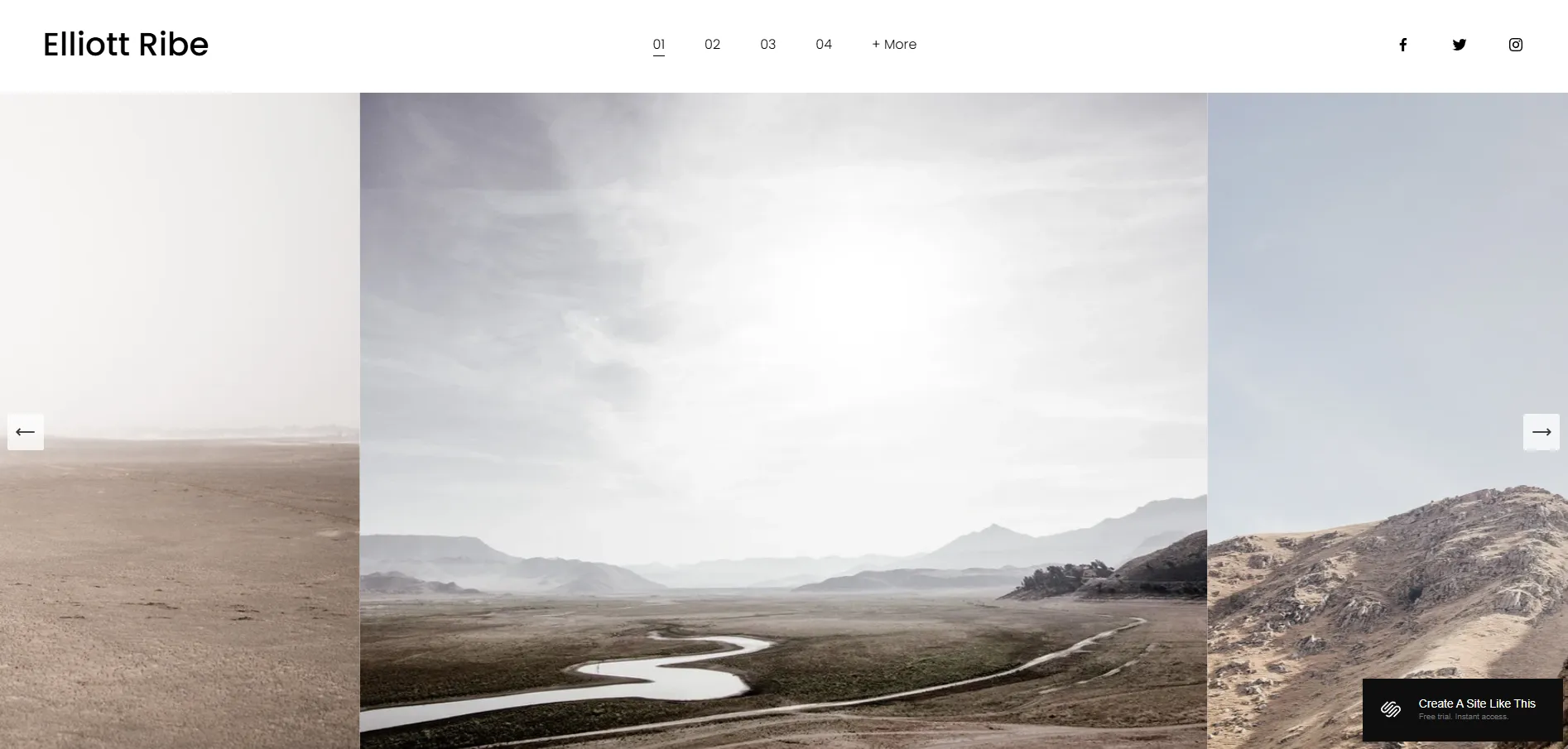
However, Elliot is less flexible when it comes to image formats. The slideshow works best with landscape images, and portrait images may be cropped or resized to fit the frame. If your work relies heavily on vertical images or mixed layouts, you’ll need to prepare visuals carefully or consider a different template.
6. Mycelium
Unlike most creative Squarespace templates, Mycelium takes a very different direction. Instead of starting with clean sections or light layouts, it puts you straight into a dark, immersive visual experience. This approach works well if you want your website to feel emotional and expressive from the first scroll.
As you move through the pages, the design clearly favors mixed media. Large visuals, video backgrounds, and scrolling effects are used to showcase work in a more dramatic way. You can still include practical pages like a shop for prints or merch and a contact page, which makes it possible to both present and sell your work on the same site.
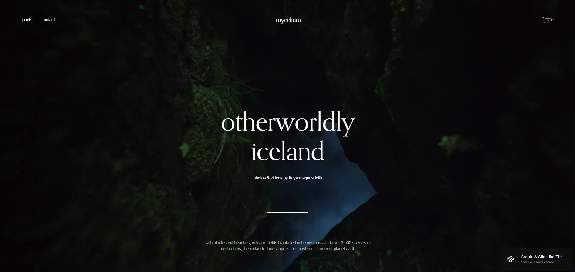
We must say that this style is not for everyone. The dark background and dense visuals can feel heavy, especially if your work already has a lot of detail. For brands aiming for a light, minimal, or refined look, Mycelium may not be the easiest template to adapt.
7. Novo
Next on our list, we have Novo. On the homepage, you’ll see a tight grid of project covers placed close together, separated only by thin white lines. This creates a clean, gallery-like overview to immediately attract visitors with your work.
When you click into a project or category, the page opens with a full-width hero image and a short introduction. Below that, you’ll find a long image gallery that works well for visual case studies, logo collections, interiors, or editorial work.
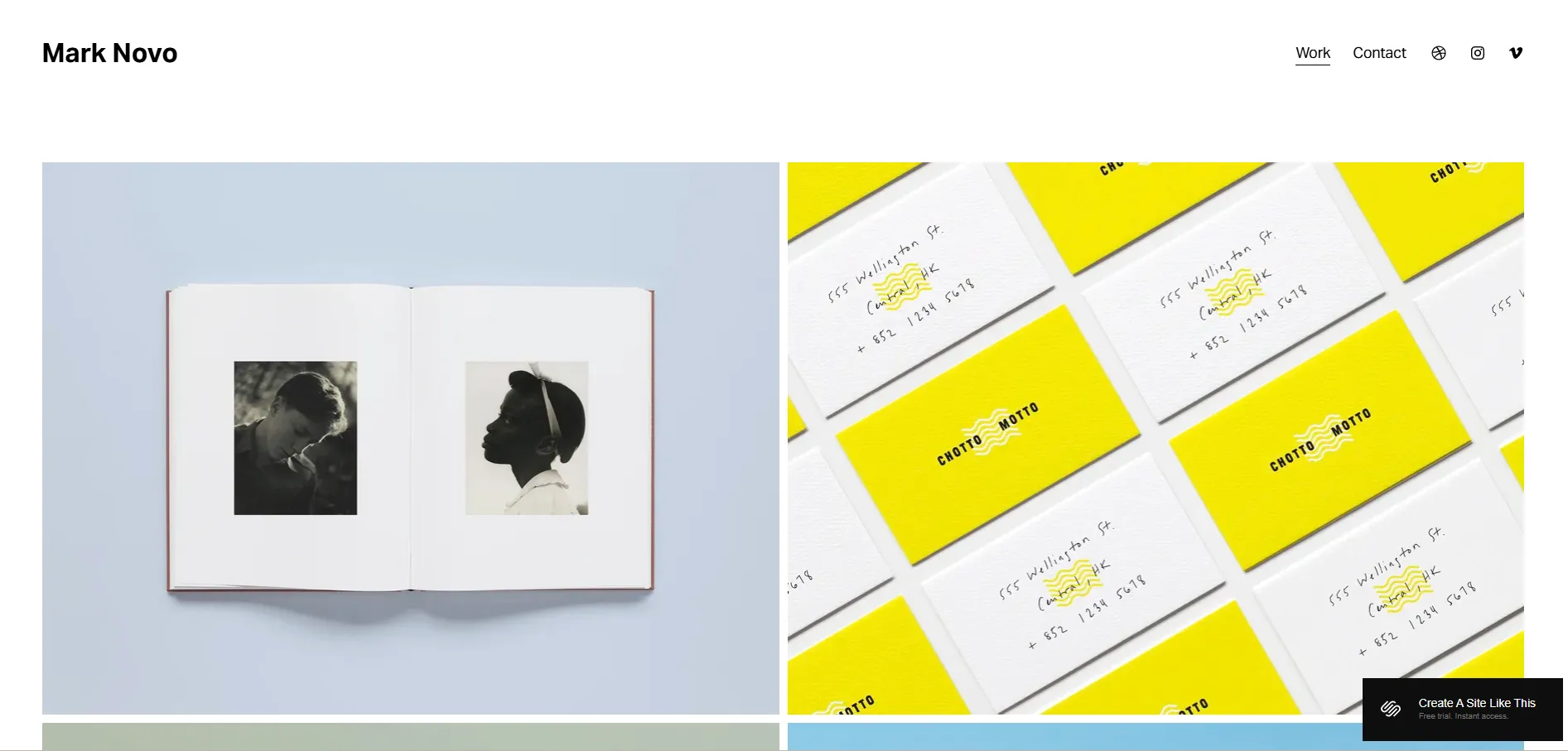
The trade-off is that text plays a supporting role here. If your projects require long explanations or content-heavy storytelling, you may need extra layout adjustments to keep text from feeling secondary to the visuals.
8. Beaumont
The Beaumont demo is built as the personal website of Hollie Beaumont, a photographer and art director based in London. Because of that, the template is clearly structured as an individual creative portfolio. If you’re also building a personal portfolio site, this template gives you a very natural starting point.
The layout is minimal but not bare. You get enough space for project descriptions and supporting text, which makes it easier to explain your work compared to portfolio templates that only allow short captions.
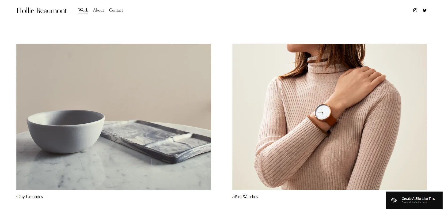
One limitation to note is the homepage structure. Beaumont uses a gallery-style page type for the homepage. If you later decide to remove the portfolio grid, you’ll likely need to rebuild the homepage using a different page type.
9. Ortiz
Ortiz is designed with that goal in mind. The template works best for personal portfolios where creative services are the main offering.
What makes Ortiz stand out is the balance between images and text. It doesn’t rely on visuals as heavily as Elliot or Novo, but it also avoids long, business-style blocks of text. You can show large images while clearly explaining who you are, what you do, what services you offer, and what clients can expect from working with you.
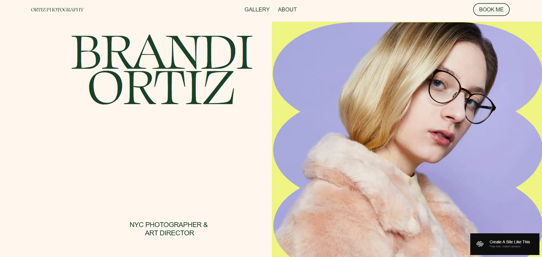
Ortiz is less suitable for heavy blogging or large eCommerce sites. You can add a blog or shop in Squarespace, but the core layout is focused on portfolios and bookings rather than long-term content or product catalogs.
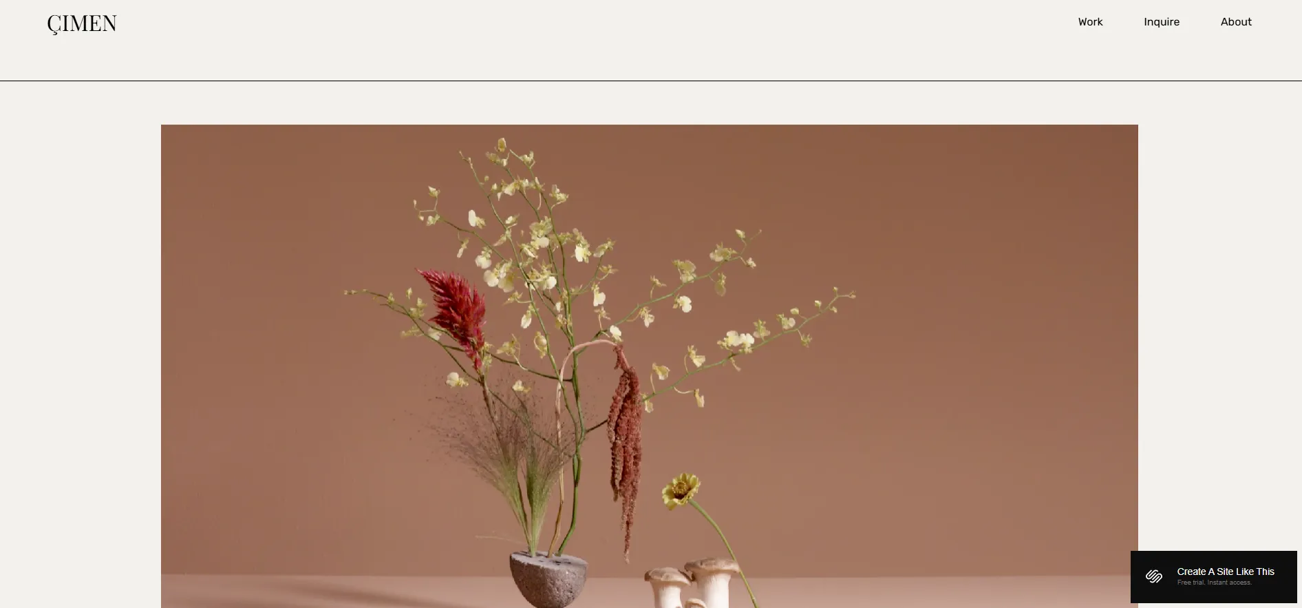
10. Cimen
In contrast to more image-led portfolio layouts, Çimen is designed to put motion first. On the homepage, Çimen supports video backgrounds right from the start, helping you show what you do within the first few seconds.
The Work page uses a three-column grid, and clicking a project opens a lightbox on the same page, allowing visitors to browse multiple projects quickly without jumping between URLs. If you don’t have video, Çimen’s strongest feature is underused. For portfolios built mostly around static images, templates like Novo, Beaumont, or Ortiz can be a more practical choice.
Found a template that fits your online store? Instead of starting over, you can migrate your products, customers, and orders to Squarespace with LitExtension and get your store up and running faster.
Squarespace Migration Made Easy With LitExtension!
LitExtension offers great migration solutions that help you transfer your data from the current eCommerce platform to a new one accurately, painlessly with utmost security.
For even more illustration, you can also check out our list of Squarespace online store examples.
Stay ahead with smarter Squarespace strategies:
- Squarespace tutorial: A Completed Guide for Beginners
- Squarespace Change Template 7.0 and 7.1: A Guide
- Figma to Squarespace: How to Convert Figma Design to Website
Best Squarespace Templates for Blogging
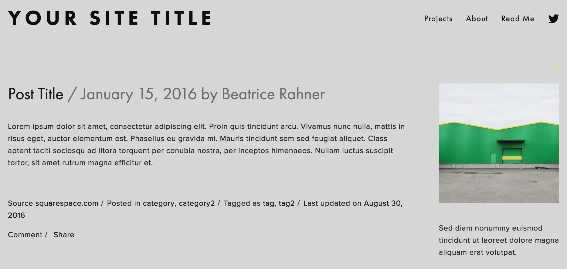
11. Fillmore
Now moving into the blogging category, the first template we want to talk about is Fillmore. This is one of those templates that’s clearly made for writing first, visuals second. If your website is built around articles, essays, or regular blog posts, Fillmore gives you a very natural starting point.
The layout is clean and text-focused, with clear typography and generous spacing. Blog posts are easy to read, headings stand out well, and the overall structure helps readers follow long articles without feeling tired.
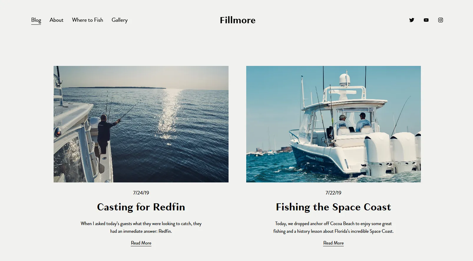
However, this simplicity also sets some limits. Fillmore doesn’t offer much flexibility for visual layouts, so blogs that rely heavily on large images or creative design may find it a bit too restrained.
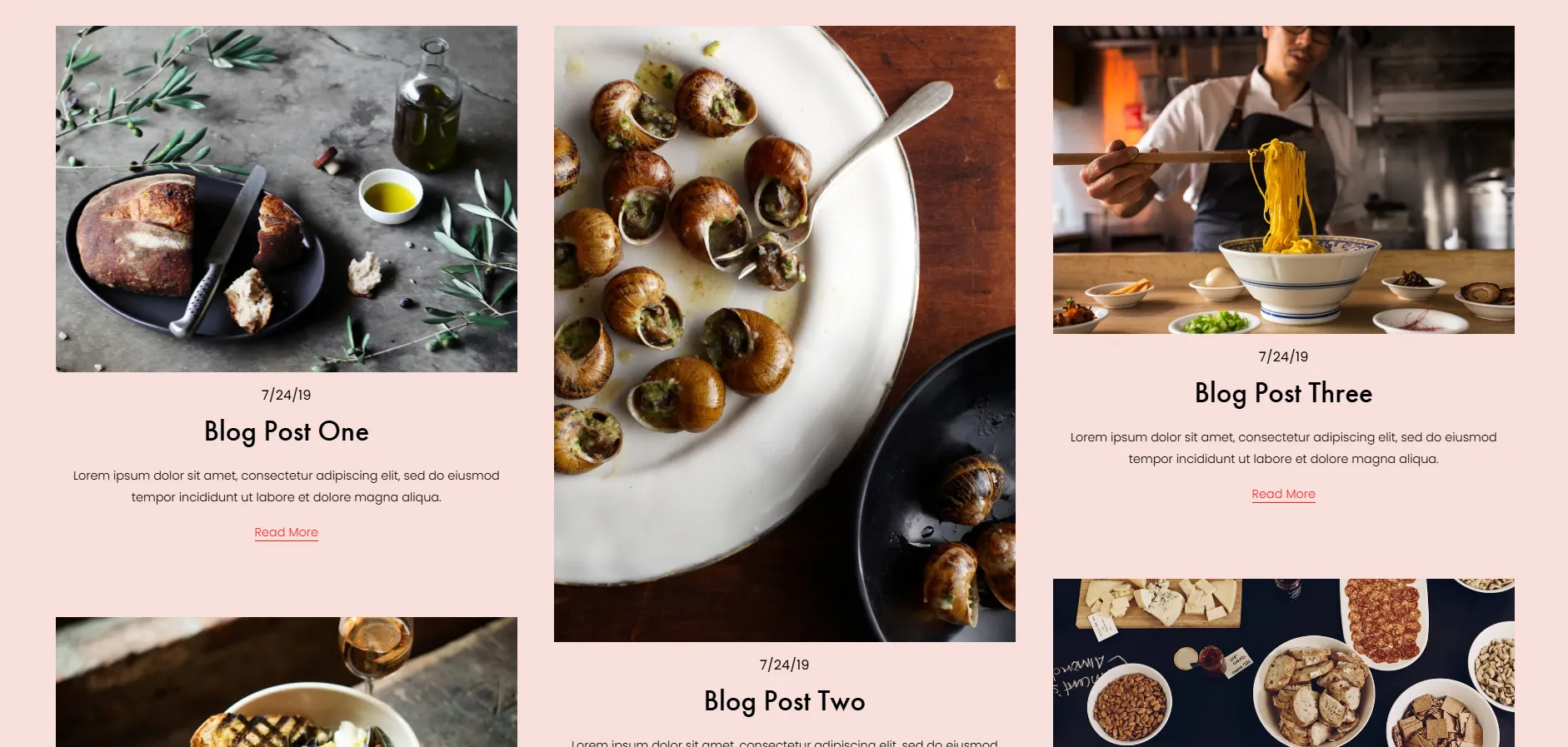
12. Rivoli
Staying in the best for blogging category, Rivoli is a good option if you want your blog to look a bit more styled while still being easy to read. It sits between pure writing templates and more visual designs.
Rivoli gives you more room to play with images compared to simpler blog templates. The homepage highlights featured posts nicely, and blog pages balance text with visuals in a way that feels structured but not rigid.
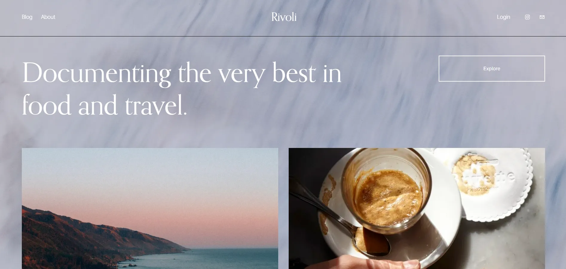
That extra visual structure can be a drawback for some use cases. For blogs that focus on long, text-heavy posts with minimal imagery, the layout may feel less focused than a more minimal option like Fillmore.
13. Brower
Wrapping up, Brower is a good fit if you want a blog that feels clean, modern, and a bit more flexible in layout. It works well for writers and creators who publish regularly but still want some visual structure around their content.
Brower mixes text and imagery in a balanced way. Blog listings are easy to scan, articles are comfortable to read, and there’s enough spacing to keep long posts from feeling heavy. It also gives you more freedom to add images, quotes, or section breaks without making the page look busy.
We noticed that the layout gives similar visual weight to most posts. As a result, featured content doesn’t stand out as much, which can be a drawback for blogs with clear editorial priorities.
Best Squarespace Templates for F&B Businesses
14. Auburn
When it comes to restaurants that want a warm and inviting online presence, Auburn is a natural starting point. This template is designed around atmosphere, making it easy to reflect the look and feel of a physical dining space.
The layout highlights large images, clear sections, and simple navigation. Menus, location details, and reservation links are easy to find, while the overall page flow keeps things relaxed and approachable. It works well for cafés, casual restaurants, or local spots that want to feel friendly rather than flashy.
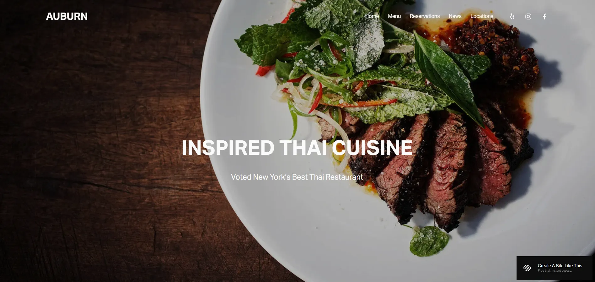
Auburn may feel a bit understated for brands that want a bold or highly stylized look. If your concept relies heavily on strong visuals or dramatic design, you may need extra styling to push it further.
15. Juniper
Juniper leans toward a more modern and polished restaurant website style. It’s a good fit if you want your food, space, and brand to look refined from the first screen.
The template uses clean layouts, strong imagery, and well-spaced sections to present menus, opening hours, and booking options clearly. Pages feel organized without being stiff, which works well for restaurants that want a balance between style and clarity.
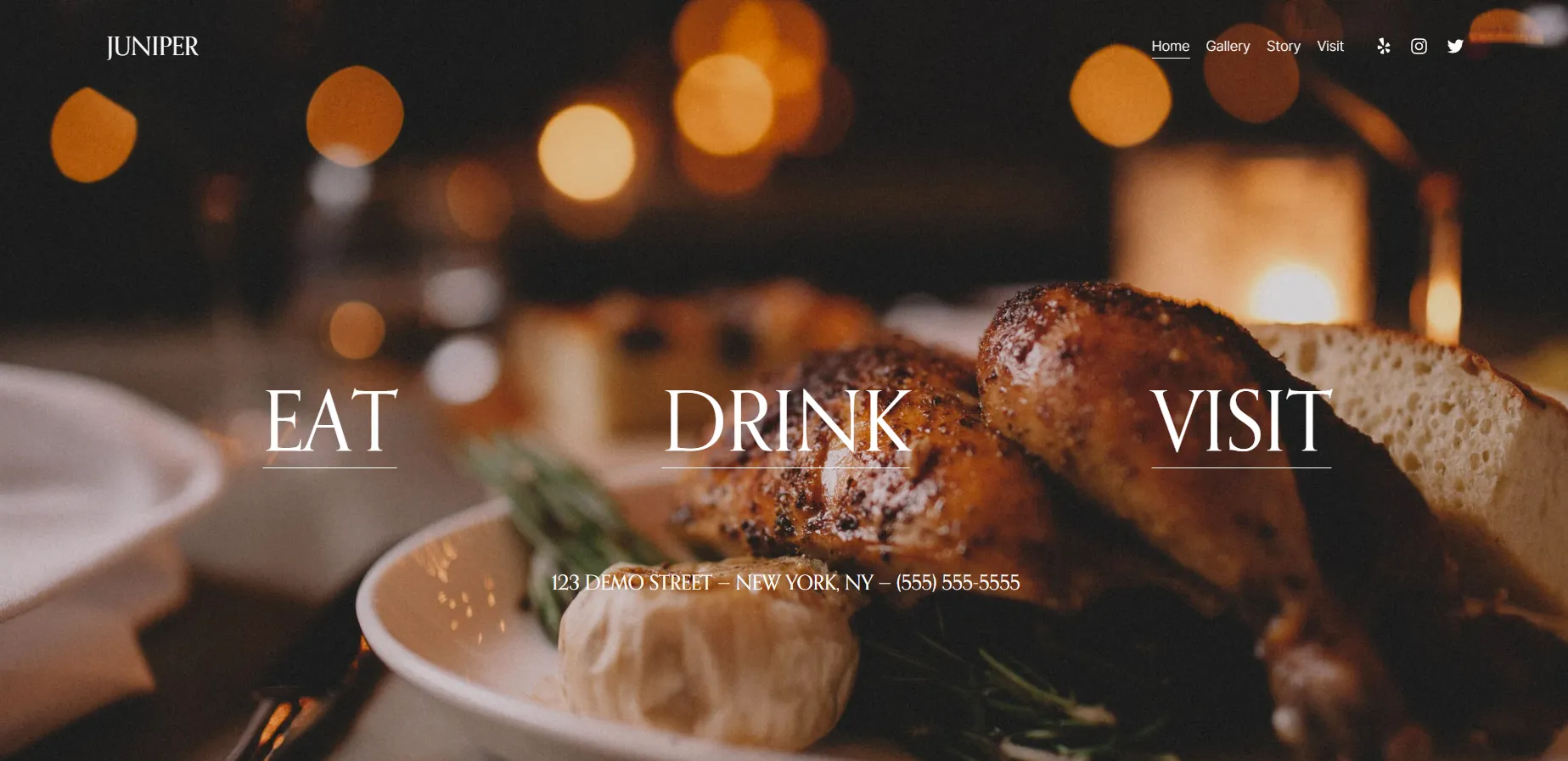
That said, Juniper’s design is quite controlled. If you prefer a more playful or experimental layout, the structure may feel a little restrictive without customization.
16. Lexington
With Lexington, the first thing you notice is the bold use of color. The template is loud, fun, and high-energy, which suits food and beverage brands that want their website to stand out instead of blending in. Large typography and playful visual details give the brand a strong, confident presence from the start.
After that visual impact, Lexington focuses on storytelling around the product. The layout is built to combine products with recipes and video content, so you’re showing how items are used, not just listing them for sale. This approach works especially well for brands like hot sauce, BBQ, snacks, coffee, or craft beverages, where ideas and usage are part of the product value.
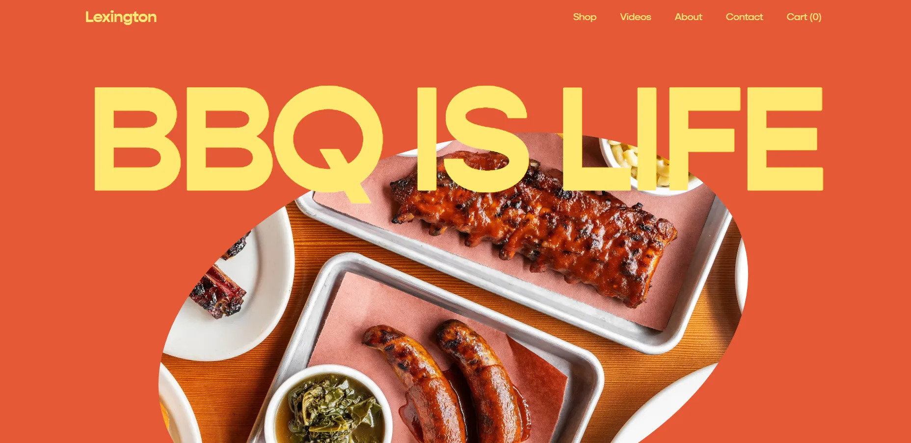
In terms of scale, Lexington works best for smaller catalogs with around 10-25 products. If you plan to grow to 50–100+ SKUs, Juniper is a stronger alternative in our best Squarespace templates list.
17. Fayette
Fayette is a one-page template for Squarespace designed for upscale, moody concepts. It works best for bars, lounges, restaurants, event venues, event planners, or DJs who want to create atmosphere first and explain details second.
The entire site lives on a single scroll. You move from a strong hero section into blocks that introduce drinks, vibe, and space, followed by an RSVP or contact section and location details at the end. Navigation is kept minimal, often using anchors instead of separate pages, and the built-in RSVP/contact form works especially well on mobile.
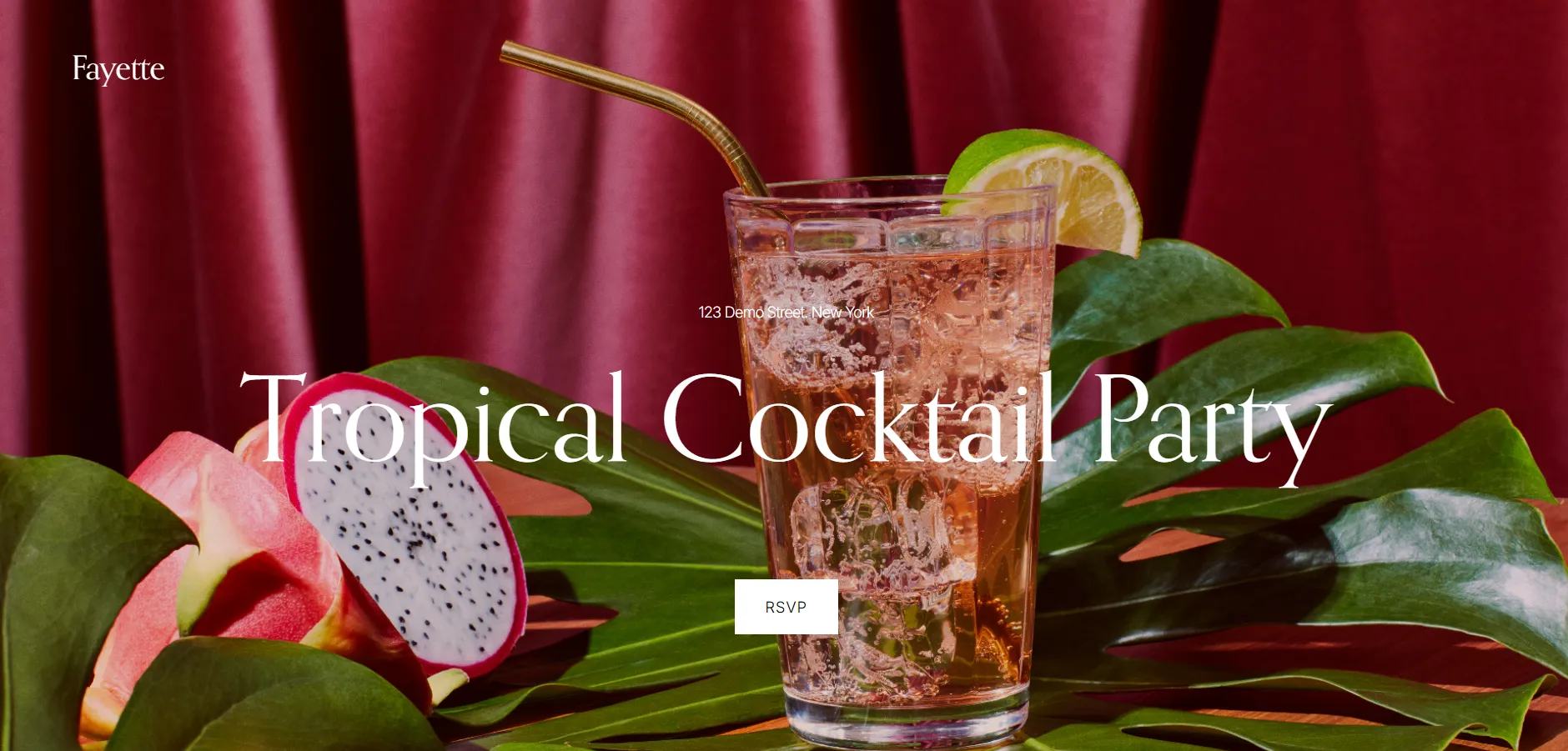
But please be aware that Fayette really only fits “upscale and atmospheric” concepts. For brighter, casual, or family-oriented venues, the design can feel too formal and out of sync with the real-world experience.
Best Squarespace Templates for Online Selling
18. Altaloma
For brands selling delicate goods – like handmade soap, skincare, or candles – Altaloma brings a calm, refined feel. It’s among the best Squarespace templates if you want to look luxe without overdesigning.
Its white space, soft color palette, and elegant typography give your store a premium, indie vibe – more luxury than mass-market. The built-in About + Ingredients layout makes it easy to share your brand story, sourcing values, and product philosophy in a way that resonates with clean beauty or natural lifestyle shoppers.
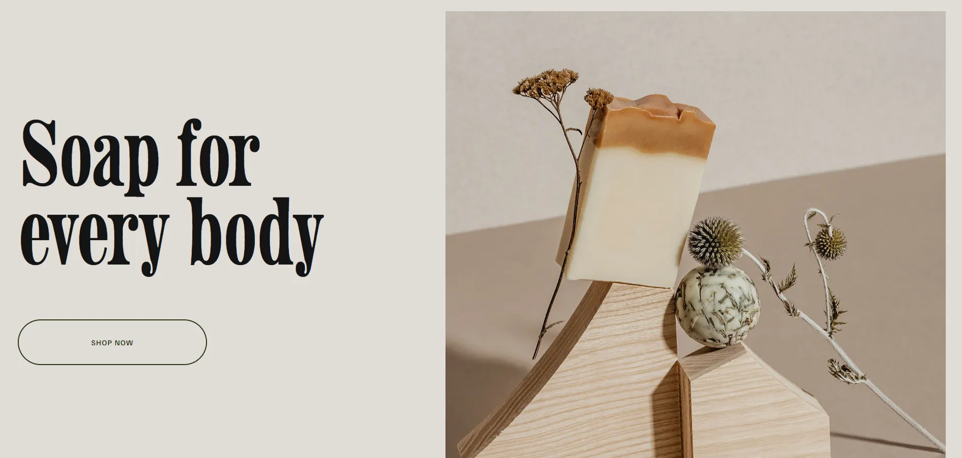
Product pages are clean and readable, with built-in support for variant types like size or scent. But if you sell complex bundles or large catalogs, the layout might feel limiting. Altaloma works best when you have a focused collection and want your content to feel thoughtful and serene.
19. Mariana
Mariana is a one-page eCommerce template with a bold, editorial style, designed for fashion and lifestyle brands with small but strong collections. It works especially well for slow fashion, artisan products, or limited drops where visuals matter most.
The entire shopping flow lives on the homepage, with price, size, quantity, and add-to-cart available right away. This setup suits stores with around 3–15 products or a small number of collections.

The main drawback, in our view, is flexibility. Mariana’s strong visual identity can feel overwhelming for minimal, traditional, or corporate brands, and adjusting it often requires significant changes to colors, fonts, and imagery.
20. Hales
Hales is best suited for florists or small product-based shops that rely on soft visuals and a calm, elegant look. What we like about Hales is that it handles products and services equally well. You can showcase physical products while still having enough space to introduce services like weddings, events, or installations without the site feeling confusing or cluttered.
Another point we appreciate is that sections like Our Story and testimonials are already thoughtfully designed. This makes it easier to build trust and add social proof, since the structure for storytelling and reviews is already there and just needs your content.
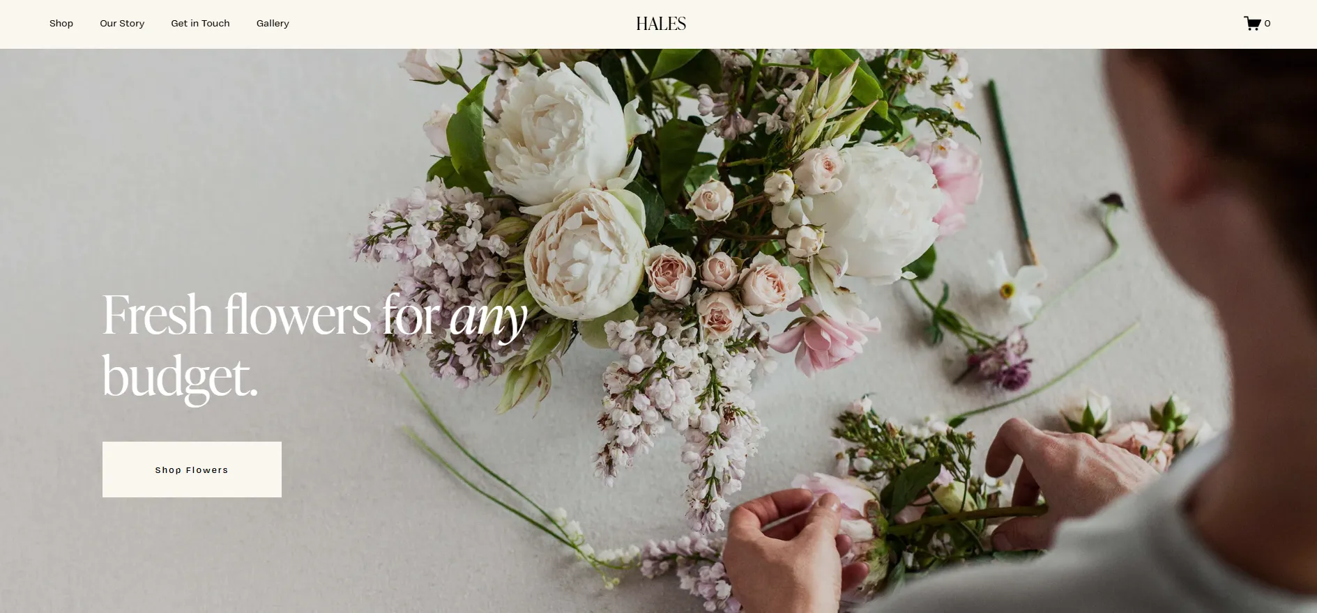
That said, Hales falls a bit short when it comes to detailed service pages. While the homepage includes a “What We Do” section, you’ll need to create separate pages if you want to clearly break down service packages with pricing, timelines, or FAQs
21. Anise
If you’re aiming for a site that feels high-end without being flashy, Anise is one of the best Squarespace templates on the market right now.
From a selling point of view, it gives you what you need without overcomplicating things. You can set up product filters, related items, customer accounts, and a full checkout flow, which works nicely if you’re running a store with a moderate product range.
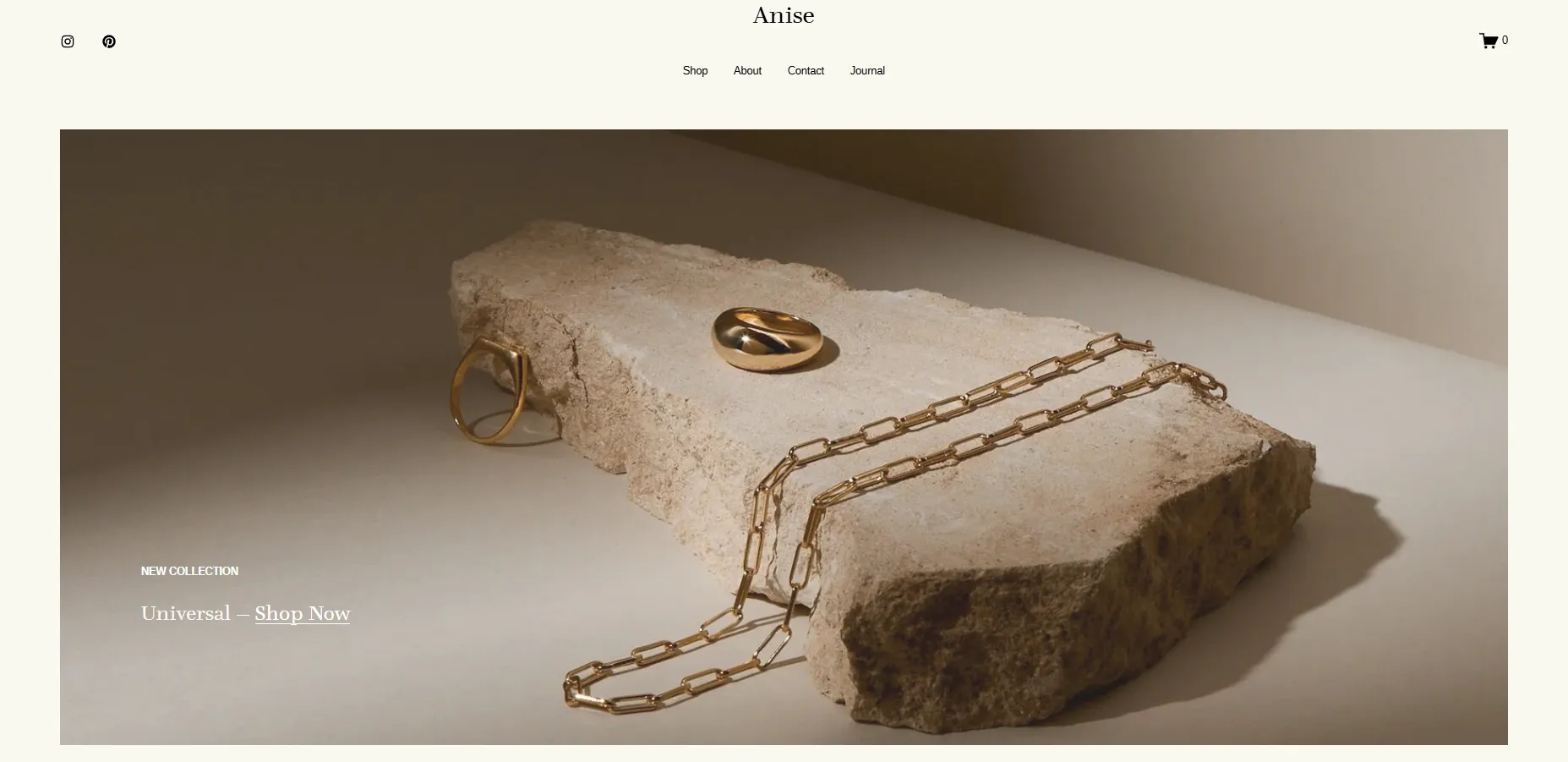
The overall look really depends on the visuals you bring in. Since the design leans heavily on imagery, inconsistent or low-quality photos can quickly take away from the luxury feel. When the visuals aren’t quite there yet, the template doesn’t shine as much as it should.
22. Crosby
With a clear structure and product-focused layout, Crosby creates a straightforward shopping experience that works well for selling physical products. The vibe is darker and more distinctive right away, so it tends to suit brands that want a boutique, slightly edgy look.
As you start exploring the template, you’ll notice how well everything around content and marketing is put together. Gift cards, a blog, and email sign-ups are all easy to plug in, and the “Journal” pages blend nicely with the overall design instead of feeling like an afterthought. The product grid is clean and straightforward, which helps keep the buying journey simple and easy to follow.
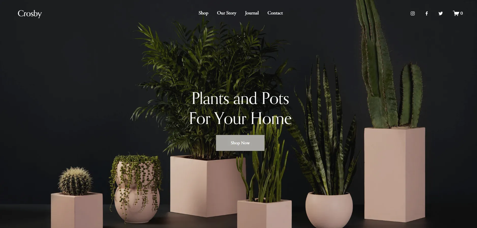
Where Crosby may not be the best fit is for service-based businesses. The structure is very much built around physical products, from the grid layout to the cart experience, so trying to adapt it for pure services can feel a bit forced.
23. Wesley
Wesley takes a much lighter and more approachable direction. The overall feel is friendly and cheerful, which makes it easy to adapt to different niches if you want your store to feel personal rather than corporate.
You can change images, colors, and fonts quite freely and still keep that welcoming tone. The homepage keeps things simple: a clear hero message at the top, followed by featured products, testimonials, and an email sign-up. For niche shops or smaller catalogs, this structure feels natural and doesn’t need much tweaking.
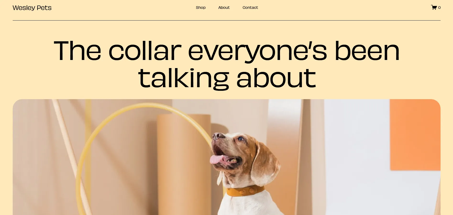
Once the catalog starts growing, though, the simplicity can become a limitation. If you’re dealing with many products, categories, or detailed filters, Wesley may start to feel too light.
Best Squarespace Templates for Professional Services
24. Bloom
Starting with Bloom, this template works best for professional service brands that value clarity and trust. It’s well-suited for consultants, coaches, and small service businesses that need to explain what they do straightforwardly.
Sections for programs, pricing tiers, and different service levels are already in place, so if you’re selling several packages at once, Bloom follows that structure very naturally. This makes it easy to present options and guide visitors toward the right offer.
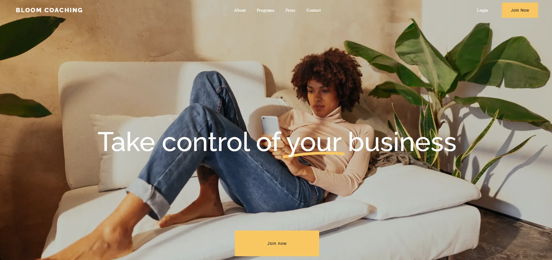
At the same time, that structure becomes a limitation if you only sell one single service. For example, if you only offer 1:1 coaching, you’ll likely need to remove pricing tables and extra program sections. In that case, you’re not really using Bloom’s strongest features, and a simpler template may be a better fit.
25. Clove
Next is Clove, a template designed with a softer, more human approach in mind. This is one of the best Squarespace templates for therapists, wellness professionals, coaches, and service brands where comfort and approachability matter.
The layout uses generous spacing and calm structure, helping visitors feel at ease while reading about services or reaching out. Contact and inquiry sections are easy to find, which reduces friction for first-time visitors.

Because of this gentle tone, Clove is less ideal for highly corporate or aggressive sales-driven services. Brands that need to feel sharp or fast-paced may find it too subdued.
26. Klipsan
Klipsan goes straight into an energetic, performance-driven direction. The design leans dark and bold, giving the site a high-energy look that fits gyms, fitness studios, and personal trainers, etc.
Instead of focusing on just one thing, the template brings many elements together. You can show class schedules, individual class pages, tour or session bookings, and even a small shop on the same site. This setup works naturally when your business runs memberships, group classes, and a few extra products alongside core services.
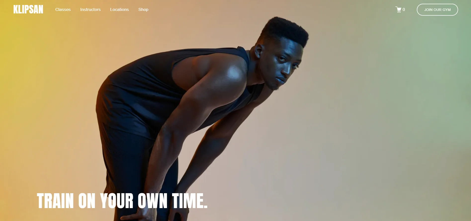
The challenge is tone. That dark and bold look doesn’t translate well to softer wellness concepts. Studios built around relaxation or mindfulness may find the design too heavy, and adjusting it to a lighter mood can take quite a bit of visual work.
27. Cedar
Among the Squarespace templates for professional services, Cedar stands out for its text-first, no-nonsense approach. It’s designed for businesses like financial advisors, consultants, agencies, and coaches that need to explain services clearly and encourage visitors to book a consultation.
The serif typography and simple color blocks give a sense of confidence and trust. Subtle details like light text animations also keep things modern without being overdone.
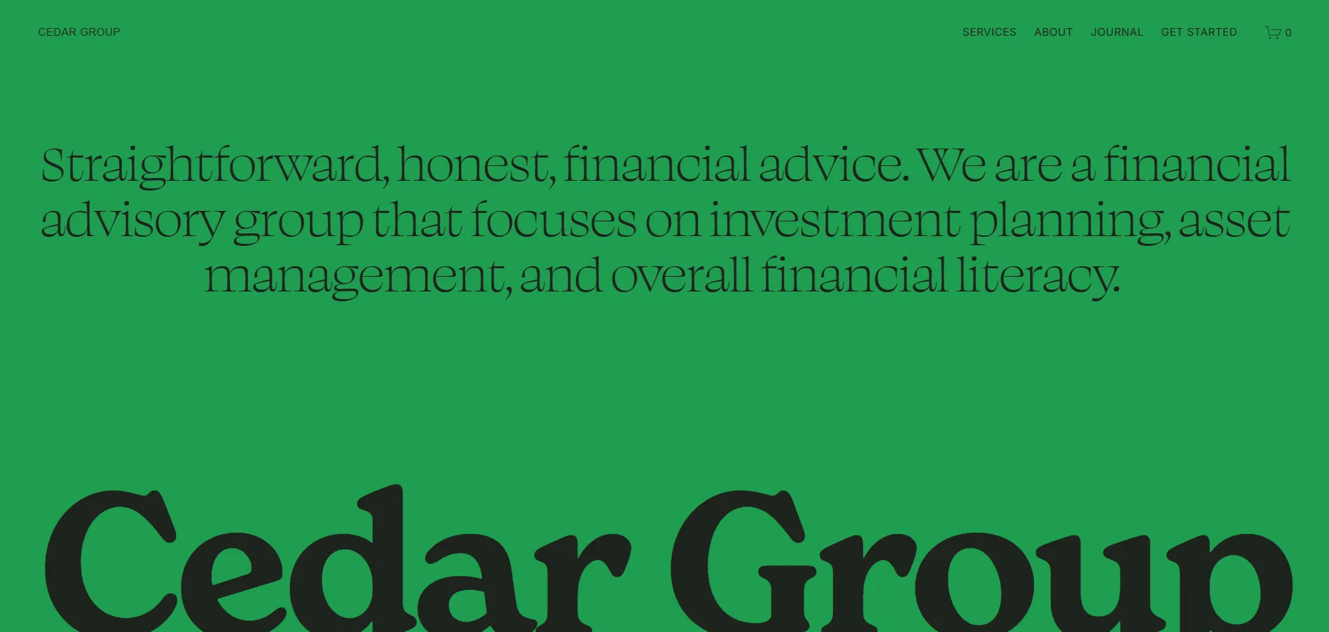
That said, Cedar isn’t built for heavy online selling. If your site needs advanced filters, multiple product categories, or a full eCommerce setup, there are better templates for that. This one is best for services, not stores.
How to Choose The Right Squarespace Template
The best template is usually not the one that looks the most impressive in the demo. Instead, it's the one that already matches the way your business actually works!
So, before you choose a Squarespace template, let's ask ourselves a few important questions first:
Step 1. Decide what your website actually needs to do
The first thing to clarify is your website's primary goal. Different Squarespace templates are designed around completely different business models, after all, so starting with the wrong structure can create unnecessary customization work for you later!
For example, an online store with 100+ products needs a very different layout from a personal portfolio or a one-page restaurant website. Similarly, a coaching business that relies on bookings and service pages will have different priorities from a fashion brand focused on product photography.
Try listing the core things your website needs before browsing templates, such as:
- Selling products
- Booking appointments
- Publishing blog content
- Showcasing portfolio work
- Building memberships or courses
- Collecting donations
- Running a one-page landing site
Once you know the core purpose, you can immediately narrow down the template library instead of browsing all designs randomly.
Step 2. Use the “Type” filter
When browsing the Squarespace template store, the “Type” filters are the fastest way to eliminate templates that simply don't fit your structure.
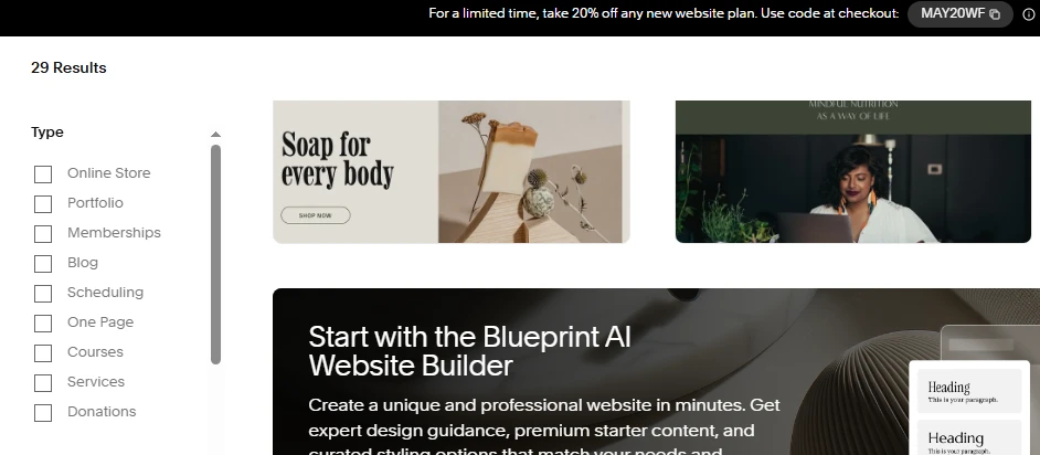
Squarespace currently organizes templates into categories like:
- Online Store
- Portfolio
- Memberships
- Blog
- Scheduling
- One Page
- Courses
- Services
- Donations
This step matters more than most people realize. For example, if you already know your business depends heavily on products, starting inside the “Online Store” category will immediately surface templates with stronger product grids, shopping flows, and merchandising layouts.
Similarly, service businesses should focus more on “Services” or “Scheduling” templates, as these usually prioritize inquiries, booking sections, testimonials, and consultation flows rather than catalog navigation.
Even if you later customize the visuals completely, starting with the right structural category saves a huge amount of time.
Step 3. Narrow the selection using “Topic.”
After filtering by website type, the next step is using the “Topic” section to match your industry or visual direction more closely. At the moment, Squarespace includes categories like:
- Fashion
- Restaurants
- Photography
- Professional Services
- Health & Beauty
- Fitness & Sports
- Weddings
- Real Estate & Properties
- Food
- Travel
- Media & Podcasts
- Art & Design
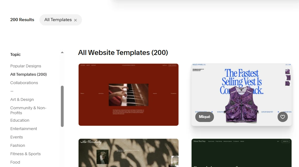
Keep in mind that this filter is less about functionality and more about presentation style. For example:
- Fashion templates often prioritize large imagery and editorial layouts
- Professional Services templates focus more on readability
- Restaurant templates usually emphasize atmosphere, menus, reservations, and location details.
All in all, using Topic filters helps you avoid forcing a completely different aesthetic into a template that was never designed for it.
Step 4. Focus on layout structure
This is probably the most important tip of all.
When browsing Squarespace templates, many people get distracted by photography, colors, or branding in the demo site. But those elements are temporary and easy to replace; instead, you should pay attention to the actual layout structure underneath:
- How are sections organized?
- Is the homepage scroll natural?
- Does the navigation feel scalable?
- Are product pages easy to browse?
- Is there enough space for text content?
- Can the layout support your future content needs?
From our experience, a template with the “wrong” colors but the right structure is usually a far better choice than a beautiful demo that fights against your business needs.
Step 5. Shortlist 2–3 templates before customizing
Lastly, rather than committing immediately to the first template you like, it's smarter to shortlist a few strong options first. Squarespace allows you to preview templates easily, so you should compare them side by side while thinking about:
- Homepage flexibility
- Mobile responsiveness
- Product presentation
- Content readability
- Navigation scalability
- Overall customization potential
Often, the differences only become obvious when you compare templates directly rather than viewing them individually. In many cases, the “best” Squarespace template is simply the one that requires the fewest compromises once your real content is added.
5 Tips to Customize Your Squarespace Templates
Customizing a Squarespace template is not about making everything look “different”, but about making it feel right for your brand. With tools like Fluid Engine and the newer updates, you can now go far beyond basic layout – if you approach customization the right way.
1. Start with the right template
On Squarespace, choosing a template that already matches your business model, content structure, and catalog size will save you a lot of time later. This becomes even more important if you plan to change Squarespace templates as your site grows.
For example, templates designed for small, curated product lines are much easier to customize than those built for large catalogs. If the core layout already aligns with your needs, you can focus on refinement instead of restructuring everything from scratch.
2. Define your brand styles
Before touching layouts or blocks, clearly define your brand’s visual system. This includes fonts, color palette, spacing, and image style.
Squarespace’s global styles allow you to apply these elements consistently across the entire site. When your brand styles are set early, even small layout changes will still feel cohesive, professional, and intentional rather than pieced together.
3. Let AI Builder support
Squarespace’s AI Builder can be a helpful assistant in the early stages of customization. It supports you in generating page structures, section ideas, and basic content layouts based on your business type and goals.
AI works best as a starting point rather than a final solution. Once the structure is in place, you can refine and adjust it using Fluid Engine controls to better reflect your brand’s tone, hierarchy, and visual balance.
4. Customize with built-in tools
With Fluid Engine, Squarespace gives you much more flexibility than older versions of the editor. You can move elements freely, fine-tune spacing, and build more dynamic layouts while keeping the site responsive across devices.
Instead of overloading pages with effects, use built-in tools to improve clarity and flow. Clean grids, thoughtful spacing, and clear content hierarchy often make a bigger impact than heavy visual styling. There are also many powerful Squarespace features you can leverage to take your store's template to another level; check them out!
5. Explore custom code or plugins
When built-in features are not enough, light custom code can help extend functionality. This may include custom buttons, animations, layout adjustments, or integrations with third-party tools.
Custom code should be used strategically. Over-customizing can make future updates harder to manage, so combining native features with minimal code usually leads to better long-term performance and maintainability.
Bonus: 5 Squarespace Templates We Don’t Recommend
Though there are plenty of excellent Squarespace templates available today, not every option has aged well. To help you avoid unnecessary customization work later, here are 5 Squarespace templates we generally don’t recommend for most businesses today: Aviator, Wexley, Forte, Supply, and Momentum.
1. Aviator
At first glance, Aviator looks visually striking because of its full-screen imagery and immersive homepage design. However, that exact structure is also what makes the template difficult to work with for most modern websites.
The biggest issue is flexibility. Aviator relies heavily on large background images and fixed full-screen sections rather than on a more natural scrolling structure. This design can quickly become limiting if your business needs multiple homepage sections, layered content, testimonials, FAQs, featured products, or detailed service explanations. Once you start adding more information, the layout tends to feel cramped rather than elegant.
Navigation is another weak point, as Aviator works best with very small websites that only need a few menu items. Hence, if your site grows and requires dropdowns, multiple service pages, blog categories, or larger navigation systems, the menu can start looking cluttered and difficult to organize cleanly.
2. Wexley
Wexley was originally released back in 2012. Despite its once-popular mosaic grid layout, the template now feels noticeably outdated in both functionality and customization.
The main problem is that Wexley was built during an older generation of Squarespace design systems. As a result, it lacks the flexible editing controls and layout freedom that newer templates now offer by default. Adjusting spacing, restructuring sections, or creating more modern content layouts often requires unnecessary workarounds.
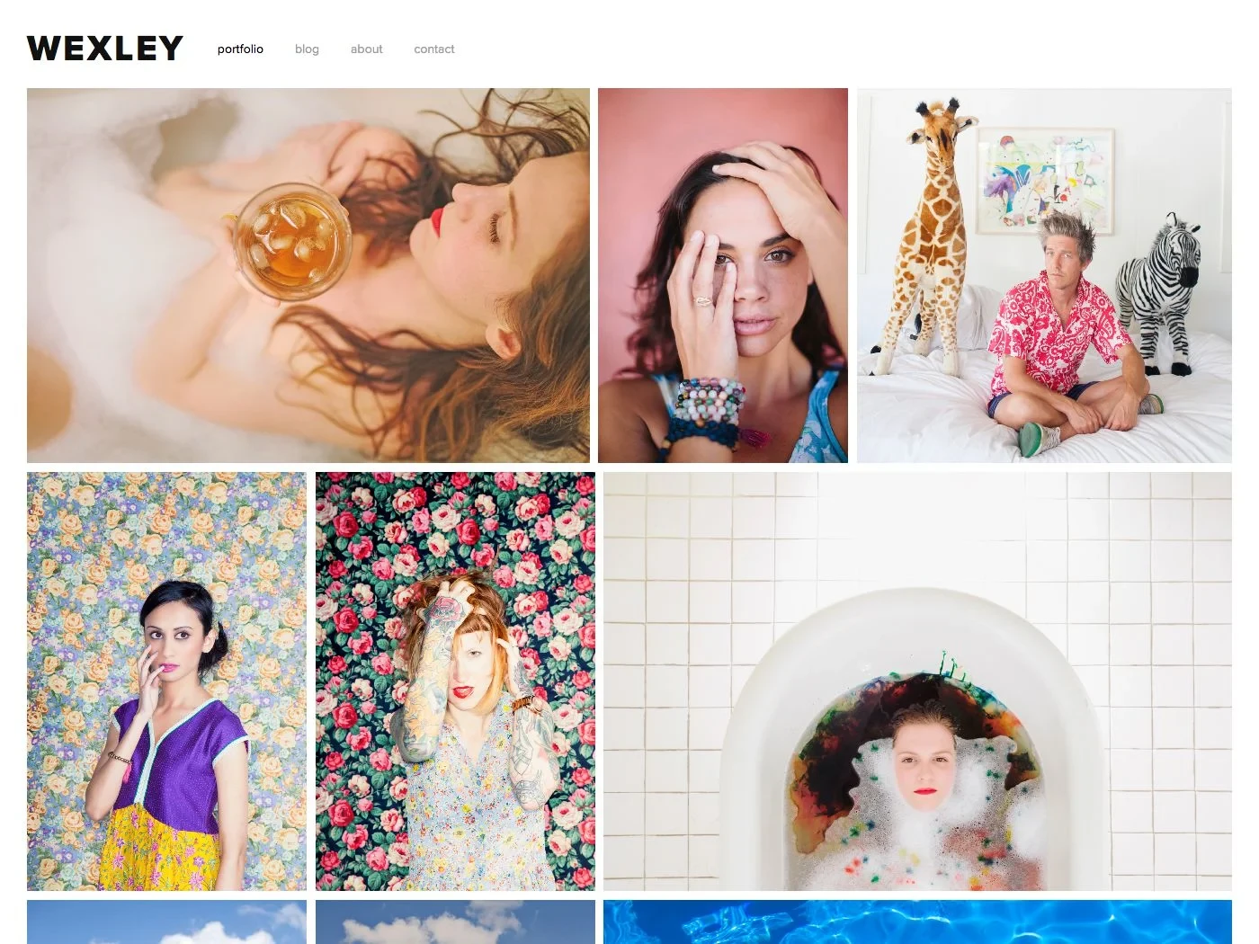
Not to mention, the mosaic-style homepage also feels tied to older web design trends. While image grids can still work today, Wexley’s execution tends to look crowded on modern large-format screens, especially compared to cleaner portfolio templates like Novo or Beaumont. So, unless you specifically want a nostalgic early-2010s portfolio aesthetic, newer Squarespace templates simply offer far more control and longevity.
3. Forte
Forte is another older Squarespace template family built around full-screen, edge-to-edge photography. Sure, this approach can still look attractive for minimalist photography portfolios, but keep in mind that it creates several practical problems for most other website types.
For starters, the template prioritizes visuals so heavily that actual content often becomes secondary. Text overlays can be difficult to read depending on the background image, and there’s limited flexibility when trying to create more structured layouts for services, pricing, FAQs, or educational content.
Secondly, customization is also fairly limited compared to modern 7.1 templates. Once you move beyond the original photography-focused concept, the layout starts clashing with your content rather than supporting it, which is a red flag for sites that rely on readability and scalable page structures.
4. Supply
Supply was originally designed as a basic eCommerce-focused template. And yet, nowadays, it struggles to meet the flexibility and usability standards expected of modern online stores.
One of its biggest weaknesses is the rigid index-page structure. Product grids, category organization, and homepage merchandising all feel far less dynamic compared to what newer Squarespace 7.1 setups can achieve using Fluid Engine. As your catalog grows, the layout becomes harder to organize cleanly without extensive customization.
The shopping experience also feels dated. Modern eCommerce design relies heavily on flexible layouts and cleaner filtering systems, none of which Supply possesses. Worse, as soon as you begin adding larger inventories or promotional sections, the template starts showing its age quickly.
5. Momentum
Lastly, Momentum is probably one of the clearest examples of a template that prioritizes visual effect over usability.
Its defining feature is a full-screen, auto-scrolling gallery that dominates the entire browsing experience. Though this looks visually dramatic at first, the layout creates major limitations for websites that need substantial written content or structured sections.
There are many complaints regarding navigation, since standard headers, multi-level menus, and more traditional website structures don’t integrate naturally into Momentum’s design system. As a result, expanding the site beyond a very small portfolio or visual showcase can become very frustrating for those with limited technical knowledge.
Best Squarespace Templates: FAQs
Are Squarespace templates good?
Yes. Squarespace templates are known for clean design, strong typography, and consistency across devices. They’re professionally designed and work especially well for portfolios, small businesses, and content-driven sites.
Is Squarespace 7.0 still available?
Yes, but only for existing sites. You can’t create new sites on Squarespace 7.0 anymore, and it’s no longer actively updated. New projects should always use Squarespace 7.1.
Which Squarespace template is best for SEO?
There’s no single “best” SEO template. All Squarespace 7.1 templates share the same SEO structure. SEO performance depends more on your content, page structure, headings, internal linking, and load speed than on the template itself.
How do I make my Squarespace site look professional?
Use a consistent font pair, limit your color palette, and give your content enough white space. High-quality images, clear page hierarchy, and a simple navigation structure make a bigger difference than fancy design elements.
What is the best SquareSpace template for a video portfolio?
Templates with full-width sections and strong media support work best, such as Paloma, Brine-style layouts, or any 7.1 template that emphasizes large visuals. The key is choosing a layout that lets videos load cleanly and stay front and center without clutter.
Key Takeaways
As you’ve seen throughout this list, different templates excel at various use cases. Thus, finding the best Squarespace templates ultimately comes down to understanding what your site needs to do first, rather than following design trends. We hope this article has helped you narrow down the right option for your business.
For more insights, check out our other blog posts and join our community group to keep learning and sharing.
Learn what successful Squarespace users are doing:
- How to Publish Squarespace Website in 5 Minutes
- How to Delete Squarespace Account: Detailed Tutorial