- Customers will form an opinion about your site in just 0.05 seconds. Moreover, in a distracting world where we are constantly inundated with information, it only takes the gentlest nudge to knock someone’s attention off course. So if people don’t like the look of your website at first glance, then you might never win them back.
- A great UI could increase the conversion rate of a website by 200%.
- A great UX could increase the same by almost 400%.
So, it can't be denied that UI & UX plays an important role in the growth of an eCommerce business. Furthermore, in the technology age like today, it becomes more & more crucial for businesses to focus on enhancing these aspects of their stores.
Three critical points will be discussed:
- General knowledge about UI and UX including definitions and differences between UX/UI design on eCommerce websites vs on other types of websites.
- Key principles for outstanding UI/UX design.
- Best practices of UX/UI design
What is UX & UI?
- UX stands for User Experience, and usually UX designs encompass the end-user’s interaction with the company, service, or products. Actually, this process can be applied to just about anything – from fighting tournaments to websites. Originally, it’s a non-digital term that focuses on the overall feel of a product or service
More often than not, UX is used in digital industries, as it involves the interaction between the user and the service. UX design is the broader term for considering all the different elements involved in this experience. The main consideration is for how the user feels when experiencing the product and how easy it is for them to use the product or service.
- UI stands for User Interface. Unlike UX, UI is strictly a digital term. It concerns the look, feel, presentation, and interactivity of a product or service. It’s the point of interaction between the user and the digital product (the touchscreen on your devices, the pages on websites …).
UI involves making the user interface of the product as intuitive as possible. This involves considering every visual or interactive thing that the user might encounter. From typography to colour schemes to responsive design, a UI designer’s main aim is to make the user’s experience with the digital product as interactive and appealing as possible.
Differences between UX/UI design on eCommerce websites and other types of websites
Generally speaking, we see 3 types of websites: informational ones, Social media ones and the eCommerce ones. Each type serves a different purpose, thus the UX-UI design on each type cannot be the same.
Informational sites (news, blog pages) focus on bringing information to the readers in the fastest and clearest way, so these types of pages need easy-to-read themes, fonts, colours, as well as a user-friendly layout
Social media sites focus on connecting users together. Normally, each social media would have one key feature. This key feature would be the selling point of the site, users will be drawn to and kept using that social media by the key feature. The UX/UI of social media would center around its key feature. Take Instagram for example. This social media's key feature is beautiful photos-videos, thus the UX/UI of Instagram evolves around showing photos-videos in the best filters, shapes … to boost the reaction rates of users toward photos-videos on Instagram.
ECommerce sites focus on bringing sales to merchants, so the key principles for UX/UI design of eCommerce sites are not the same with informational ones and Social media ones. So what are those principles for eCommerce sites?
Key principles for UX/UI design of eCommerce sites
Speed
Speed is key. Since the beginning of 2020, besides content, Google has deemed that the speed of the websites is also a crucial point to rank the SEO score of a website. Take a look at this site https://developers.google.com/speed/pagespeed/insights/. On this site, you can check the speed score from Google of any websites you want. Google also points out the key metrics that you should take note of to improve on your websites. (check some websites)
To be fair, the speed of your websites are not being judged by Google only. All the users of your sites can feel it. In this fast paced century, speed is the key to success (or failure). We all accept the fact that there are at least dozens of competitors with similar products with our online stores out there.
So how to get a high PageSpeed score?
There are 4 things to remember: Strong hosting, Image shrinking, Lazy loading, JavaScript & CSS files optimization.
- Strong hosting
Most new site owners choose the cheapest possible option for hosting. While this is often enough in the beginning, you’ll likely need to upgrade once you start getting more traffic. Don’t skimp on your host, get one that you can trust. There are a great set of the reviews on the best web hosts out there
When looking at hosting, you have three different options:
- Shared hosting
- VPS hosting
- Dedicated server
Shared hosting is the cheapest option and you can often get it for about five dollars per month. While it’s fine for low-traffic sites, shared hosting does struggle to keep up with traffic spikes and high-volume sites. And it is possible for your site to be impacted by traffic spikes from other sites using the same server as you. With shared hosting, you share certain resources like CPU, disk space, and RAM with other sites hosted on the same server.
With VPS hosting, you still share a server with other sites, but you have your own dedicated portions of the server’s resources. This is a good in-between option. It protects your site from everyone else on your server without the cost required for dedicated hosting.
You can look at dedicated hosting, it is like owning a home. You don’t share resources with anyone else, and you’re responsible for all maintenance. With a dedicated server, you have much more space — but you also have more work to do with configuration and technical setup. If you need tons of space and want complete control over your hosting, having the fastest site speed is your best bet.
As you may have guessed, though, it’s the most expensive option.
If you’re at a point where your traffic levels are slowing down your server response times, it may be time to switch from shared hosting to a VPS, or from a VPS to a dedicated server.
Image shrinking
Images can play a major role in your site speed. They’re often very large files, which can slow down page load times.
In fact, in one study, resizing 22MB of images down to 300KB resulted in a 70% reduction in time to interact, or the amount of time a user needs to wait before they can interact with a site.
One of the easiest ways to reduce image file sizes is cropping your images to the correct size. For example, if you want an image to appear as 570px wide, resize the image to that width. Don’t just upload an image that is 2000px wide and set the width parameter to the size you want. This requires your page to load the full image, then adjust it to the appropriate size, slowing your page.
If you use the width parameter to make images appear smaller on your site, resizing those images should be a priority. It’s an easy way to reduce the total size of each page and can have a major impact on your site’s speed.
Next, you can compress your image files with a few different tools. After you’ve saved the new compressed image files, you can use them on your site. However, we recommend that you should take things to the next level: using the appropriate file types for your images. This may seem like a minor concern, but the file types you use do have a tremendous effect on your sites’ loading speed. Commonly, you have options like JPG, PNG … But we’d like to suggest a different file type for your website images: webp. This format is specially designed for website images with two major advantages:
- Webp file sizes are relatively smaller than JPG or PNG
- Pictures in webp normally show up better than JPG or PNG on websites
There are many online converting tools to change JPG or PNG files into webp files, and they all work nicely. Change all your website images into webp files and then check the Google speed score, you will see the differences immediately. If you are using videos in your web pages, you could also compress videos online using good video editing tools.
Lazy loading
Lazy Loading Images is a set of techniques in web and application development that defer the loading of images on a page to a later point in time – when those images are actually needed, instead of loading them up front.
To put it simply, instead of loading these resources as soon as the page loads, which is what normally happens, the loading of these resources is put off till the moment the user actually needs to view them.
The technique of lazy loading can be applied to almost all the resources on a page. For example, in a single page application, if a JS file is not needed until later, it is best not to load it initially. If an image is not needed up front, load it later when it actually needs to be viewed.
This technique has been proven to be one of the best ways to optimize your site speed.
You can find out which images are a candidate for lazy loading and how many bytes you can save on the initial page load by using Google Lighthouse audit tool. The audit performed by this tool has a section dedicated for offscreen images. You can also use ImageKit’s website analyzer to identify if your website uses lazy loading or not, in addition to other critical image-related optimizations on your page.
JavaScript & CSS files optimization
Scripts like CSS and JavaScript can be loaded in two different ways: Synchronously or Asynchronously.
If your scripts load synchronously, they load one at a time, in the order they appear on the page. If your scripts load asynchronously, on the other hand, some of them will load simultaneously.
Loading files asynchronously can speed up your pages because when a browser loads a page, it moves from top to bottom.
If it gets to a CSS or JavaScript file that is not asynchronous, it will stop loading until it has fully loaded that particular file. If that same file were asynchronous, the browser could continue loading other elements on the page at the same time.
And, lastly, the most obvious yet most important recommendation: have your developers merge all the JS/CSS files into as few files as possible.
Checkout pages
Each country has different payment method preferences. Therefore, digital retailers need to embrace a variety of payment forms to open their user experience to suit a broader audience.
If your aim is to reduce friction, there are very few higher barrier points than an inability to pay for desired items. Remove this barrier by accepting an array of payment options beyond debit/credit cards such as PayPal and Stripe, Opayo, Google Wallet, Apple Pay, and other popular online payment methods around the world. Also, be sure to give account holders the option to save their card information.
Though using payment gateways might slow down the checkout speed, and we are talking about how to make your web go faster, your customers love security when it comes to money. A trustworthy checkout process will ensure more sales. After all, securing sales is the most important thing for merchants.
Content is still the king
- Clear information
- Easily navigate throughout website
- Theme and design compatible with the companies' products/services
- Short, simple to understand, insightful content
- Content can be shown in banner, popup, sidebar so that there are less actual texts on web
Best practices
Talking about e-commerce, it’s vital to understand that selling the goods via the website or mobile application is a minimal program of actions.
User retention is the direct condition of growing profits. And we have to admit that this aspect makes the e-commerce sphere highly attractive for designers. The objective which should be achieved is clear and simple: people have to reach the e-commerce platform and buy items offered on it.
A positive user experience is a key thing for user retention. In the case of e-commerce, the four key aspects of UX are quite clear:
- Utility lies in the nature of the product: it helps users to choose and buy things and services they need (Satisfied User Wishes, Solve Problems)
- Usability has to make the customer journey clear and easy, without unnecessary clicks, time lost on loading overloaded pages or inconvenient menus, the frustration of not getting feedback from the system, etc.(Clear, Convenient, Logical and Easy to use)
- Accessibility has to bring up designs that can be used by different categories of users, for example, people with disabilities (dyslexic, color-blind, etc.) or low level of tech literacy.
- Desirability means that the app will get the look and feel which will make the experience enjoyable and users will wish to get back again. (Positive Emotion, Aesthetic Satisfaction, Pleasure).
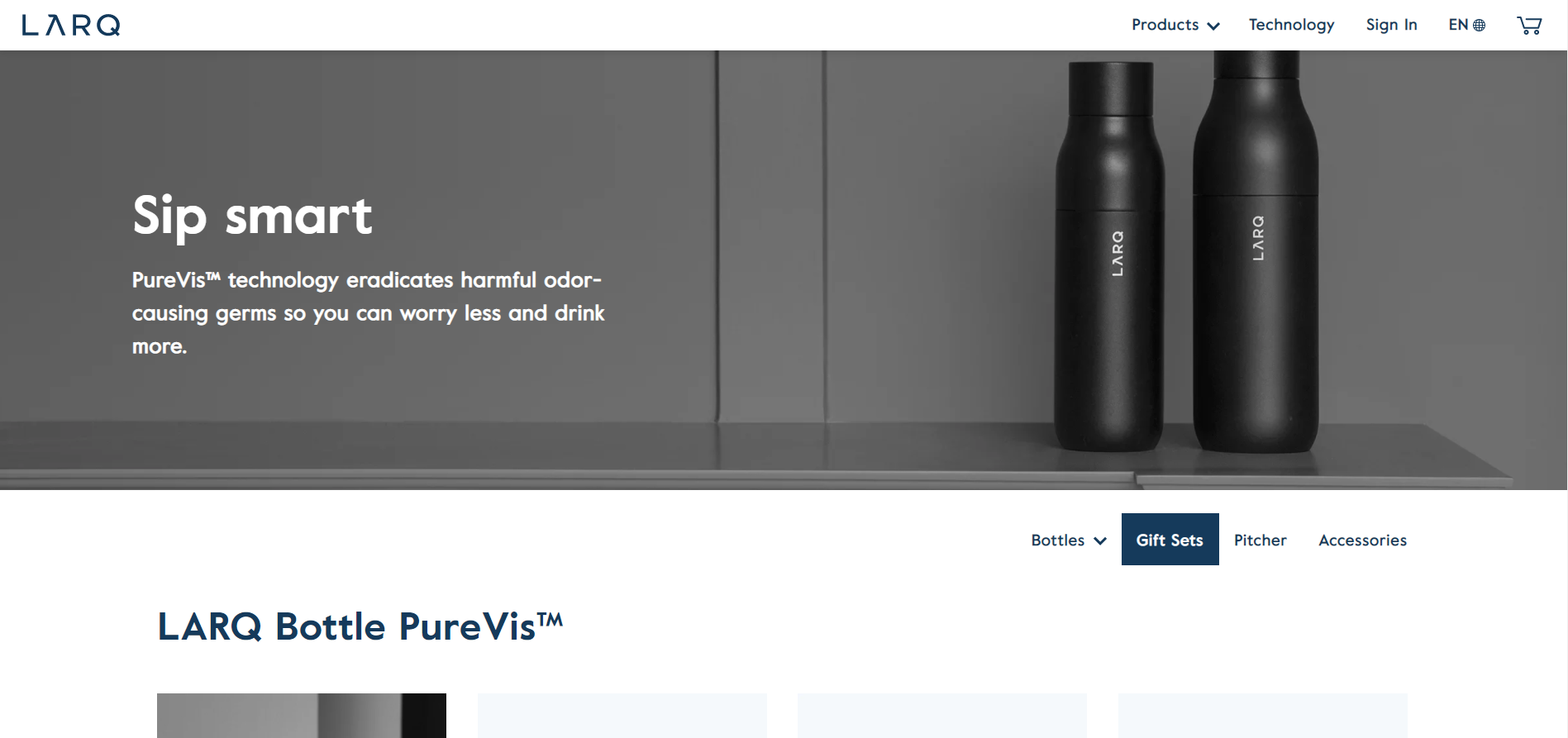
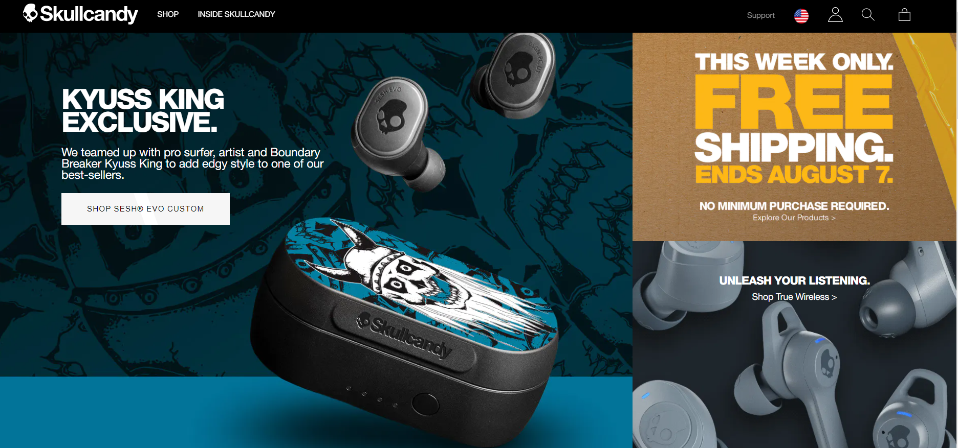
Good examples can be retreived from Skullcandy and LARQ:
- Example from LARQ
- Example from Skullcandy
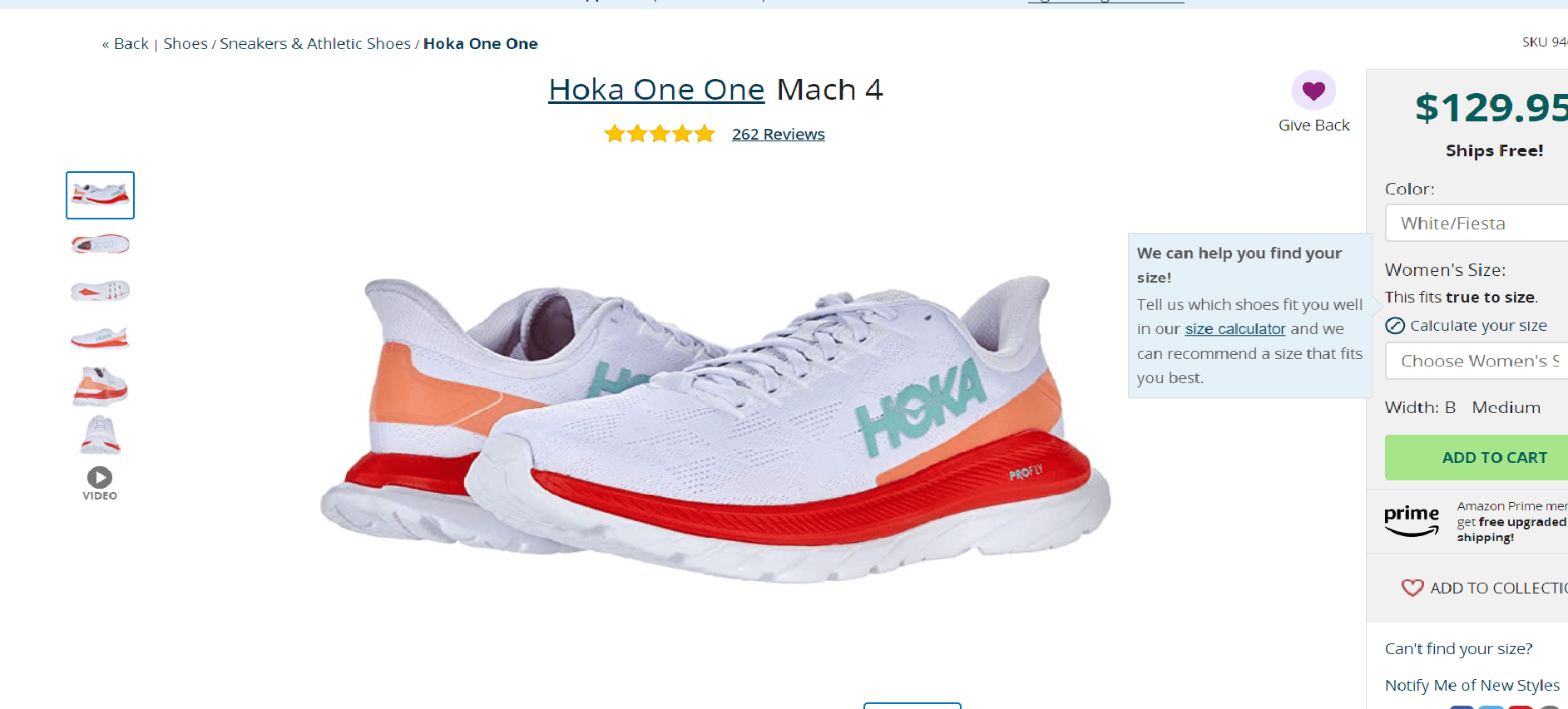
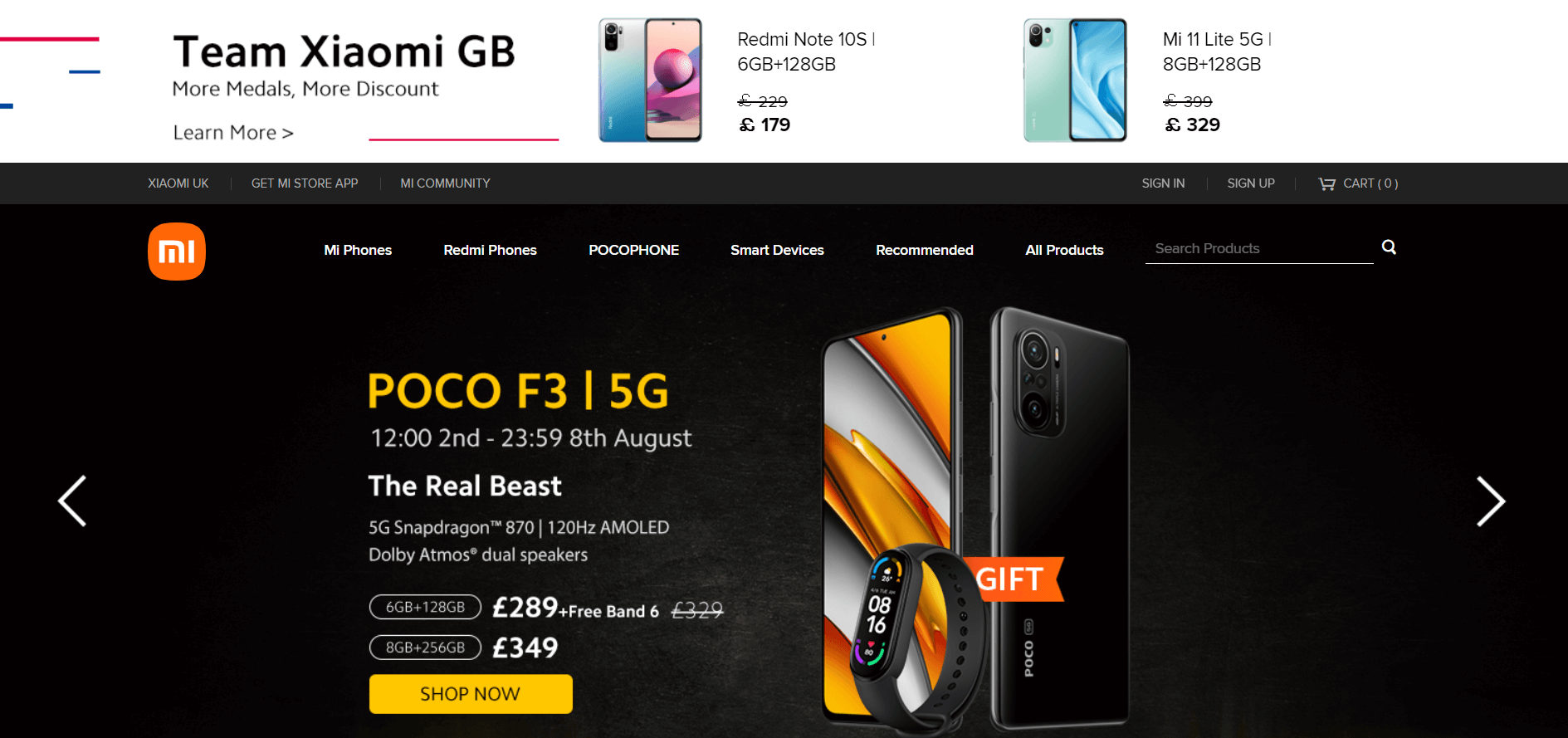
Bad examples can be XiaomiUK and Zappos:
- UI/UX design example Zappos
- UI/UX design example from Xiaomi
According to a study by Anagard, the average time spent by a user on a particular site is just six seconds. Your UX must therefore be designed to convince users they need to spend more time on the site. This is why using a video is absolutely crucial for your efforts.
The product descriptions on this particular site can definitely be taken up a few notches higher. Visitors would definitely appreciate some extra information, which can lead to better conversions.
For many online merchants the UX of a website begins and ends with the product pages on their site and a quick and convenient shopping cycle. What they fail to understand is that a serious shopper will go through plenty of other pages on the site to make a buying decision. I for example like to go through the ‘Returns Policy’, ‘Shipping Delivery’, ‘Payment Pages’, and ‘Customer Service’ pages of a site and am majorly put off if a site doesn’t have them or just comes up with such pages for the heck of it; in such cases I am forced to believe these websites aren’t really concerned about offering more information about the business and its policies to its target customers.
Q&A
Some extensions claim to optimize the JS/CSS files for you on the market, do they actually work?
Yes, they do, but only 20% of the work. After all, they are just automated extensions. It's best that you leave this task for professional developers to do.
Payment gateways will slow down the checkout process, but what if you want a fast checkout process? Is there a way to do that?
There are certainly extensions to speed up the checkout process, one of the most famous ones is the one page checkout modules. However, we still recommend against using those extensions on your eCommerce sites, for security reasons.
We see a lot of eCommerce sites that have a blog section. Do you need one for your site?
We highly recommend having one. A blog section will be a filter for your eCommerce sites, thus the traffic coming to your sites will result in higher conversion rates.
There is a famous eCommerce site called Flipkart, but when you check it, it is not that appealing ? How can Flipkart get so famous?
First of all, this eCommerce site's main focus is the Indian market, so the UX/UI design of this website might not be that suitable for international users.
Final Words
If you have any questions, don’t hesitate to contact us or join our Facebook Community for further information! Here’s a recording of the webinar Livestream! Don’t forget to visit LitExtension Youtube channel for other webinars and more interesting eCommerce-related videos!
