When you’re designing an online store on Squarespace, one question usually comes up early: what does a good storefront actually look like in practice? Real-world Squarespace online store examples show how brands like yours turn design, content, and commerce into a cohesive experience.
This article shows you great examples of Squarespace stores across different industries:
Keep reading to see how you can learn from them!
Squarespace Online Store Examples in Food & Beverage
1. Jones Bar-B-Q
Jones Bar-B-Q is a family-run barbecue brand rooted in Kansas City, with a strong emphasis on heritage and authenticity. Its Squarespace storefront doesn’t feel like a typical online shop. Jones introduces the brand first, then leads you to the products naturally.
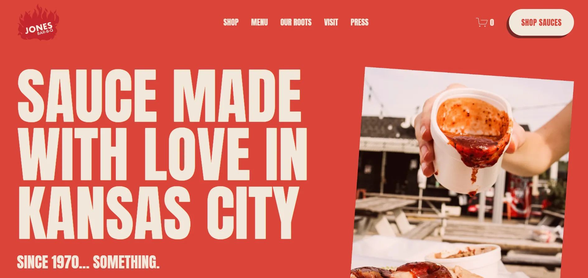
How this store uses Squarespace in practice:
- Homepage sections that mix brand messaging and product CTAs instead of separating “shop” and “story”.
- Product presentation embedded within the homepage, not pushed into a standalone catalog view.
- Content blocks are used to surface press logos and brand credibility mid-scroll.
- Email signup is placed after storytelling sections, once brand trust is established.
2. Supernatural
Among Squarespace store in the food space, Supernatural stands out for its bold, colorful visuals. The brand sells plant-based food products, and the website clearly reflects that identity from the first scroll. The homepage puts products front and center, using bright colors and short, punchy messages to make an immediate impression.
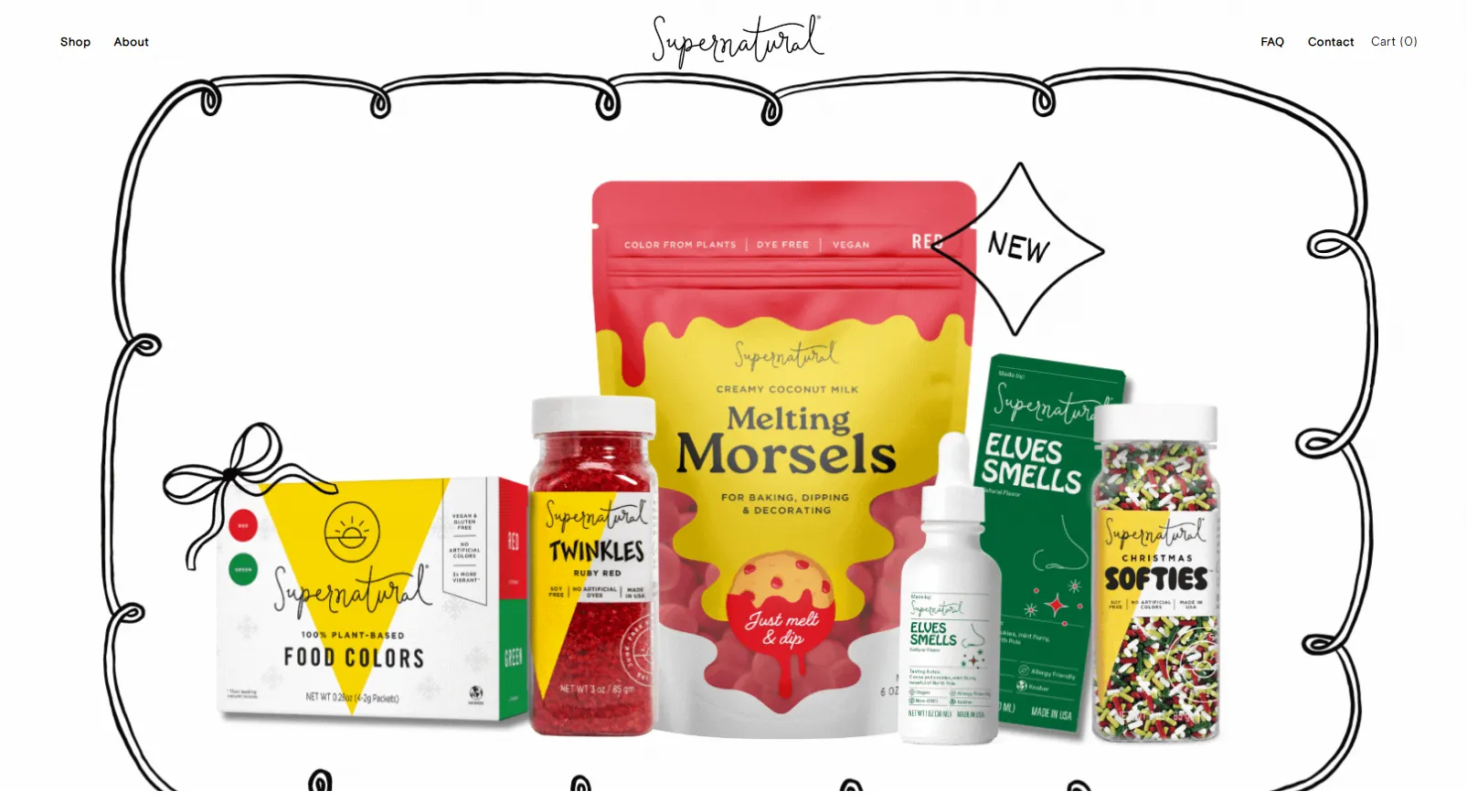
How Supernatural uses Squarespace in practice:
- Modular homepage sections that rotate between different product drops without relying on a fixed “hero + catalog” structure.
- Subtle motion and animated elements are applied to illustrations to bring products to life as users scroll.
- Flexible layouts that let different product types live together while still feeling like one unified brand.
3. Hungry Harvest
Hungry Harvest takes a slightly different approach compared to more traditional website storefronts. Instead of focusing on individual products, the site is built around a service-driven model, explaining the concept first and selling the value before pushing users to convert.
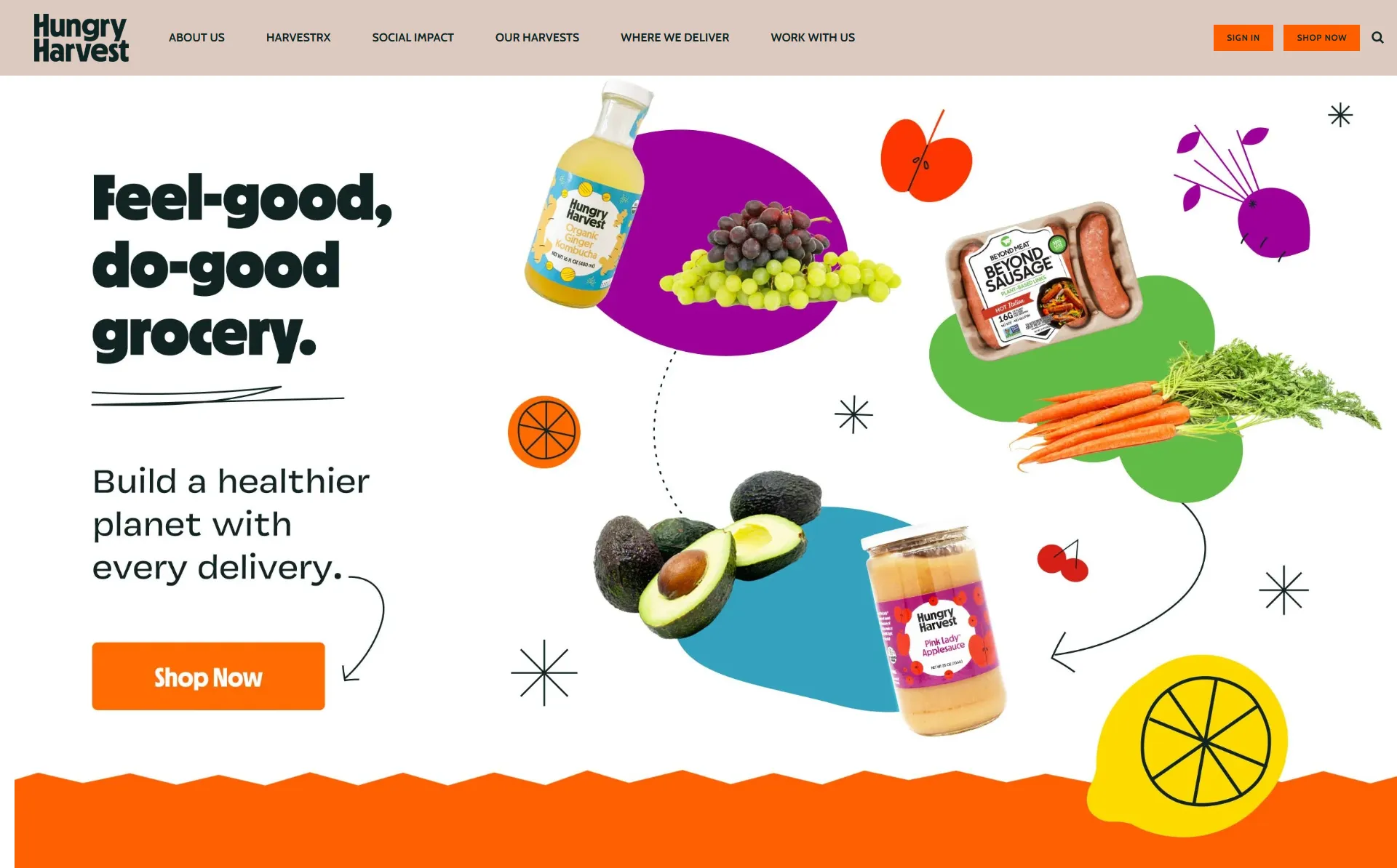
The layout follows a clear narrative flow: what the brand stands for, how the service works, and why it matters. Visually, the site uses bold color blocks, simple illustrations, and generous spacing to keep the experience approachable while still guiding users toward action.
How this store uses Squarespace in practice:
- Clear visual separation between sections using background color blocks, helping each message stand on its own without clutter.
- Icon-based layouts are used to structure complex information (like service steps) into an easy-to-scan design system.
4. Blackbird Foods
If you’re browsing online store that feel energetic but still controlled, Blackbird Foods is an interesting one to stop at. The brand sells plant-based comfort food, and its storefront reflects that balance through bold colors, strong imagery, and a layout that stays visually active as you scroll.
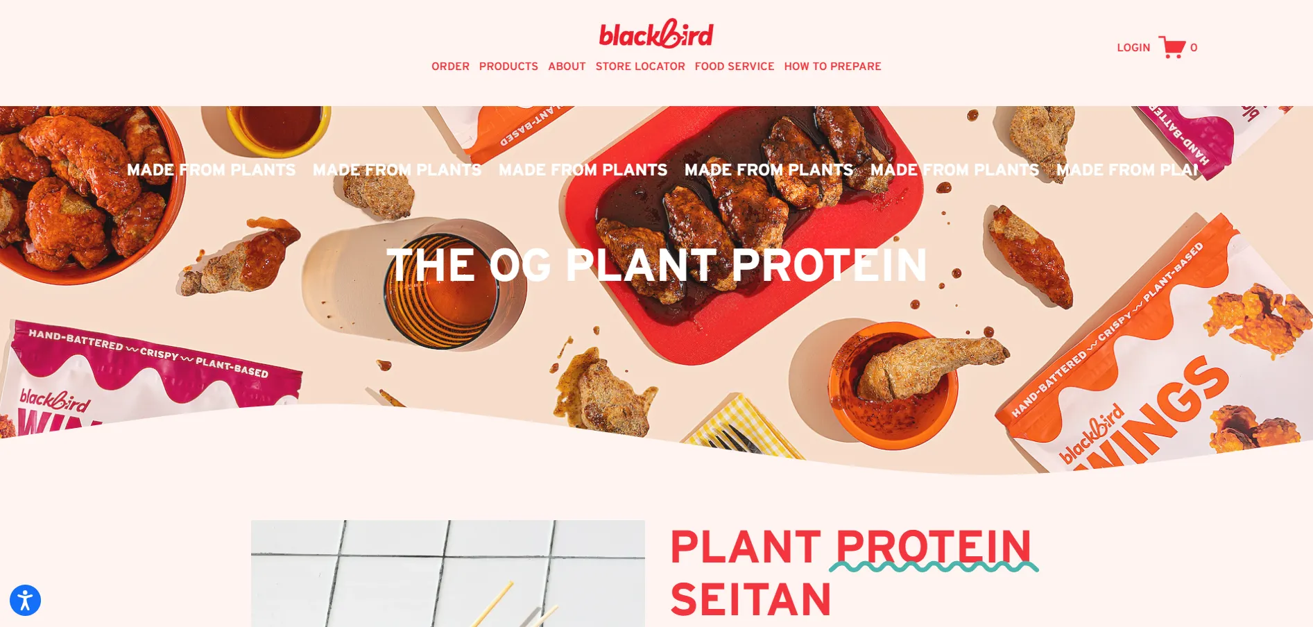
How this store uses Squarespace in practice:
- Scroll-based animation is applied to images and text to create a continuous sense of movement as users move down the page.
- Large, alternating content sections with bold background colors to clearly segment product stories.
- Product highlights are presented as full visual panels instead of compact grids, keeping focus on individual items.
- Layout spacing and alignment are used deliberately to balance busy visuals and prevent visual overload.
5. 1st R.O.W. Estate Winery
Compared to the more energetic food Squarespace brands above, 1st R.O.W. Estate Winery keeps things noticeably calm. The site uses soft colors, spacious layouts, and cinematic photography to reflect its premium positioning.
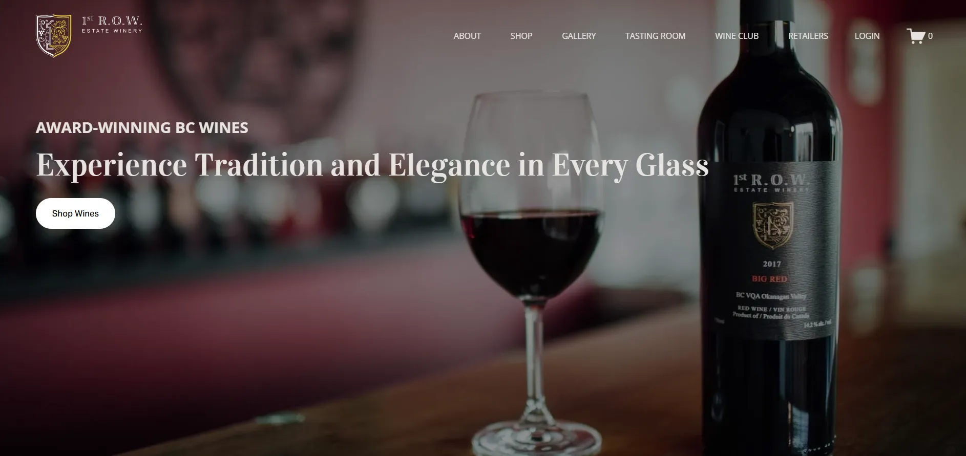
How this store uses Squarespace in practice:
- Large hero imagery and gallery-style sections to establish atmosphere before introducing products.
- Clean product listings that highlight individual bottles without crowding the page.
- Clear separation between shopping, tasting room information, and wine club content through structured page layouts.
- Integrated email signup and wine club CTAs that fit naturally into the browsing flow.
6. Muff & Co
Muff & Co presents itself as a warm, home-style baked goods brand, and that feeling comes through clearly on its Squarespace storefront. Instead of bold statements or heavy visual effects, the site leans into soft colors, cozy photography, and a relaxed browsing pace.
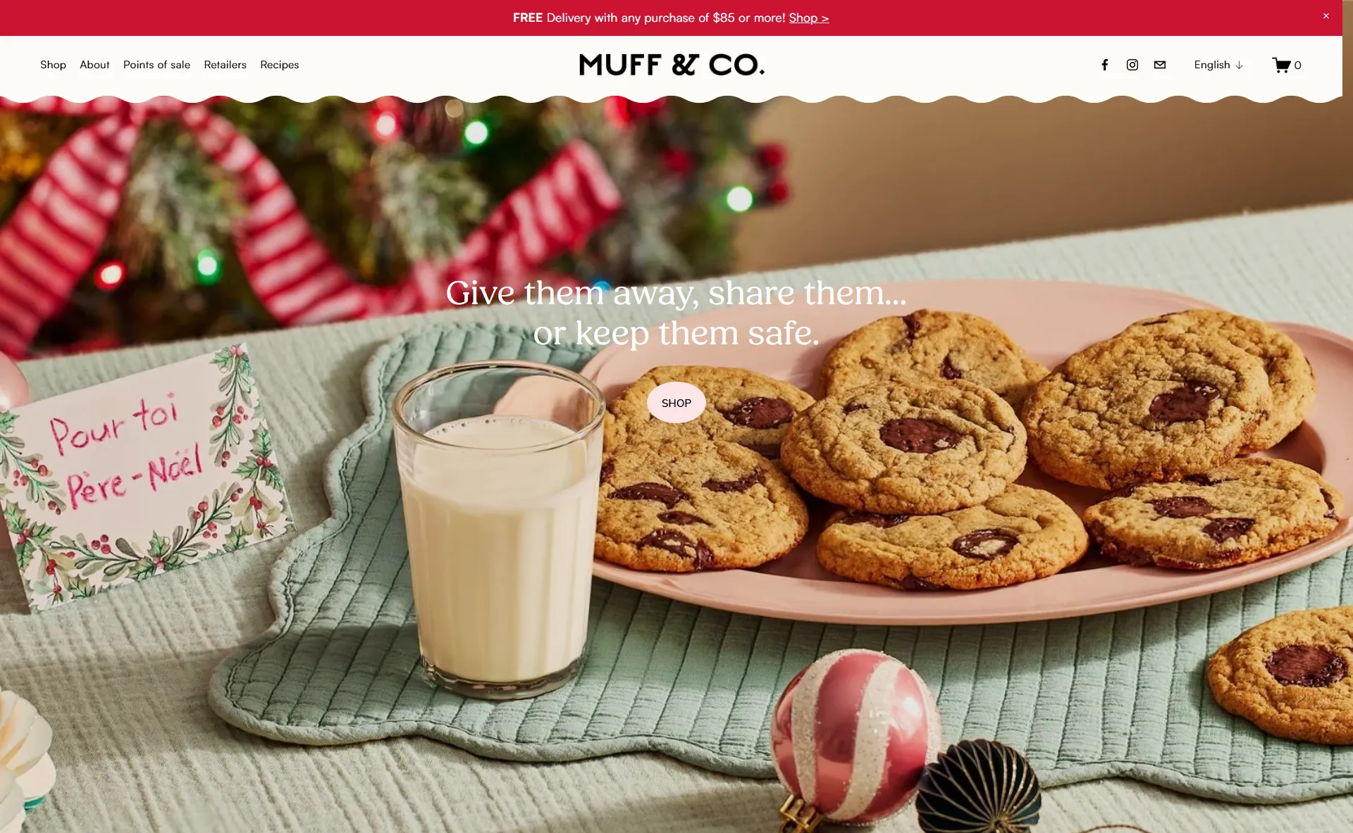
How this store uses Squarespace in practice:
- A long-scroll homepage that blends lifestyle imagery and product listings without sharp section breaks.
- Product collections are introduced gradually, mimicking the experience of browsing a small bakery display.
- Soft background colors and consistent spacing to maintain a calm, home-like tone.
- Product grids are kept simple and uniform, making items easy to compare without visual noise.
7. Carolyn’s Krisps
Next on our list is Carolyn’s Krisps – a plant-based snack brand positioned to feel modern, fun, and slightly bold rather than artisanal or rustic. The products themselves are simple, but the brand clearly leans into visual confidence to stand out in a crowded food category.
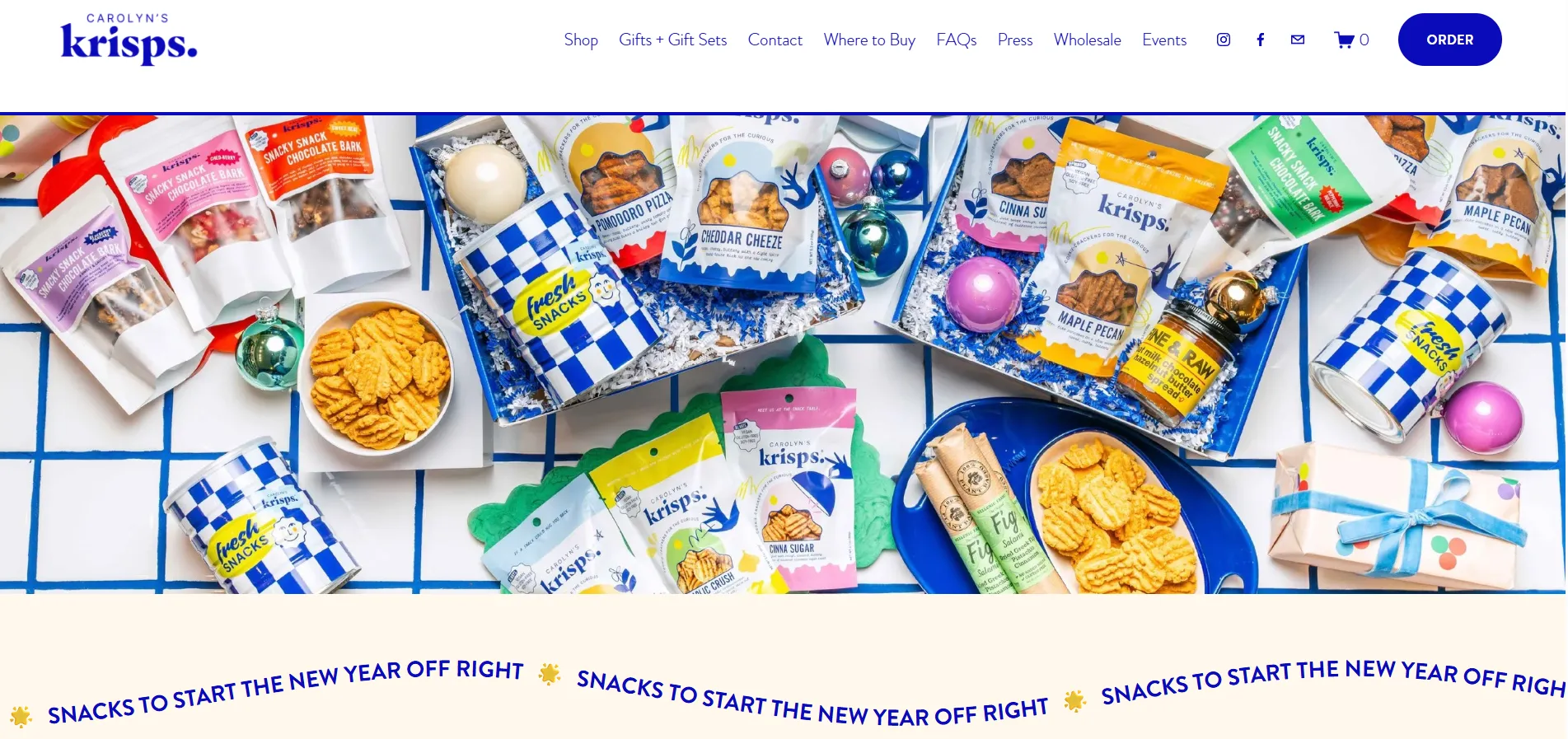
How Carolyn’s Krisps stands out in its eCommerce setup:
- Brand identity is treated as a system, with color, typography, and spacing applied consistently across product pages, content pages, and shopping flows.
- Product pages stay visually led, focusing on clarity and impact.
- Shopping is woven into the broader brand experience instead of being isolated in a separate “catalog” section.
- The buying journey feels short and intentional, reducing friction rather than adding steps or distractions.
8. Nice Day Chinese Takeout
Instead of starting with a menu, Nice Day Chinese Takeout starts with a feeling. The website immediately sets a mood that’s playful, modern, and slightly unexpected for a Chinese takeout brand. Only after the tone is clear does the site shift toward food and ordering. This makes the experience feel like you’re getting to know the brand first, then the restaurant.
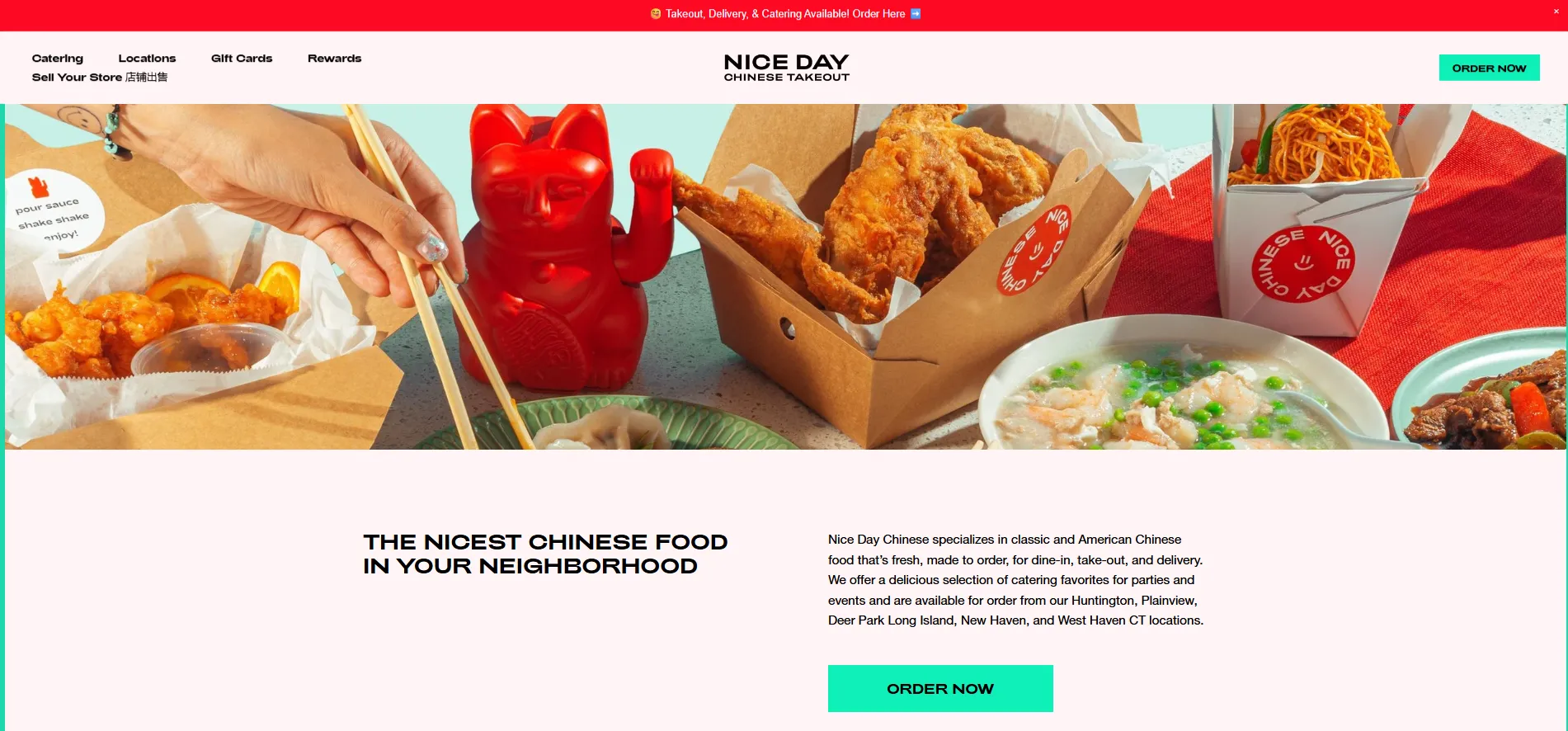
How Nice Day Chinese Takeout stands out in its eCommerce setup:
- Brand-first page structure that prioritizes visual identity before menu details.
- Menu layouts that stay concise and scannable instead of dense or text-heavy.
- Ordering flows integrated into the site’s overall design language.
- A simplified path to action that avoids breaking the browsing experience.
9. XLNT Foods
XLNT Foods is a long-established California food brand, best known for its tamales and chili products, with a history that goes back more than a century. That legacy plays a central role in how the website is structured. Rather than trying to modernize the brand aggressively, the storefront emphasizes familiarity, tradition, and scale.
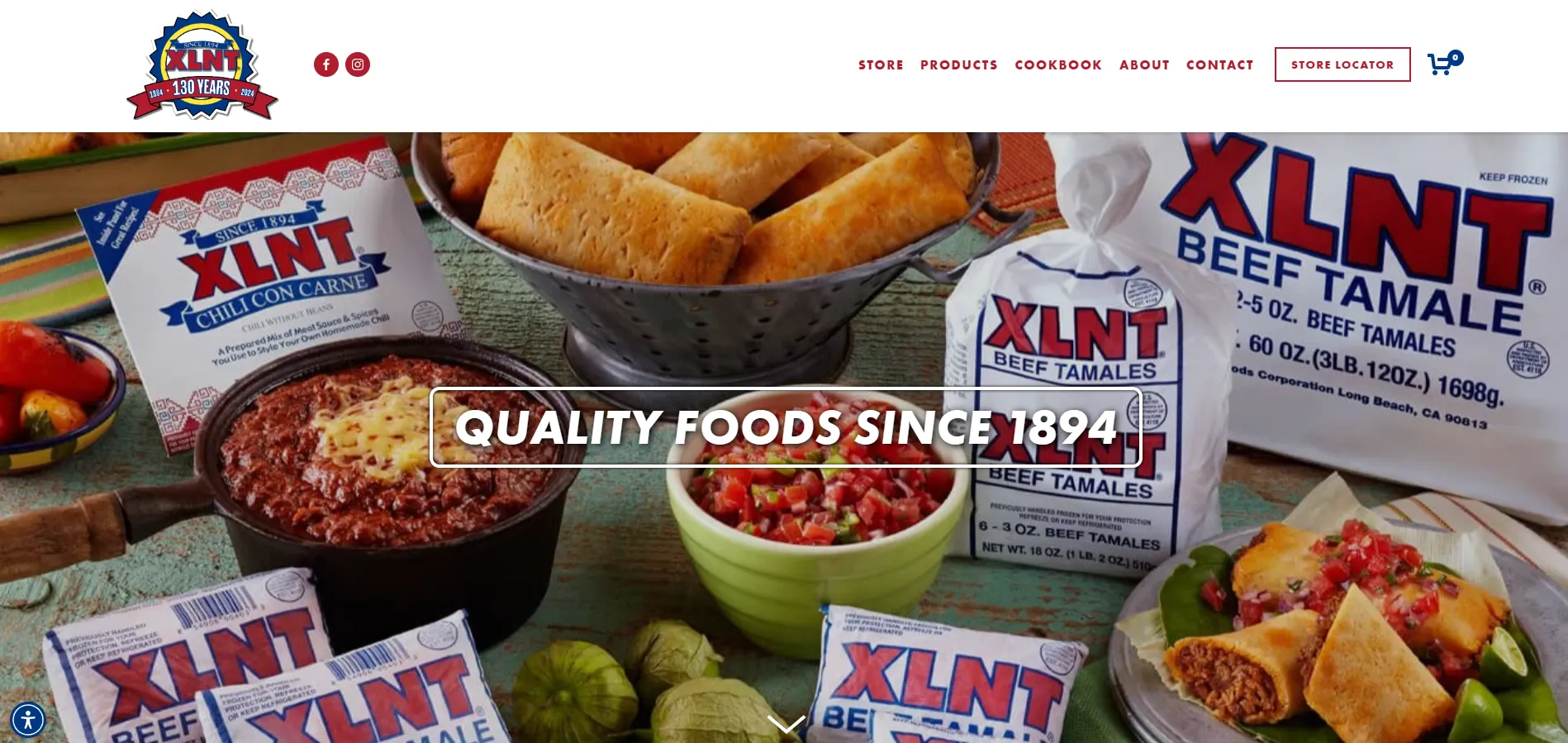
How XLNT Foods stands out in its eCommerce setup:
- The homepage is structured to showcase the full scope of the brand, including products, recipes, retail availability, and company history within a single scroll.
- The online store is positioned as one sales channel among many, rather than the primary focus of the entire website.
- Navigation is clearly segmented to separate shopping, brand storytelling, and utility-driven pages such as store locators.
- Non-product content like recipes and cookbooks is integrated to support trust and long-term brand credibility.
- Merchandise and food products are presented within the same ecosystem, reinforcing brand identity over pure conversion optimization.
10. Jabani
Wrapping up this F&B list, Jabani is one of those Squarespace store that immediately stands out for how unapologetically bold it is. The brand sells jaggery-based candies rooted in Indian flavors, but the website avoids any traditional or muted food aesthetic. Instead, it leans fully into bright colors, playful illustrations, and oversized visuals to create a storefront that feels energetic, youthful, and highly distinctive.
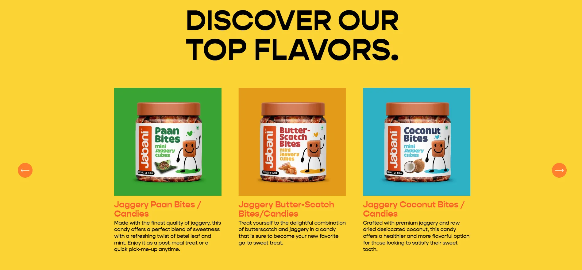
How Jabani stands out in its eCommerce setup:
- The homepage uses bold, full-width color sections to establish a strong visual identity from the first scroll.
- Product listings are kept simple and consistent, allowing packaging and color to do most of the branding work.
- Illustrated elements are used as supporting accents to reinforce brand tone without overwhelming the layout.
- Brand story and product benefits are woven into the same page flow, avoiding a hard split between “about” and “shop.
Key lessons for food & beverage brands on Squarespace:
- Brand comes before the menu: Squarespace makes it easy to introduce your story, values, or mood first, then guide people toward food and ordering.
- Layout replaces heavy merchandising: For food products, clear sections and visual pacing often matter more than complex selling features.
- Visual consistency builds appetite and trust: Reusable styles and structured layouts help food brands stay recognizable across pages without overdesigning.
Squarespace supports this approach by giving food brands flexible layouts, strong visual control, and built-in commerce without forcing a sales-first structure. That balance makes it easier to design storefronts that feel inviting, brand-led, and still ready to convert.
Fashion & Accessories Brands Built with Squarespace
11. AAKS
AAKS is best known for its handwoven bags made in Ghana, and that craftsmanship-led identity shapes how the website feels. This Squarespace clothing website storefront doesn’t rush users toward products. Instead, it creates a slower rhythm where texture, material, and detail take priority over volume or speed. The experience feels closer to browsing a lookbook than scrolling through a catalog.
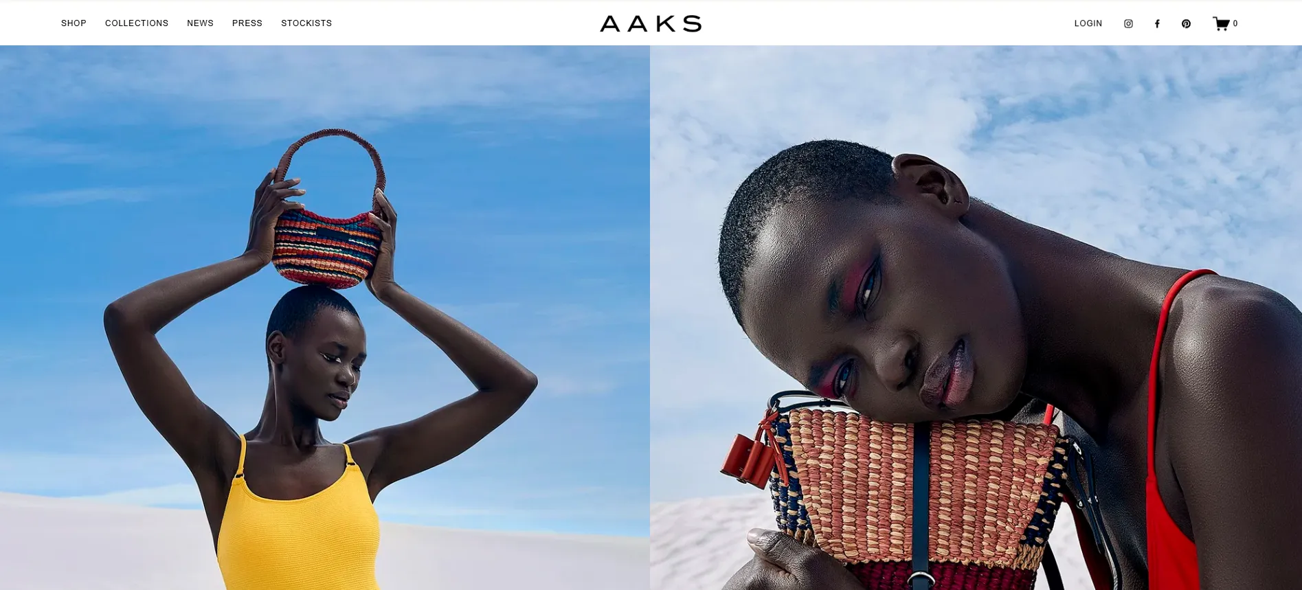
How AAKS uses its Squarespace store in practice:
- The layout gives generous space to each product, allowing craftsmanship to be the main focus.
- Product pages emphasize materials and making process instead of promotional messaging.
- Visual consistency across pages reinforces a calm, premium brand tone.
- Shopping is embedded naturally into an editorial-style browsing experience.
12. Melula
Rather than explaining what the brand is about upfront, Melula uses visuals to introduce the brand. As soon as you land on the site, you’re met with a sequence of carefully staged scenes where shoes appear almost like design objects placed inside a color-driven environment. The effect feels closer to browsing an art installation than entering a typical fashion store, which immediately sets Melula apart.
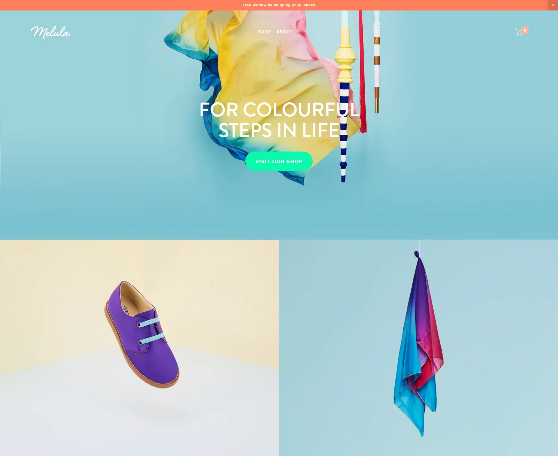
How Melula uses its Squarespace store in practice:
- The homepage relies on modular section layouts to present products as standalone visual moments rather than items in a list.
- Color-blocked backgrounds are used as a structural element, reinforcing brand identity across the page.
- Generous spacing around imagery keeps focus on form, silhouette, and material.
- Editorial-style sections are blended with subtle shopping entry points, encouraging exploration over quick conversion.
13. MILK Boutique
MILK Boutique is a Chattanooga-based fashion styling studio offering both personal and editorial styling services. Unlike other Squarespace online store, MILK isn’t built around selling physical products at scale. The business centers on taste, curation, and one-to-one styling expertise.

How MILK Boutique maintains its eCommerce setup on Squarespace:
- The site uses Squarespace as a lightweight commerce layer, prioritizing service bookings and inquiries over traditional product sales.
- Shopping functionality is kept intentionally minimal, allowing the brand to avoid maintaining large inventories or complex product catalogs.
- Clear page separation helps ensure that eCommerce elements do not interfere with service-focused content or editorial work.
- Email signup and contact forms are used as the primary conversion tools, supporting ongoing client relationships rather than one-off purchases.
14. Artips
Artips sits between beauty and design. While it sells ready-to-wear gel nail strips, the site avoids typical beauty eCommerce patterns and instead focuses on mood, repetition, and clean visuals. The result feels more like a design brand than a fast-paced beauty store.
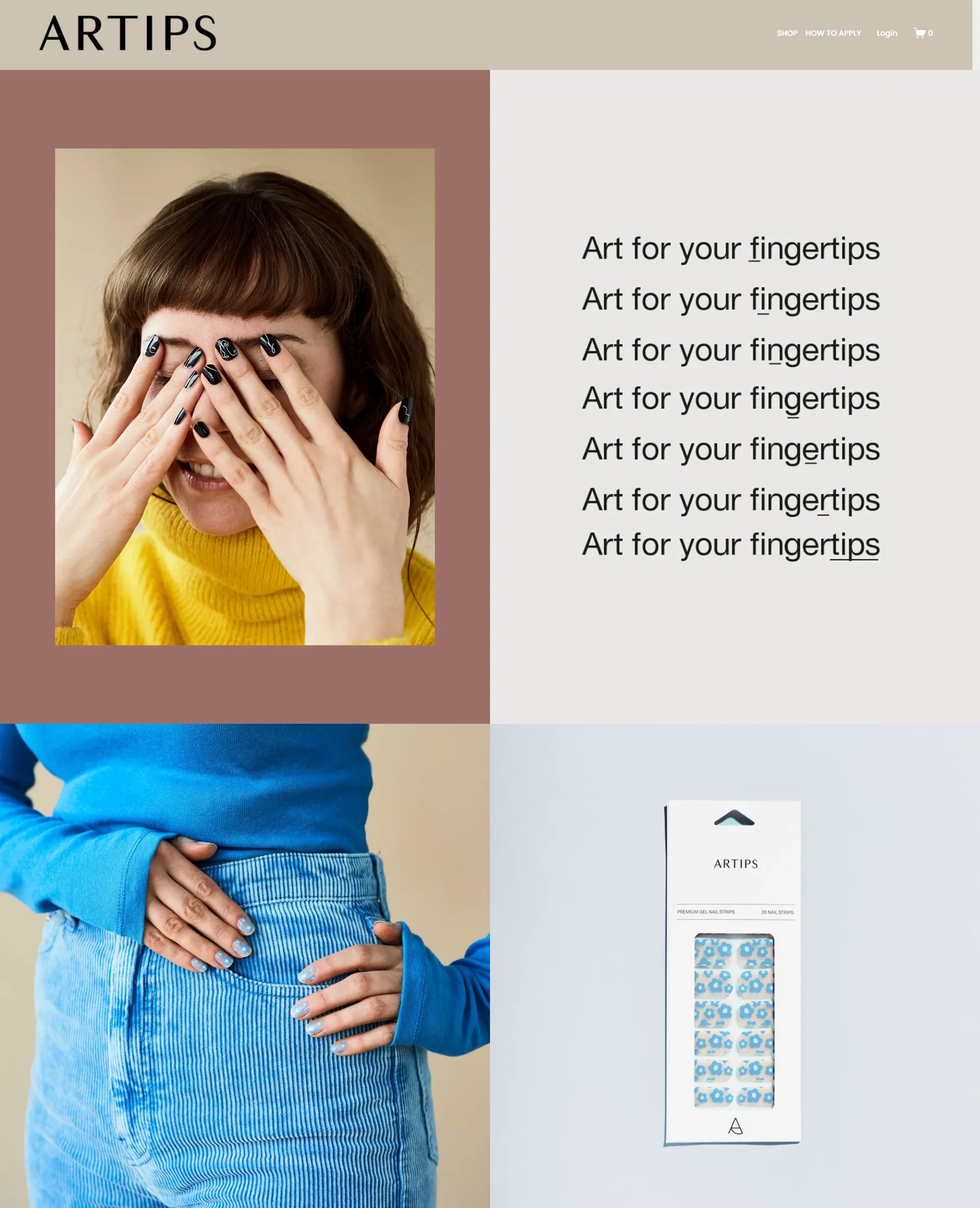
How Artips maintains its eCommerce setup:
- The homepage is structured to introduce the concept visually first, with product education placed further down the page.
- Product pages focus on clarity and reassurance, highlighting ease of use and non-damaging claims without overwhelming detail.
- Social proof and user-generated content are integrated to build trust around a try-at-home beauty product.
15. Sunday State
Next on the list of Squarespace clothing website examples is Sunday State. It’s a Canada-based lifestyle retailer offering a curated mix of fashion, beauty, home, and wellness products. The storefront feels calm and minimal, encouraging visitors to browse rather than rush to checkout.
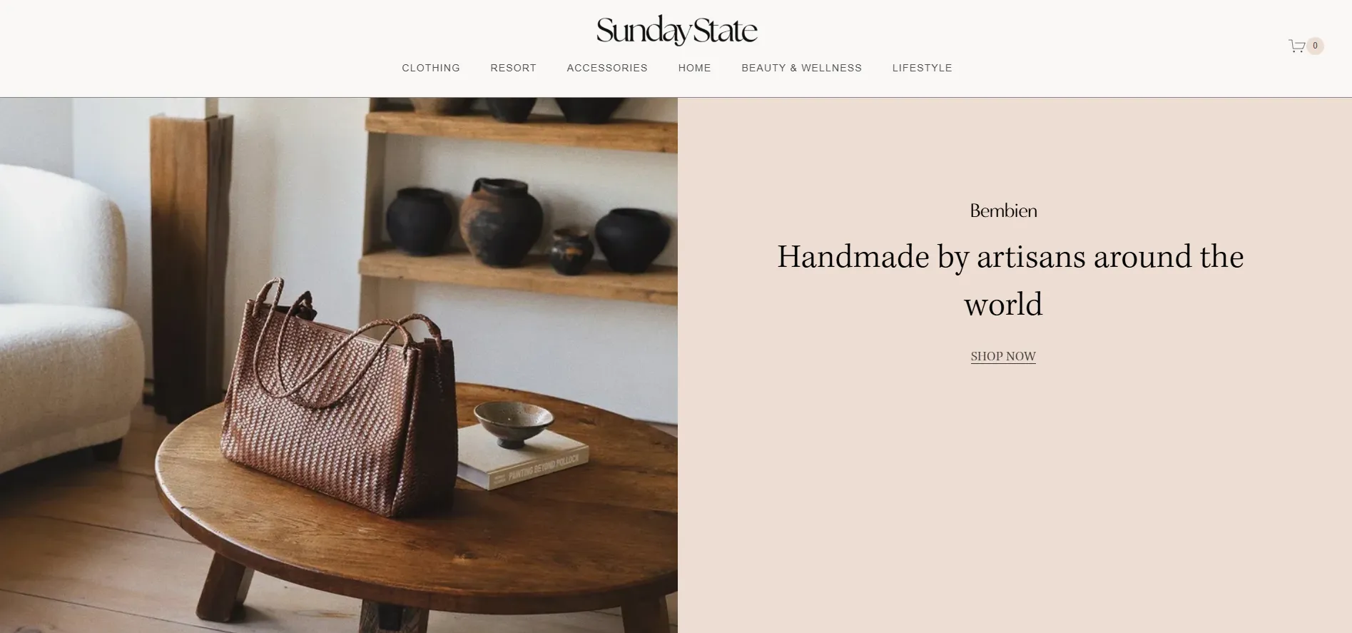
How Sunday State maintains its eCommerce setup:
- The site organizes products around lifestyle groupings, allowing different categories to coexist naturally.
- Editorial imagery and product listings are woven together, keeping commerce embedded in the brand narrative.
- A consistent visual system helps manage a broad catalog without overwhelming the page.
- Calls to action remain understated, supporting a calm and considered buying journey.
16. Dumb Industries
Rounding out this fashion list is Dumb Industries, a streetwear brand that clearly doesn’t aim to please everyone. The name sets clear expectations, and the website feels direct and honest. Compared to other Squarespace fashion stores, it focuses more on raw, street-inspired style than on a clean or polished look.
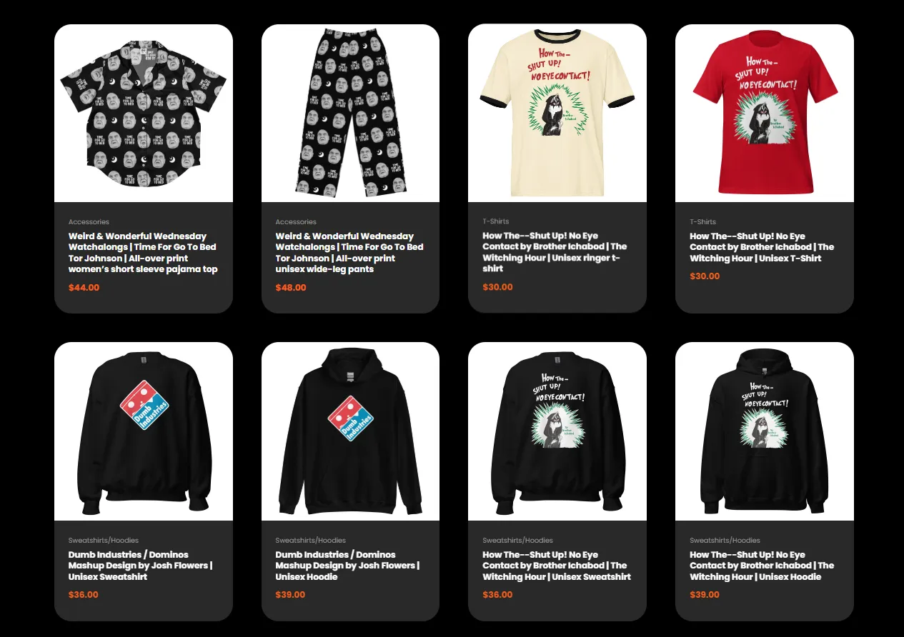
How Dumb Industries maintains its eCommerce setup:
- The store keeps product presentation intentionally straightforward, avoiding layered storytelling or editorial framing.
- Visual roughness is used consistently as a branding tool rather than treated as a limitation.
- The shopping flow stays short and direct, reducing steps between landing and purchase.
- Design choices favor attitude and identity over usability optimization or visual harmony.
Key lessons for fashion & accessories brands on Squarespace:
- Lead with the visual: Fashion storefronts work best when imagery and layout guide attention before any product details appear.
- Design around collections: Grouping items into looks or themes creates a stronger browsing flow than treating each product as a standalone listing.
- Keep product pages visually light: Clean layouts, consistent spacing, and strong imagery reduce the need for dense product information.
Squarespace gives you section-based page layouts, built-in galleries, and visual product blocks. These features make it easy to mix lookbook imagery, brand content, and products on the same page. For fashion stores, this supports selling collections and styles without relying on complex filters or third-party apps.
Creative & Personal Brand Squarespace Website Examples
17. Samantha Wills
Samantha Wills represents a personal brand that has evolved beyond traditional retail. Known initially as a jewelry designer, her Squarespace website now functions as a platform for storytelling, personal philosophy, and selective commerce, reflecting a shift from product-led selling to audience-led engagement.
This structure is common among Squarespace store built around founders rather than catalogs, where commerce supports the brand narrative instead of defining it.
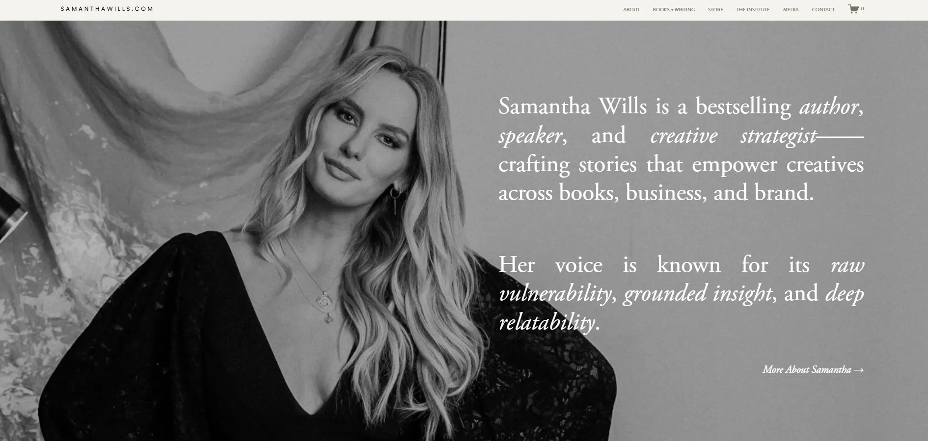
How Samantha Wills maintains her eCommerce setup:
- The site uses curated product offerings instead of a full-scale online store.
- Brand storytelling and founder perspective are positioned ahead of direct selling.
- Product pages are simplified to support considered, context-driven purchases.
- Email capture is emphasized as a long-term audience relationship tool.
18. Peter McKinnon
Shifting from founder storytelling to creator-led commerce, Peter McKinnon represents a very different model. As a photographer, filmmaker, and YouTuber, his business is built on content first, with products supporting an already engaged audience.
Visually, the site uses full-width video, strong contrast, and immersive layouts. Products are placed directly within the content flow and feel like a natural part of the experience.
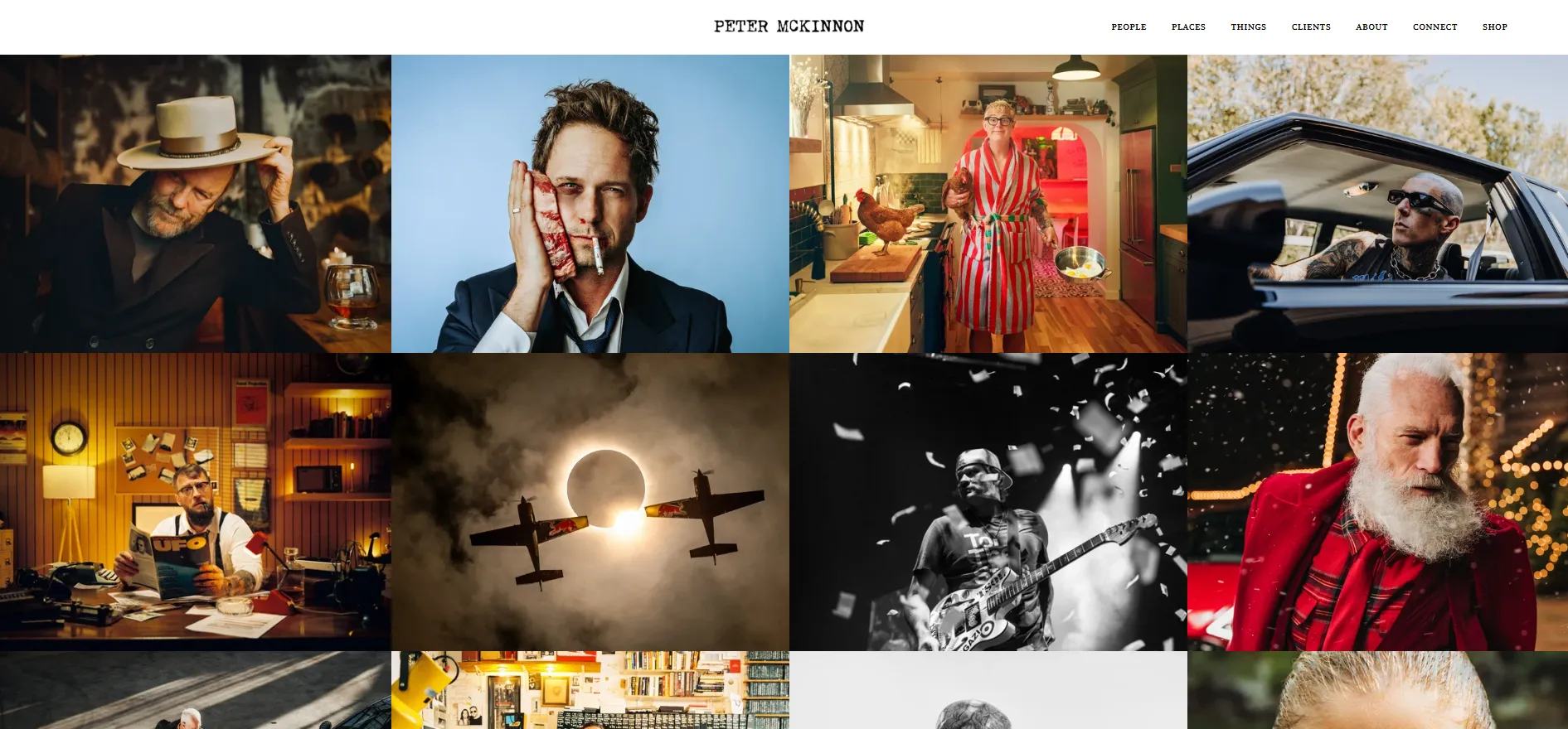
How this brand maintains its eCommerce setup:
- The site supports both digital and physical products tied directly to creator content.
- Store elements are integrated into a content-first navigation structure.
- Product offerings align closely with audience needs and creator credibility.
- Checkout flows remain simple to keep focus on content consumption.
19. Johanna Springer
Moving toward an artist-led business model, Johanna Springer is a German visual artist whose work spans illustration, print, and applied visual pieces. Her online shop focuses on selling selected products that feature her artwork, rather than positioning itself as a large-scale retail operation.
From a storefront perspective, the website feels calm and gallery-like. Large visuals take center stage, text is kept intentionally light, and the pacing encourages viewers to spend time with each piece before considering a purchase.
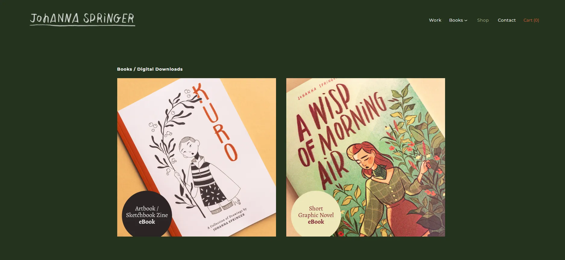
How this brand maintains its eCommerce setup:
- Products are released in limited drops, not kept in stock all the time.
- Product pages emphasize form and uniqueness over technical details.
- Selling is paced to match production capacity.
- Commerce is positioned as part of the creative practice, not its driver.
20. Marie Boiseau
Continuing with a portfolio-first approach, Marie Boiseau is an illustrator who uses her website primarily as a space to showcase visual work. The site behaves much like an online gallery, where imagery leads the experience, text is kept intentionally minimal, and generous spacing allows each piece to stand on its own.
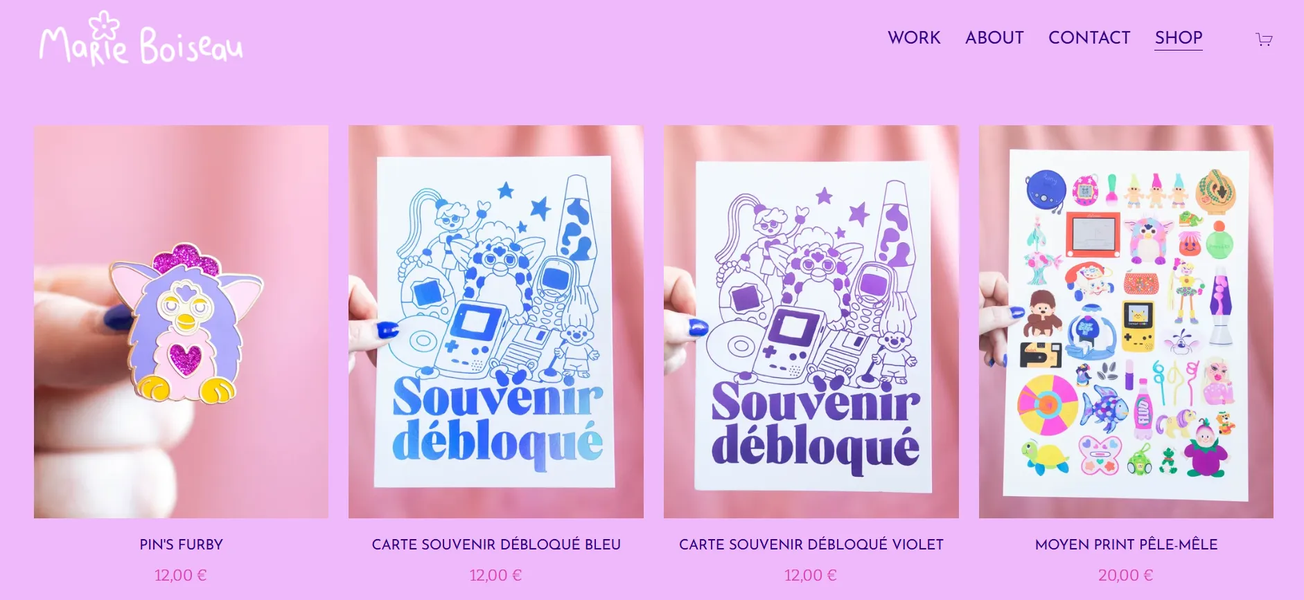
How this brand maintains its eCommerce setup:
- The shop is integrated alongside portfolio pages without altering site rhythm.
- Products are treated as extensions of artwork rather than focal points.
- Navigation clearly separates browsing from buying.
- The eCommerce layer remains intentionally lightweight.
21. Betty Lu Paperie
At the more product-driven end of this category, Betty Lu Paperie focuses on wedding invitations and paper goods for meaningful life events. Compared to many Squarespace store built for fast, repeat purchases, this storefront is designed to support slower, considered decisions where emotion and detail matter.
The layout balances clarity with softness. Product grids are easy to navigate, but careful use of color, typography, and spacing helps the site feel personal and intimate.
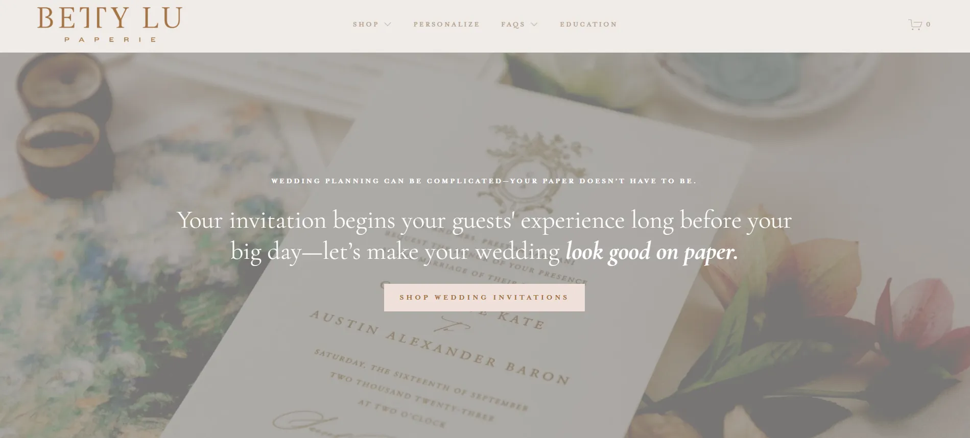
How this brand maintains its eCommerce setup:
- The store uses a structured catalog that remains easy for first-time buyers.
- Consistent photography helps maintain cohesion across collections.
- Seasonal items are surfaced without major layout changes.
22. Ilovecreatives Studio
Rounding out this category with a non-product business, Ilovecreatives Studio is a creative education platform focused on programs, resources, and community rather than physical goods. The storefront feels more like a learning hub than a shop. Pages are organized around actions such as learning, joining, and exploring, with paid offerings introduced as part of those journeys.
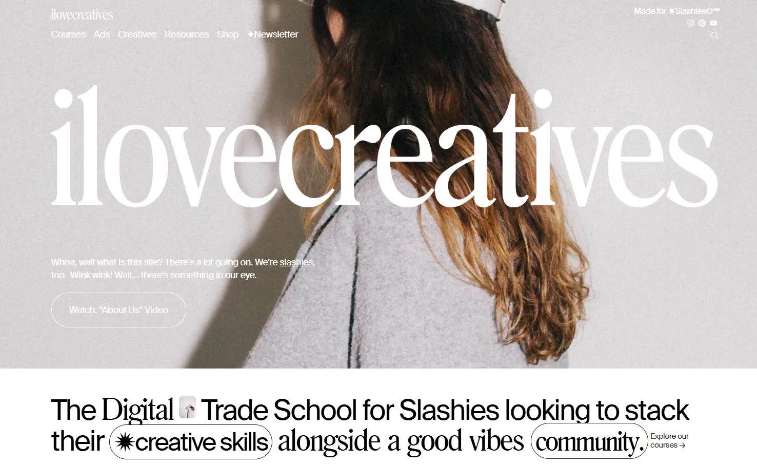
How this brand maintains its eCommerce setup:
- The site supports digital programs and educational products.
- Commerce is embedded within content- and community-focused pages.
- User paths are designed around progression, not checkout funnels.
- Clarity and trust are prioritized over visual experimentation.
Key lessons for creative & personal branding brands on Squarespace:
- Show your creative identity first: Your homepage should show who you are and what you stand for before asking people to buy.
- Think like a portfolio: Keep navigation simple and avoid too many CTAs. Large images and focused sections make your work feel curated and professional.
- Guide, don’t push: Use About pages, projects, or stories to lead visitors naturally toward contact or booking. This feels more appropriate for creative and personal brands than hard selling.
Squarespace is well suited for creative and personal brands because its templates prioritize visuals, spacing, and structure over complex selling tools. You can build a site that feels like a portfolio or personal space first, then add contact forms, bookings, or light commerce only where it makes sense.
Squarespace Online Store Examples for Gifts, Home & Niche Products
23. The Fancy Friend Shop
Opening this section is The Fancy Friend Shop, an illustration-led gift store built around playful artwork, humor, and personality-driven products. The site goes straight into the product gallery, letting the artwork speak for itself without extra explanation.
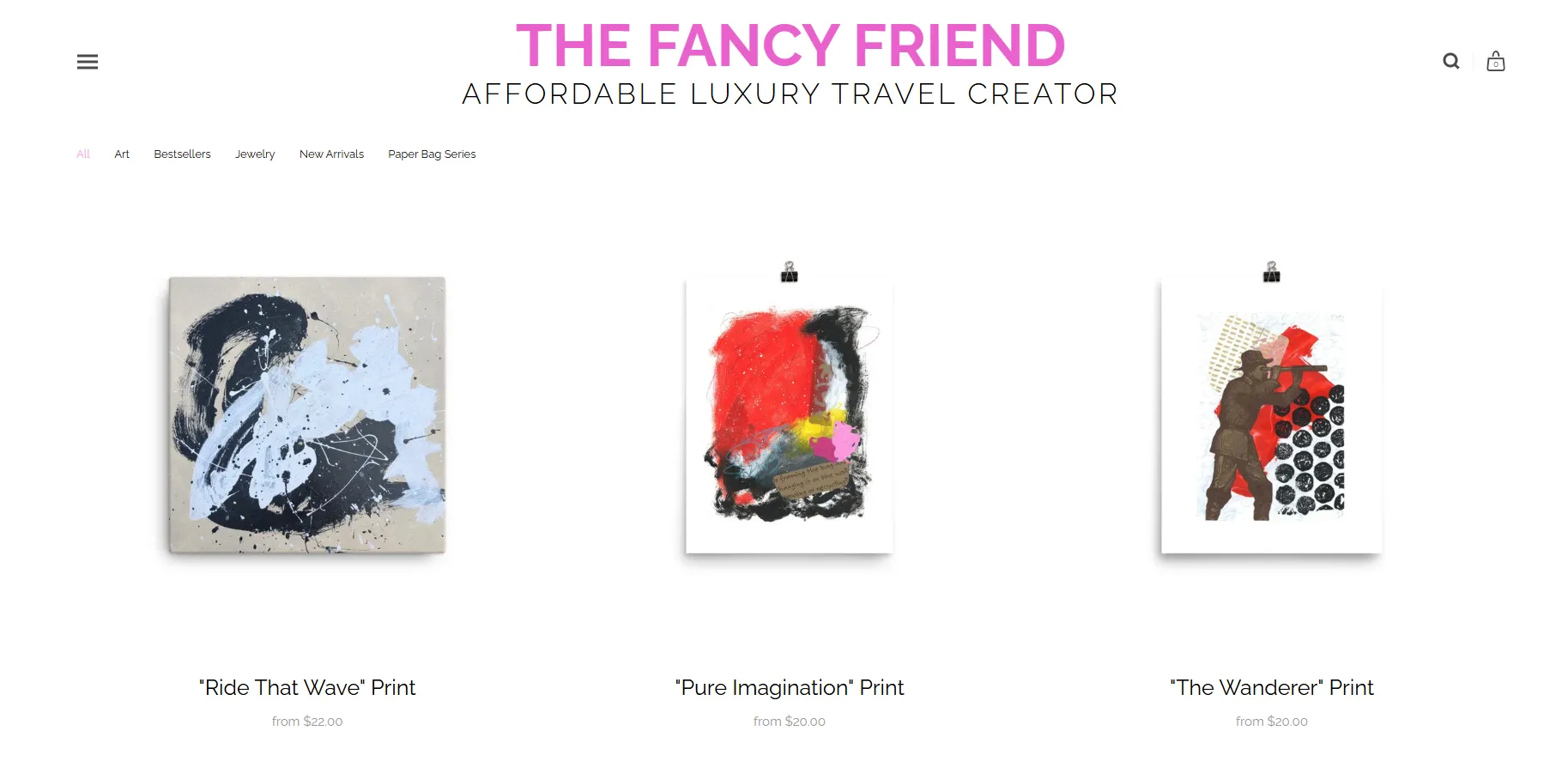
How this brand maintains its eCommerce setup:
- The storefront prioritizes artwork presentation over merchandising tactics.
- Product pages remain visually consistent to keep focus on the illustration style.
- Navigation stays minimal to avoid distracting from browsing and discovery.
- The store supports impulse-friendly purchases without aggressive promotion.
24. paper&stuff
Shifting toward a calmer, more tactile category, paper&stuff is a stationery brand focused on paper goods, small objects, and thoughtfully designed everyday items. The brand’s product range is narrow but cohesive, built around texture, simplicity, and function.
The website reflects that restraint. Pages feel airy and balanced, with neutral tones, consistent spacing, and clear product groupings. Browsing encourages slow scrolling, which fits naturally with the nature of the products themselves.

How this brand maintains its eCommerce setup:
- The store uses clean category structures to support intentional browsing.
- Product pages emphasize material and form over descriptive copy.
- Visual consistency helps manage a small but curated catalog.
25. Not Work Related
Moving in a more playful direction, Not Work Related is a novelty gift brand built around humor, irony, and irreverent messaging. The products themselves are intentionally simple, allowing the brand voice and tone to carry most of the appeal rather than complex design or customization.
The storefront mirrors that attitude closely. Layouts are direct and copy-forward, with a clear visual hierarchy that delivers jokes quickly and gets out of the way.
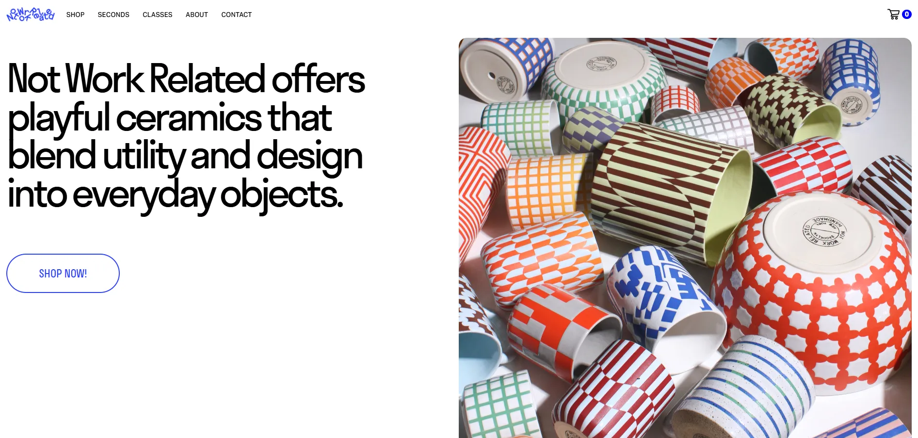
How this brand maintains its eCommerce setup:
- The store places copy and product messaging at the center of the experience.
- Product listings are optimized for fast scanning and quick decisions.
- The layout minimizes friction between landing and checkout.
- Branding consistency carries across all pages without complex design layers.
26. Altrock
Taking a step into a more niche and functional space, Altrock is a brand specializing in architectural and surface materials. Unlike most gift-oriented stores in this category, the products here are technical and specification-driven.
The website reflects that shift clearly. The storefront is structured, information-focused, and visually restrained.
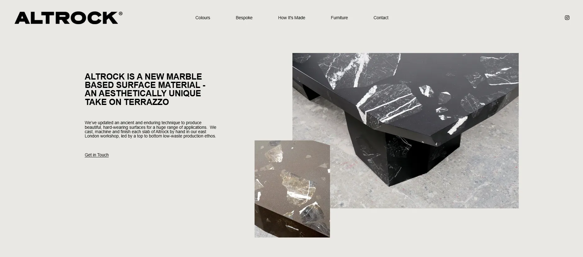
How this brand maintains its eCommerce setup:
- The site supports detailed product information without visual clutter.
- Layout sections prioritize clarity and readability over decoration.
- Product pages are designed to support evaluation rather than emotion.
- Navigation separates inspirational content from technical browsing paths.
27. Deeper Japan
Continuing with a culturally driven niche, Deeper Japan curates products that reflect Japanese craftsmanship, aesthetics, and everyday rituals. The brand operates more as a cultural bridge than a typical retail store.
The storefront feels editorial and curated. Products are grouped thoughtfully, with storytelling elements woven into the browsing experience.
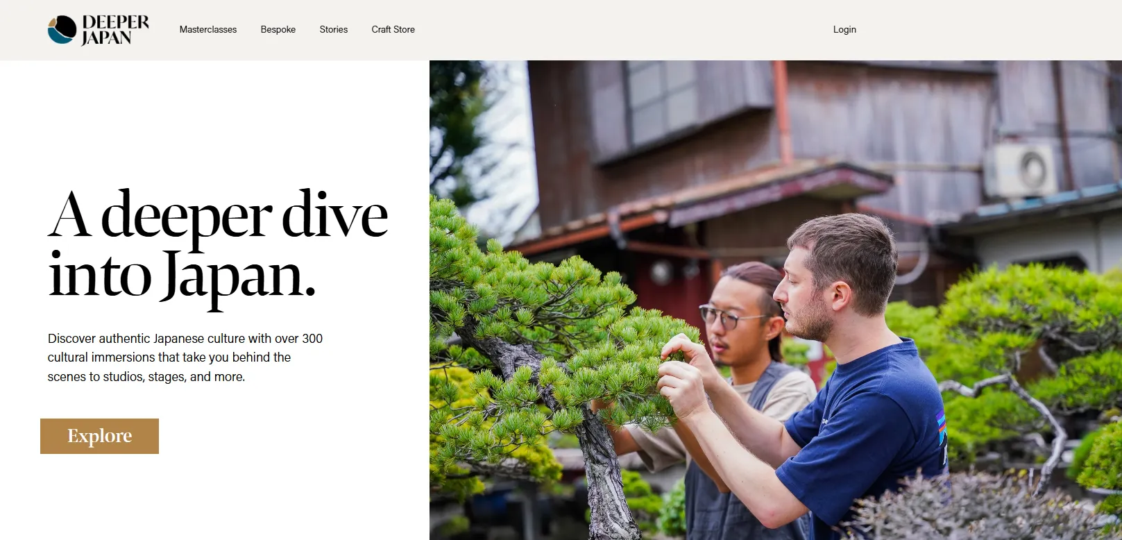
How this brand maintains its eCommerce setup:
- The store blends storytelling and commerce within the same page structures.
- Product collections are curated around themes rather than categories alone.
- Visual pacing supports discovery instead of urgency.
28. Soilboy
Moving into the home and lifestyle space, Soilboy is an urban plant shop selling greenery and plant-related goods. The brand combines education, care guidance, and retail into a single experience.
The website feels welcoming and grounded. Visuals are natural, layouts are friendly, and product information is presented clearly to reduce hesitation for less experienced buyers.

How this brand maintains its eCommerce setup:
- The storefront integrates educational content alongside product listings.
- Product pages support trust-building through clarity and guidance.
- Navigation helps users move between learning and shopping easily.
- The site supports both browsing and purposeful purchasing journeys.
29. Little Clay Land
Closing this section is Little Clay Land, a ceramic studio offering handmade pieces in limited quantities. The homepage opens with its clay figures front and center. Soft colors, friendly shapes, and minimal text help show the handmade style right away.
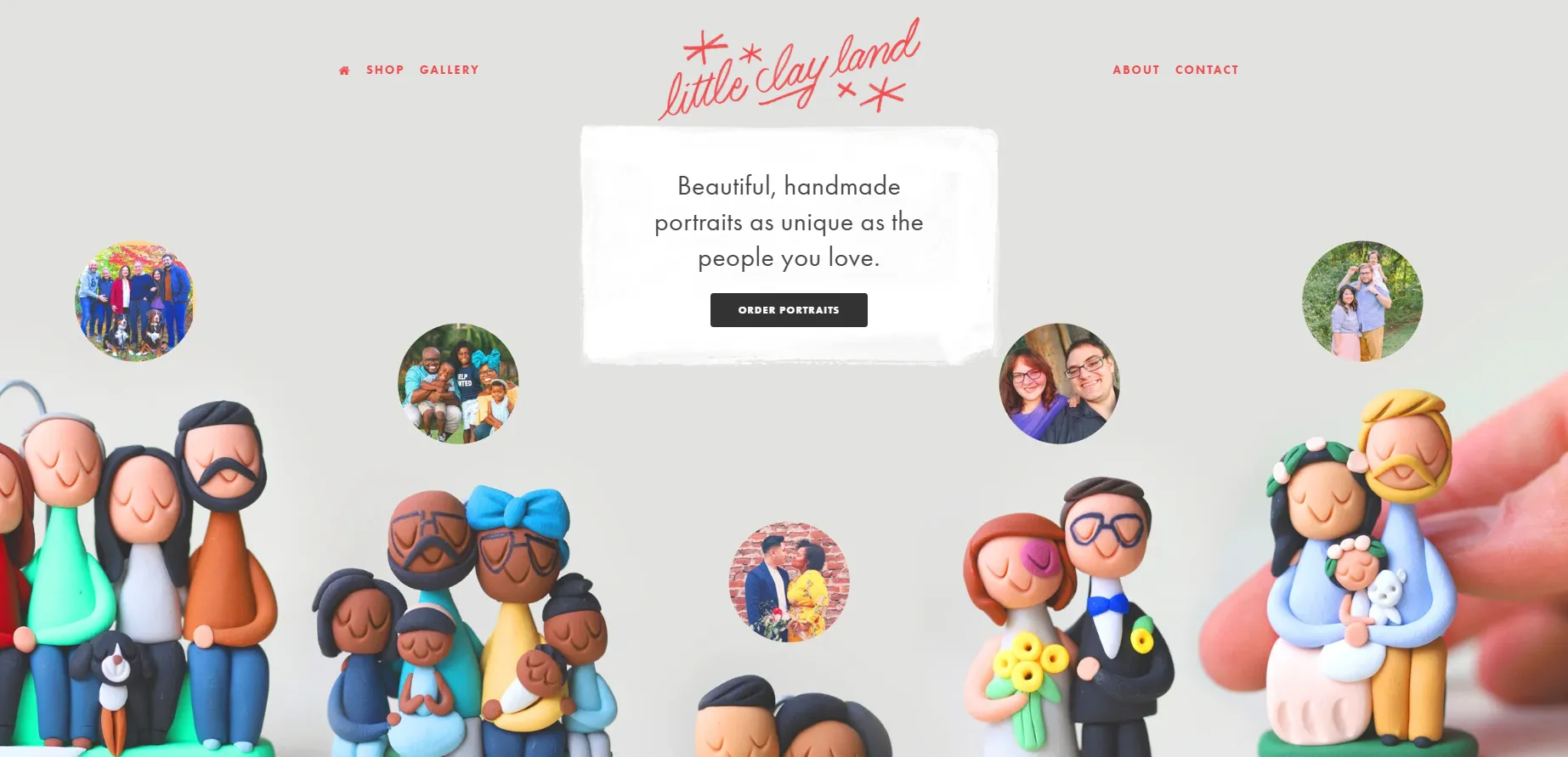
How this brand maintains its eCommerce setup:
- The store supports limited releases without complex inventory systems.
- Product pages focus on form, texture, and uniqueness.
- The layout encourages slower browsing and thoughtful decisions.
- Commerce remains secondary to showcasing the craft itself.
Key lessons for home & niche brands on Squarespace:
- Show the product context, not just the item: Use homepage imagery to show how the product looks on a desk, shelf, or as a gift. This helps shoppers quickly imagine who it’s for and why it matters.
- Design for small collections: Limit how many products appear per row and avoid long product grids. This makes niche or handmade items feel curated, not mass-produced.
- Support slow browsing: Use soft colors, whitespace, and short descriptions to keep the experience calm. This suits gift and home products, where shoppers often browse for inspiration.
Squarespace works well for this category because it supports visual-first layouts and small, curated product collections. Merchants can highlight product details, textures, and context without needing complex filters or dense catalog structures.
Tips to Design Your Squarespace eCommerce Websites
After looking across dozens of real Squarespace store, one thing becomes clear: good Squarespace stores don’t try to do everything. They focus on clarity, pacing, and brand intent first, then let the platform do the heavy lifting.
- Start smart with templates: You should focus on layout and structure first, then customize colors, fonts, and sections to match your brand. If you need inspiration, our guide to the best Squarespace eCommerce templates can help you get started.
- Design mobile-first: Most shoppers visit online stores on their phones, so the mobile experience needs to feel clear and effortless. Text should be easy to read, images should stay sharp, and navigation should work smoothly on smaller screens.
- Keep navigation intuitive: Clear product categories help visitors find what they need without confusion. Filters such as size, color, or price also make browsing easier, especially for larger catalogs.
- Use high-quality visuals: Good images help customers understand your products and build trust. Photos should match your brand style and load quickly across all devices.
- Simplify for conversions: A focused homepage helps guide visitors toward popular or new products. Product pages should present options clearly, and the checkout process should feel short and reassuring.
- Build trust through content: An About page, clear contact information, and a simple “How it works” section help customers feel confident about buying from you. These elements show that there are real people behind the store.
- Check performance often: Design changes can affect spacing and layout in unexpected ways. Regular checks on mobile and desktop help catch issues before they impact users.
- Use data to improve: Analytics show how visitors interact with your site and where they drop off. These insights help you make small design updates that improve the overall shopping experience.
If you’re planning ahead, now is a good time to think beyond design and look at timing and strategy too. Download our free eBook to plan ahead!
Squarespace Online Store Examples: FAQs
What companies use Squarespace?
Squarespace is used by a wide range of companies, from independent creators to established consumer brands. Well-known examples include Sunday State, AAKS, Carolyn’s Krisps, Betty Lu Paperie, and Peter McKinnon. These brands span fashion, food, stationery, and creator-led businesses.
Is Squarespace good for eCommerce?
Yes, Squarespace is a strong option for eCommerce when your business values design clarity, brand experience, and simplicity. It works especially well for small to mid-sized stores, curated catalogs, digital products, and brands that sell through storytelling.
Is Squarespace cheaper than Shopify?
In many cases, yes. Squarespace plans often include website hosting, design templates, and eCommerce features in a single subscription, which can make total costs lower for simpler stores. However, Shopify may offer better value if you need advanced inventory management, multi-channel selling, or extensive automation.
What is the downside of Squarespace?
The main downside of Squarespace is limited flexibility at scale. While it’s excellent for clean, well-designed storefronts, it’s not ideal for very large catalogs, complex product rules, or highly customized checkout flows. App integrations are also more limited compared to platforms like Shopify or WooCommerce.
Conclusion
Looking across these Squarespace online store examples, one thing becomes clear: the platform works best when you design with intent, not excess. If you’re building or refining your own store, we hope these examples can help as reference points. Pay attention to why each design choice was made and how Squarespace supports it.
For more practical eCommerce insights, explore our other blog posts or join our Facebook community group to share ideas and learn from other merchants.