Every store owner knows the common frustration: traffic keeps coming in, yet sales don’t grow at the same pace. You have to watch people browse, even add items to their cart, and then disappear before ordering! What should you do to mitigate such issues and boost eCommerce conversion rate optimization, then?
No worries; here's where we can help you. In the following sections, our team will explore how to increase the conversion rate eCommerce through 20 helpful tips, including:
- Make site navigation intuitive and simple
- Enable category-specific search
- Refine autocomplete to handle errors smoothly
- Deliver clear and informative product descriptions
- Showcase high-quality product images
- Offer personalized recommendations based on browsing history
- Display customer reviews prominently
- Highlight security and trust indicators
- Place shipping and return details where users expect them
- Use live chat wisely to assist, not distract
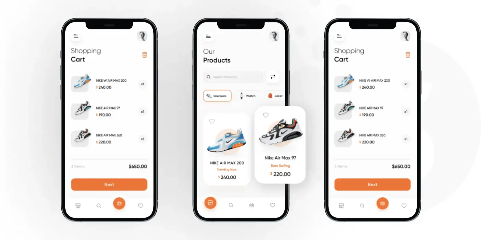
- Ensure mobile shoppers have a smooth experience
- Motivate account creation at the right moment
- Add social proof through “bestseller” and “trending” labels
- Use urgency and scarcity cues (e.g., low stock notices)
- Design a checkout flow that feels effortless
- Simplify and clarify checkout form fields
- Clearly distinguish between optional and required fields
- Streamline mobile payment options
- Keep coupon and promo code fields low-key
- Provide multiple delivery options and clear timelines
Let's get started!
How to Measure the eCommerce Conversion Rate
We have discussed all 20 simple but powerful tips for eCommerce conversion rate optimization. Now, let's address one last issue: how to measure it?
Fortunately, measuring conversion rate is straightforward once you know what counts as a conversion!
In eCommerce, the primary conversion is usually a completed purchase. To calculate it, take the total number of orders during a given time period, divide it by the total number of site visitors in that same period, and then multiply by 100 to get a percentage.
Formula:
Conversion Rate (%) = (Number of Orders / Number of Visitors) × 100
For example, if your store had 500 sales from 20,000 visitors in a month, your conversion rate would be 2.5%.
Note: It's also helpful to track micro-conversions alongside purchases, which are smaller actions that indicate buying intent (e.g., adding a product to the cart, signing up for a newsletter, or starting checkout). Monitoring both macro (purchases) and micro conversions gives you a fuller picture of how well your site is guiding users toward completing transactions!
What are 20 proven tips to optimize eCommerce conversion rate (CRO)?
1. Make site navigation intuitive and simple
First of all, navigation is the customer’s first guide through your store. If it feels too confusing, they definitely will not stay long!
Hence, for eCommerce conversion rate optimization, we suggest you map categories in a way that reflects how your customers think. Plus, avoid all internal terms or technical codes in favor of everyday language, such as “Main courses” or “Appetizers.” You can test with real users through card-sorting or tree-testing to see whether your category logic matches customer expectations.
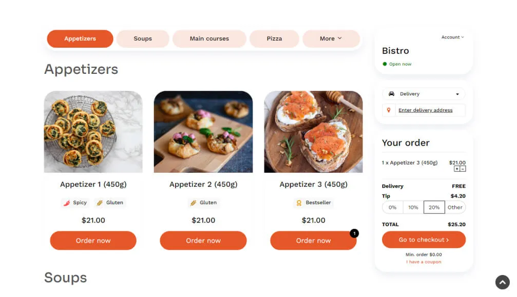
And once the hierarchy is solid, translate it into a clear interface. Usually, on a desktop, a top bar or mega menu works well (provided it doesn’t overwhelm with too many links). Meanwhile, on mobile, collapsible menus with large, easy-to-tap options are highly favored. Breadcrumbs on product pages also help reduce disorientation and let your customers retrace their steps without restarting their journey.
2. Enable category-specific search
Because navigation can only take shoppers so far, many will rely on the search bar once they have a specific item in mind.
To meet that expectation, search must respect the context of where the user is on the site. If someone is already in “Dresses” and types “M&S,” results should prioritize M&S dresses, not unrelated clothings!
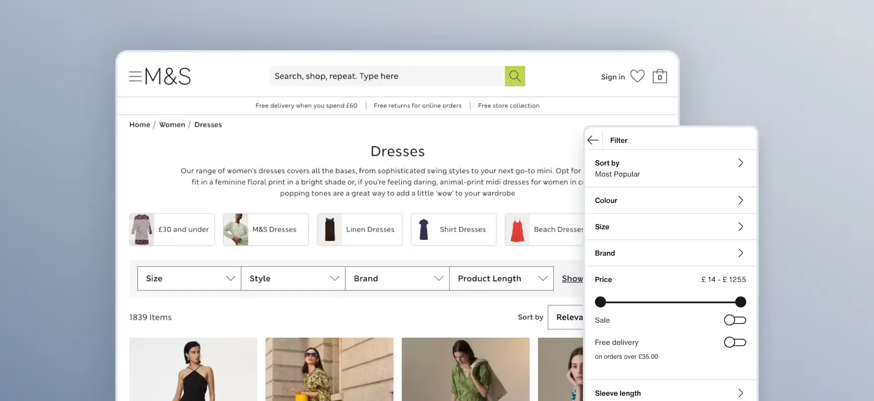
And from our observation, giving shoppers a sense of control makes scoped search even more powerful. For instance, a dropdown beside the search bar (“Search all” versus “Search this category”) helps set expectations before a query is submitted. Once results load, labels like “Results in Electronics” will confirm the scope and reduce customers' confusion when certain products are absent.
3. Refine autocomplete to handle errors smoothly
With scoped search in place, autocomplete becomes the feature that makes searching feel effortless. After all, since many users type quickly (often on small screens), typos are unavoidable. And yet, 69% of eCommerce sites do not offer relevant autocomplete suggestions for closely misspelled search terms, which leads users to abandon search entirely!
The best way to prevent such disasters and seize your chance for eCommerce conversion rate optimization is to build a system that can anticipate common misspelling errors in the first place. Cases in point include fuzzy matching, synonym libraries, and natural language processing, which allow “iphon chager” to resolve instantly into “iPhone charger” and keep the experience fluid.
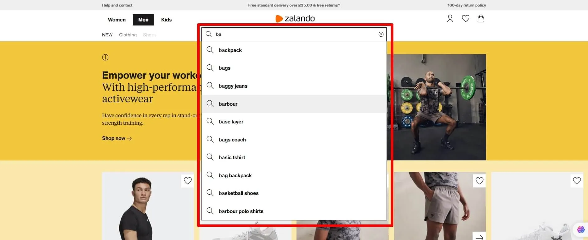
Furthermore, how results appear is just as important as the logic powering them. Autocomplete should show more than plain text, offering thumbnails, category labels, and even prices to help users confirm choices before they click. Plus, even when no direct matches exist, the box should suggest related terms or popular products instead of leaving a void.
4. Deliver clear and informative product descriptions
When autocomplete delivers a customer to a product page, the responsibility now shifts to the description to answer every practical question.
All in all, a good description must clarify what the product is made of, whether it will fit, and how it should be used. Also, creating a standardized template ensures consistency: you can begin with a plain summary, follow with specifications like dimensions or compatibility, and close with care or usage guidance.
Most importantly, every description must be current and leave no room for outdated details. Every few months, make sure your team audits product pages for packaging or feature updates to keep information 100% reliable!
5. Showcase high-quality product images
After reading a clear description, shoppers usually look for images to confirm what they've learned. So, what can you do here for eCommerce conversion rate optimization?
In our opinion, effective imagery begins with professional photography that maintains consistent lighting and backgrounds across the catalog. Contextual shots (e.g., clothing on varied body types or furniture placed in real rooms) also help your customers better visualize how products fit into their lives.
Also, don't forget interactive elements; in fact, research from BusinessDasher shows that integrating 360-degree product views results in a 47% increase in eCommerce conversion rate optimization compared to 2D images! You can use zoom tools to let users examine fine details from multiple angles. Plus, for product variants, consider color swatches that instantly refresh the gallery to prevent mismatches.

6. Offer personalized recommendations based on browsing history
Though strong images grab attention, the momentum will fade without follow-up!
Fortunately, personalized recommendations can keep it alive by showing shoppers products that align with their browsing behavior. With consent (obviously), you can track what categories they visit, what items they view, and what they add to cart. Then, feed this data into recommendation engines that can present dynamic suggestions like “Frequently bought together” or “Recommended for you.”
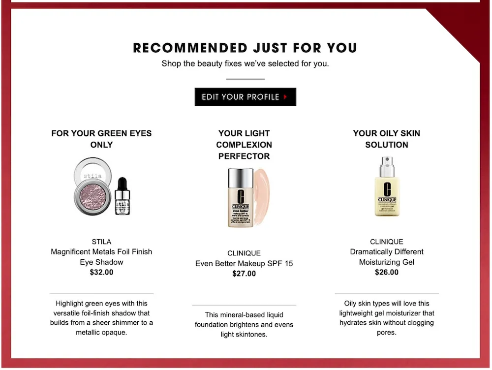
Placement of recommendations also determines how effective they feel:
- On product pages, they should suggest accessories or similar styles.
- On category pages, they can highlight trending items.
At checkout, they work best when subtle; low-friction add-ons like cases or warranties complement the purchase without distracting from it.
7. Display customer reviews prominently
Once customers have browsed recommendations, the next thing they look for is, obviously, reassurance from other buyers. According to PowerReviews' 2025 survey, shoppers who engage with reviews are 108.3% more likely to convert than those who don't, and that's another opportunity for your eCommerce conversion rate optimization!
All in all, reviews only deliver that reassurance if they are both easy to find and structured for usability.
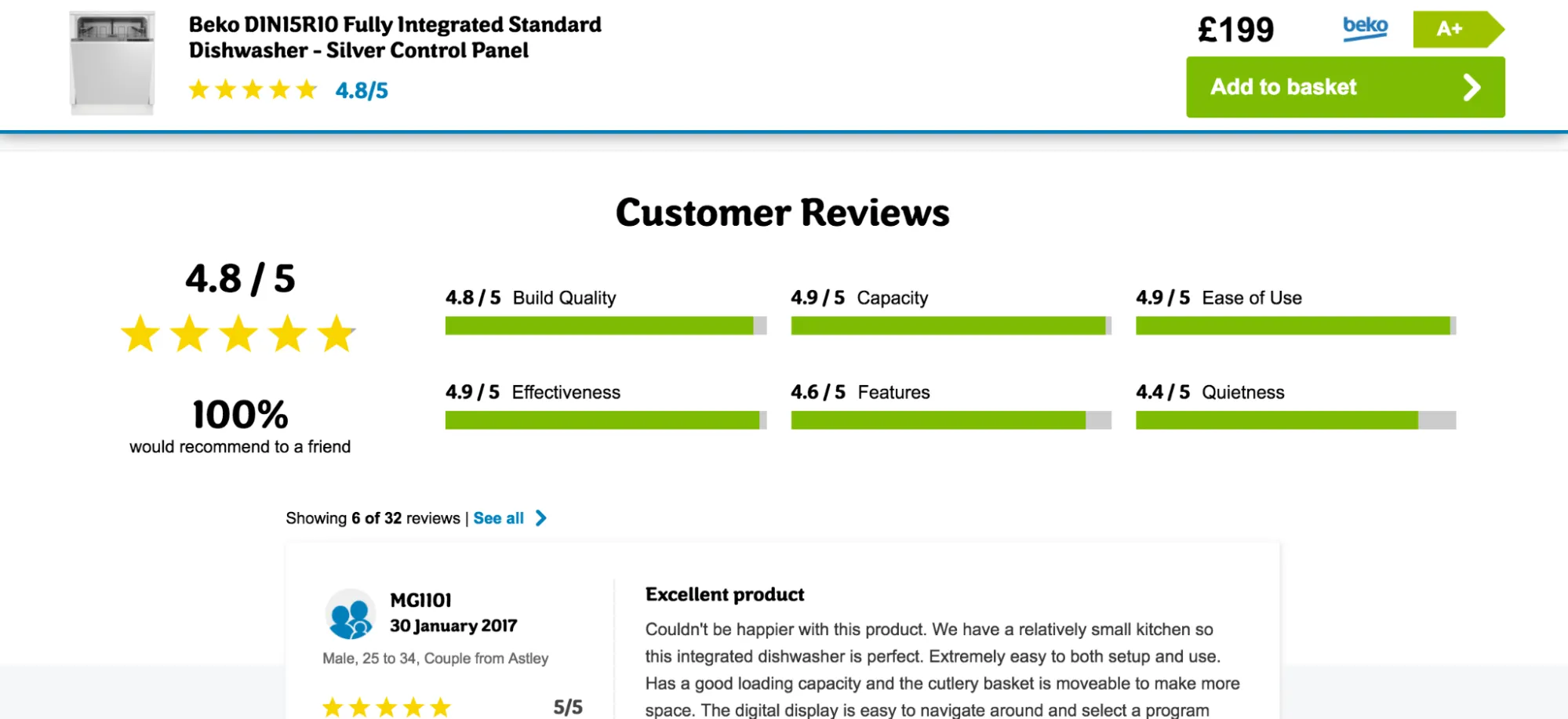
So, the first step is placement: show the average star rating and total number of reviews directly under the product title and price. This approach ensures credibility is visible at the exact moment shoppers consider whether to scroll further or click away.
Then, the second step is building functionality into the review section. A simple wall of unfiltered text doesn't help anyone; instead, implement filters that let users sort by recency, by rating, or by reviews with images. Many customers want to check the lowest ratings to see potential issues before committing, so making negative reviews easy to access actually increases trust. Also, don't forget to add “verified purchase” labels (so users know which reviews are genuine), and allow customers to upload photos of their purchases for visual validation.
8. Highlight security and trust indicators
After reviews reassure customers about the product, they begin asking: “Is it safe to buy here?” Well, security and trust indicators answer that question!
Start by making sure your site is SSL-certified and that the browser's padlock icon is always visible. Then place recognizable badges, such as Norton or McAfee Secure, close to where users enter sensitive information. In most cases, trust signals like these work best when they are near the credit card fields, not scattered randomly across the page.

Still, be careful not to overdo it; too many badges or warnings can look fake and backfire. The best approach is to A/B test different badge placements and microcopy to measure which combination actually increases checkout completions.
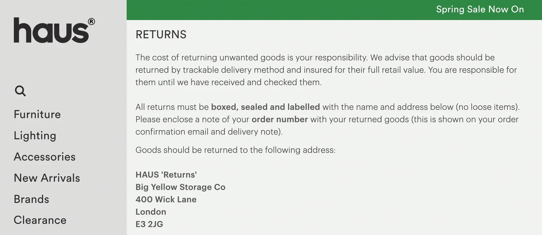
9. Place shipping and return details where users expect them
Needless to say, trust in security is still not enough if logistical details are unclear. Customers often hesitate if they don't know how quickly an item will arrive or whether they can return it!
Hence, one of the first rules for eCommerce conversion rate optimization is to place links to shipping and return policies in the site footer (since many shoppers instinctively scroll there). The second is to duplicate this information on product pages, ideally near the “Add to Cart” button, so customers don't need to search for it.
Most importantly, make the information short, clear, and honest. Instead of vague promises like “Fast shipping,” state specifics such as “Delivered within 3–5 business days.” For returns, mention the timeframe (e.g., “Free returns within 30 days”), any conditions, and whether return shipping is covered.
10. Use live chat wisely to assist, not distract
And what if your customers still hesitate after reading shipping or return policies? In that case, live chat can resolve final doubts, though its implementation also makes the difference between help and irritation.
For starters, you should avoid chat boxes that pop up the second someone lands on your homepage or reopen after being dismissed. Instead, configure specific triggers; for instance, launch chat after a user spends a long time on a checkout step, revisits the same product repeatedly, or signals intent to exit the page.
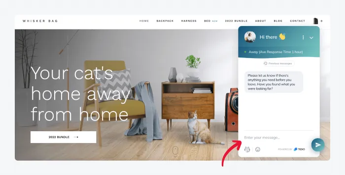
Furthermore, the interface should feel like support rather than an interruption. On desktop, keep chat as a small icon or expandable box in the corner. And on mobile, make sure the chat window doesn't overlap navigation or cover the “Add to Cart” button. Always let users minimize or close the chat permanently during a session!
11. Ensure mobile shoppers have a smooth experience
What we discussed earlier about live chat interactions also further highlights how critical mobile design is for eCommerce conversion rate optimization. After all, if your site feels slow or clumsy on mobile, customers won't even stay long enough to ask questions!
So, what can you do to ensure a smooth experience?
Start by testing on real devices: buttons should be large enough for fingers, menus should collapse logically, and forms should accept autofill to cut down on typing.
Also, performance is a top priority; Google's mobile research shows that 53% of visitors abandon sites that take longer than 3 seconds to load! Therefore, we recommend optimizing images with responsive formats (like WebP), compressing code, and using content delivery networks (CDNs) to minimize load times. Plus, remember to provide clear visual feedback when errors occur in forms and keep input fields short.
12. Motivate account creation at the right moment
We all know a well-optimized mobile journey sets the stage for asking customers to create an account. The wrong timing, however, kills conversions.
Therefore, you should never force account creation before checkout; always allow guest checkout first! Instead, present account creation after the order is confirmed. At that point, users are more open to hearing about the benefits because the purchase hurdle is already cleared.
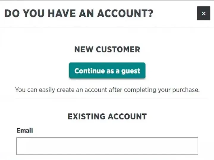
Likewise, you should make sign-up just as effortless. For instance, you may include a simple checkbox that says, “Save my details for next time” on the confirmation page. This approach usually converts the transaction into an account with one click! Many large stores also offer one-click sign-in options via Google, Apple, or Facebook, allowing users to create accounts in seconds without typing.
13. Add social proof through “bestseller” and “trending” labels
After customers create an account, they begin navigating the catalog again. At that phase, subtle nudges help guide them to decisions and also increase your eCommerce conversion rate optimization.
For instance, common social proof labels like “Bestseller” or “Trending” reassure your customers that others are also choosing the same products. To implement them credibly, you should base the labels on real-time or recent behavioral data such as sales volume, views, or add-to-cart frequency. Also, rotate the tags frequently so they feel fresh and believable!
And like with other elements, where you place these labels matters. They should appear next to product names or thumbnails, right where customers are making decisions. Avoid covering every product with a badge; overuse like that only makes the signal meaningless.
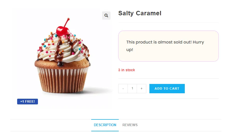
14. Use urgency and scarcity cues (e.g., low stock notices)
Once social proof has reassured customers that they're making a smart choice, urgency helps them commit.
The obvious move is to connect these cues directly to live inventory data. Notices like “Only 4 left in stock” must be 100% accurate; anything misleading might damage trust in the long term! You can also combine this with time-sensitive prompts like “Order within 2 hours for delivery tomorrow,” which tie urgency to concrete benefits.
And in many cases, refining urgency requires testing. Some simple A/B experiments can help you identify whether “Only a few left” outperforms “Limited stock” or if a delivery countdown influences behavior. And when used correctly, urgency pairs with social proof to create a powerful one-two punch: customers see that others are buying and realize they must act quickly if they don't want to miss out.
15. Design a checkout flow that feels effortless
After urgency and scarcity have encouraged a decision, the checkout process becomes the make-or-break moment. Baymard Institute’s 2023 study on checkout usability shows that optimizing checkout flows can yield a 35% lift in conversion rates!
To design a flow that feels effortless and boost eCommerce conversion rate optimization, you should map out each step from cart to confirmation. Eliminate redundant pages, such as separate “review” screens, if their content can be folded into existing steps; after all, every extra click is an opportunity for users to drop off!
Once you’ve minimized the steps, give customers a clear sense of progress. A simple bar at the top that shows “Shipping → Payment → Review” helps them understand where they are and how close they are to finishing. You can keep the design clean by removing distracting elements like banners, unrelated links, or upsell pop-ups as well.
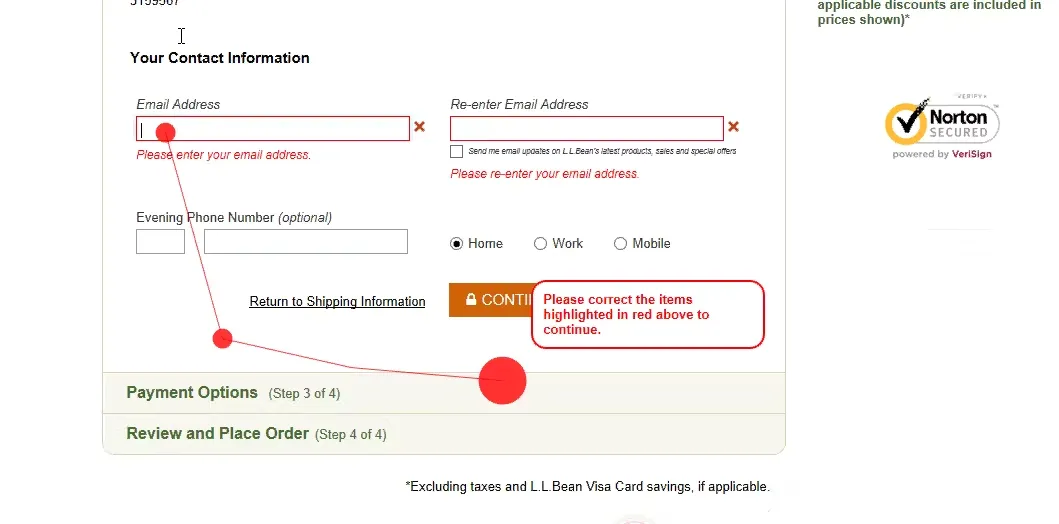
16. Simplify and clarify checkout form fields
Once the flow is streamlined, attention now shifts to the forms. These can either accelerate completion or frustrate your customers into leaving.
First, you should audit every input field and ask yourself whether each one is truly necessary for order fulfillment. For instance, fields like “Fax number” or “Address line 2” rarely add value and often intimidate users with unnecessary length, so remove or collapse them where possible.
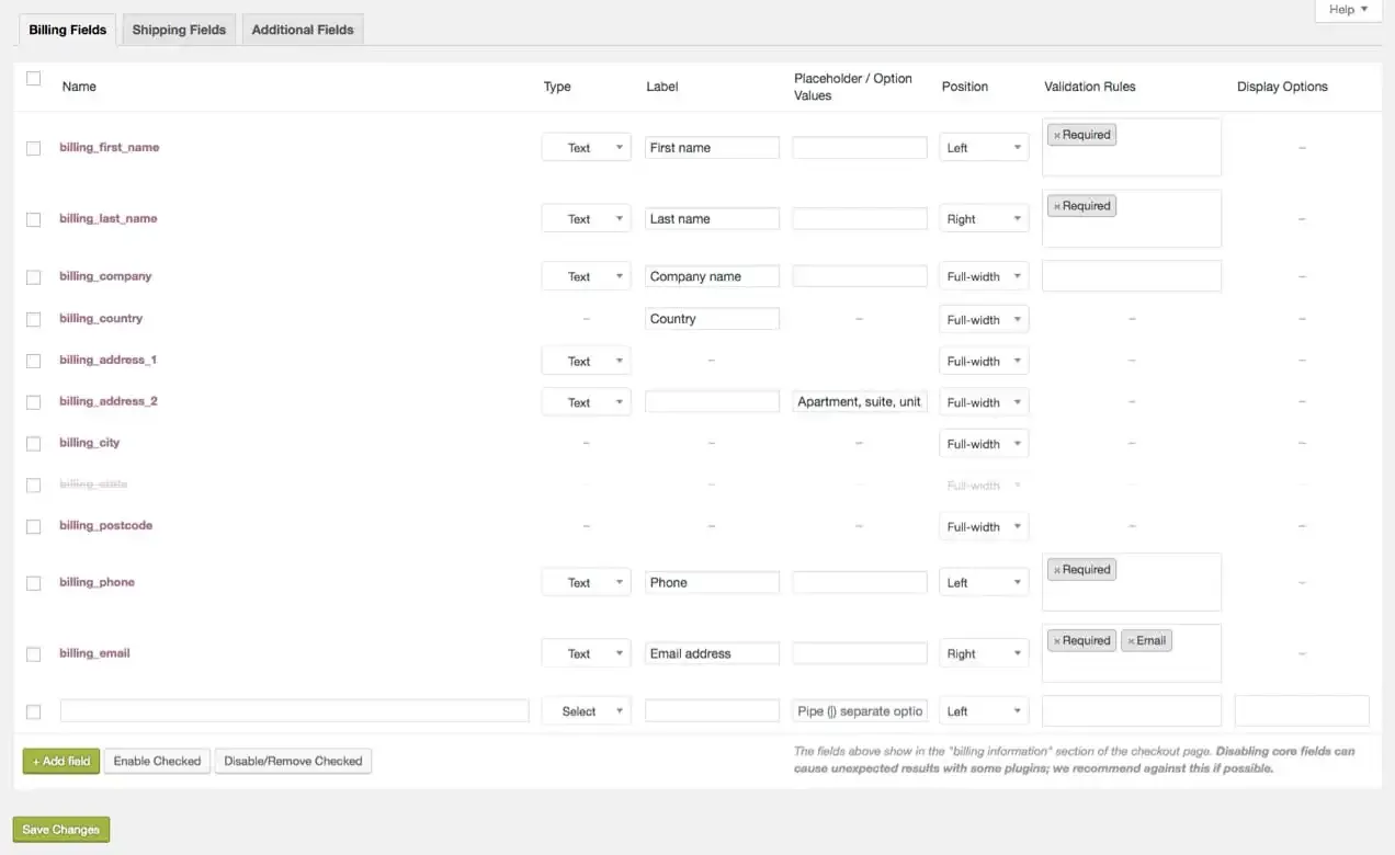
Next, focus on clarity. You should use direct language for labels; for example, “Street address” works better than “Address line 1.” And if possible, auto-detect information such as country codes for phone numbers, or add inline hints about format. Use input masks that automatically format numbers and dates to reduce typing errors and make the process feel more fluid.
17. Clearly distinguish between optional and required fields
After shortening and clarifying forms, the next refinement is removing doubt about which fields must be completed. If users guess wrong and see error messages later, the process can feel quite punishing – not something that would work in your favor if you aim for eCommerce conversion rate optimization!
To prevent this, explicitly mark optional fields in the label, such as “Company name (optional),” so shoppers are reassured that they can safely skip it.
For required fields, visual markers like asterisks help, but clarity increases when you explain why the field matters. For example, under “Date of birth,” a very quick note like “Required to verify age and complete your purchase legally” not only signals necessity but also makes the request feel more reasonable.
18. Streamline mobile payment options
Now that the forms have been smoothed out, the next critical task is making payment quick and painless on small screens.
Long card entry on mobile is one of the top reasons for abandonment. To overcome this, consider enabling wallet-based payments like Apple Pay, Google Pay, or PayPal, which will allow your customers to complete purchases with a single tap and auto-fill shipping details.

But what if, for some reason, manual entry is still unavoidable? In that case, you need to design fields with mobile ergonomics in mind: trigger the numeric keypad for card numbers, split the input into four-digit groups for readability, and keep layouts in a single column so users don't need to scroll sideways. Autofill should also be activated so that stored addresses and names can be inserted instantly.
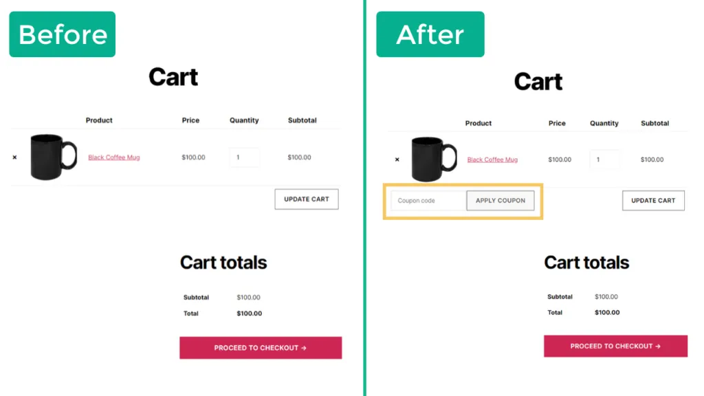
19. Keep coupon and promo code fields low-key
Even with fast mobile payment, poorly designed promo code fields can interrupt the flow. If these fields are too prominent, shoppers without a code often leave to search for one and may never return.
Hence, the best approach for eCommerce conversion rate optimization is to collapse the field behind a small link labeled “Have a promo code?” Only users who actively want to enter a code will expand it, keeping others focused on completing the order.
And from our personal experience, you should put the link below the order summary rather than beside the payment inputs. This way, the main checkout task isn't disrupted. And when a code is applied, the store should show an immediate confirmation message like “Promo applied: –$10” and adjust the total instantly. This immediate feedback prevents users from double-checking or worrying whether the discount worked.
20. Provide multiple delivery options and clear timelines
Last but not least, after payment is confirmed, customers want certainty about receiving their order.
No matter your business size, you should offer at least two or three shipping choices (for example, standard, expedited, and express). Each should include a clear cost and a delivery window, such as “Guaranteed delivery by Friday, March 7.”
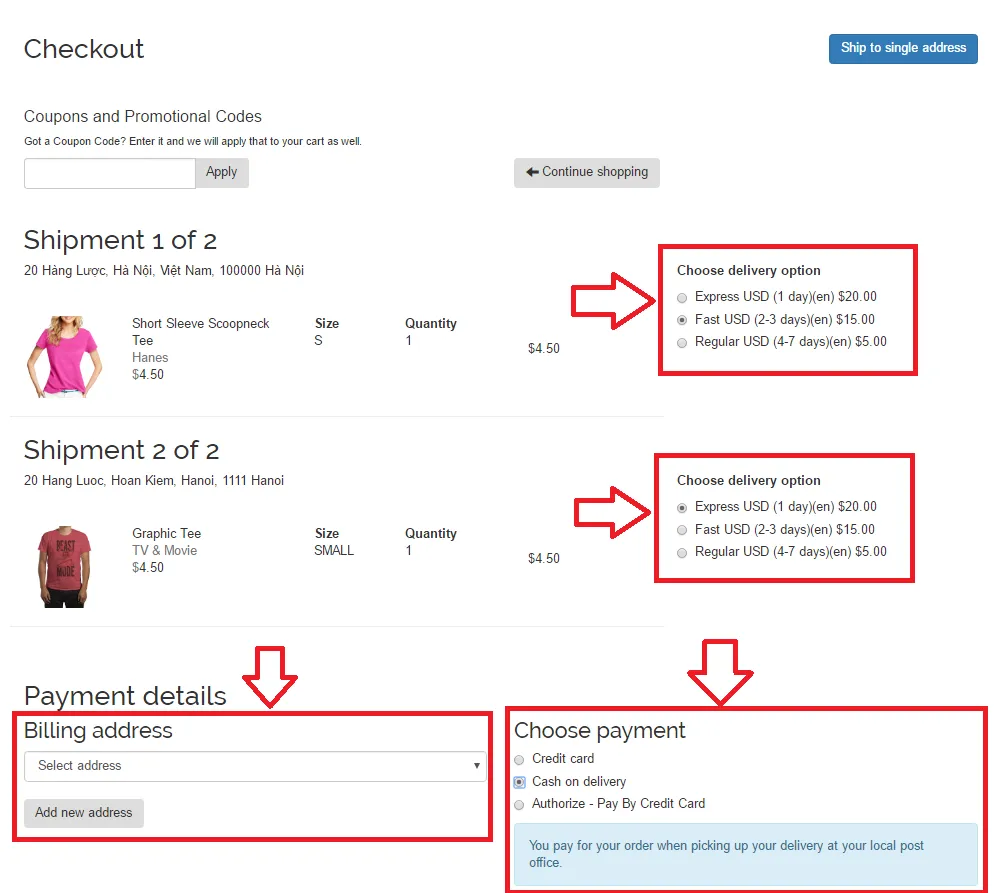
Plus, it would be best to integrate your system with carriers that show real-time delivery estimates and tracking numbers, which further helps reduce customers' anxiety. If free shipping is available above a certain threshold, state this clearly at checkout so customers can make informed decisions about whether to add more items.
eCommerce Conversion Rate Optimization: FAQs
How to improve conversion rate in eCommerce?
To improve the conversion rate, you must first identify friction points in the customer journey and optimize the site navigation so shoppers can find products quickly. Checkout is another major area: you can refine it by simplifying forms, clarifying optional vs. required fields, and offering flexible payment and shipping options.
What is a good conversion rate for eCom?
The benchmark for a "good" conversion rate varies by industry, product type, and traffic source. However, across eCommerce as a whole, most studies show an average between 2% and 3%.
Is 25% conversion rate good?
A 25% conversion rate is extremely high for ecommerce and well above industry norms. In most cases, such a number suggests that the conversion is being measured on a narrower action (like email sign-ups or returning customers) rather than purchases alone.
What is the first stage of an effective eCommerce conversion rate optimization process?
The first stage is always diagnosis. Before making changes, you need to understand where and why visitors are dropping off. This stage usually involves:
+ Analyzing analytics data to see which pages have the highest exit rates
+ Reviewing session recordings or heatmaps to observe customer behavior
+ Identifying barriers such as confusing navigation, poor mobile performance, or friction in checkout.
Final Words
By now, you’ve seen how many small details can shape whether a visitor becomes a customer. None of these fixes sounds that significant on their own, but together, they transform the entire shopping experience and help you with eCommerce conversion rate optimization!
For even more eCommerce insights, check out our blog and join our Facebook Community.