Being the final step in customers’ buying journey, a fast-loading, convenient, and well-organized checkout page can greatly contribute to your store’s success. That’s why you need to perform eCommerce checkout optimization tasks to reduce friction and boost conversions.
With 12 years of experience assisting thousands of store owners in migrating their stores to improve user experience, LitExtension – the #1 eCommerce Migration Expert – has compiled this list of the 15 best practices to help you optimize online checkout, including:
- #1 Offer guest checkout option
- #2 Minimize form fields
- #3 Use autofill and address validation
- #4 Provide a progress indicator
- #5 Enable multiple payment methods
- #6 Optimize for mobile eCommerce checkout
- #7 Display trust signals and security badges
- #8 Allow easy cart-editing at checkout
- #9 Show transparent shipping costs early
- #10 Allow coupon entry without disrupting flow
- #11 Use exit-intent pop-ups strategically
- #12 Offer live chat or support during checkout
- #13 Provide clear return and refund policies
- #14 Optimize checkout page load time
- #15 Send cart abandonment emails with incentives
Without further delay, let’s get started!
eCommerce Checkout Optimization – All You Need to Know
What is checkout optimization for eCommerce stores?
Once a customer reaches the checkout page, your store is just one step away from making a sale. But even at this final stage, many shoppers drop off due to friction, confusion, or lack of trust.
That’s when eCommerce checkout optimization becomes crucial. It is the practice of fine-tuning the checkout process to make it easier for customers to complete their orders. It focuses on removing unnecessary steps, reducing wait times, and making sure nothing stands between your buyers and their successful orders.
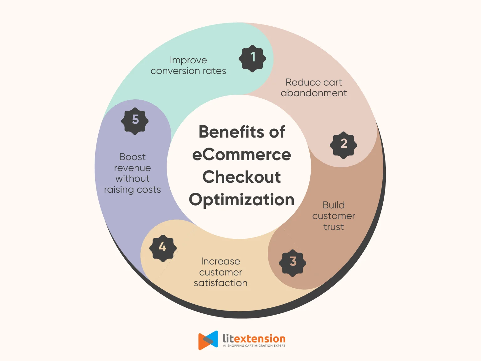
By refining this part of the journey, you can turn more visitors into buyers, build stronger customer relationships, and grow your revenue – all without increasing your marketing spend. In the next section, we will present five benefits of eCommerce checkout optimization to help you understand why this process is essential for every business.
Why eCommerce checkout optimization is essential for your business
1. Improve conversion rates
First and foremost, eCommerce checkout optimization makes it easier for consumers to say “yes” at the final step. When the process is clear, smooth, and user-friendly, they are more likely to complete their purchases, leading to more sales generated. Therefore, a well-optimized checkout page can significantly increase your conversion rates.
2. Reduce cart abandonment
Every extra click or delay can lead to a lost sale since customers might abandon their carts due to a poor checkout experience. However, with eCommerce checkout conversion rate optimization, you can reduce friction, remove confusion, and encourage users to complete their purchase. In other words, you keep more of the customers you've already convinced to buy.
3. Build customer trust
From our experience, customers will feel more secure when your checkout page looks reliable and easy to use. By using checkout optimization to add trust signals, clear policies, and secure payment options, you show buyers that your business is legitimate. As a result, they feel confident sharing their personal and payment details.
4. Increase customer satisfaction
A fast and easy checkout experience doesn't just help with conversions; it also leaves customers with a positive impression of your brand. By performing eCommerce checkout optimization, you can remove unnecessary steps and give clear instructions to make sure customers feel respected and valued.
5. Boost revenue without raising costs
One of the most powerful reasons to invest in checkout page optimization is that it helps you earn more from your existing traffic. By turning more browsers into buyers, you can increase your revenue without spending more on ads or promotions. It’s one of the most cost-effective ways to grow your business, especially when margins are tight.
15 eCommerce Checkout Optimization Best Practices to Improve Conversion Rate
In this section, we will walk you through 15 proven eCommerce checkout optimization strategies that will help you streamline the experience and boost your store’s performance. Whether you are running a Shopify store, selling on WooCommerce, or managing a custom-built site, we hope that these best practices can help you turn more carts into conversions.
Let’s dive right in!
#1 Offer guest checkout option
While account creation is valuable for building long-term relationships, forcing users to register before purchasing often creates unnecessary friction, especially for first-time buyers. In fact, we’ve seen many shoppers abandon their carts the moment they’re asked to create an account. They may not want to commit, or they simply want to complete their purchase as quickly as possible.
That’s why allowing customers to check out as a guest is one of the quickest wins in eCommerce checkout optimization. This solution removes a major barrier and gives customers the option to purchase without delay. It creates a smoother first-time experience, reduces cart abandonment, and increases the chances of turning casual shoppers into repeat buyers who will eventually register an account when they are ready.
Here’s how to implement guest checkout effectively:
- Keep it truly “guest”: Don’t require a password or force users into account creation midway through the process. A guest checkout should only ask for essential details like name, email, shipping address, and payment info.
- Make it clearly visible: At the login or checkout step, show the “Continue as Guest” option just as prominently as the login or sign-up prompts. It should feel like an easy and obvious choice.
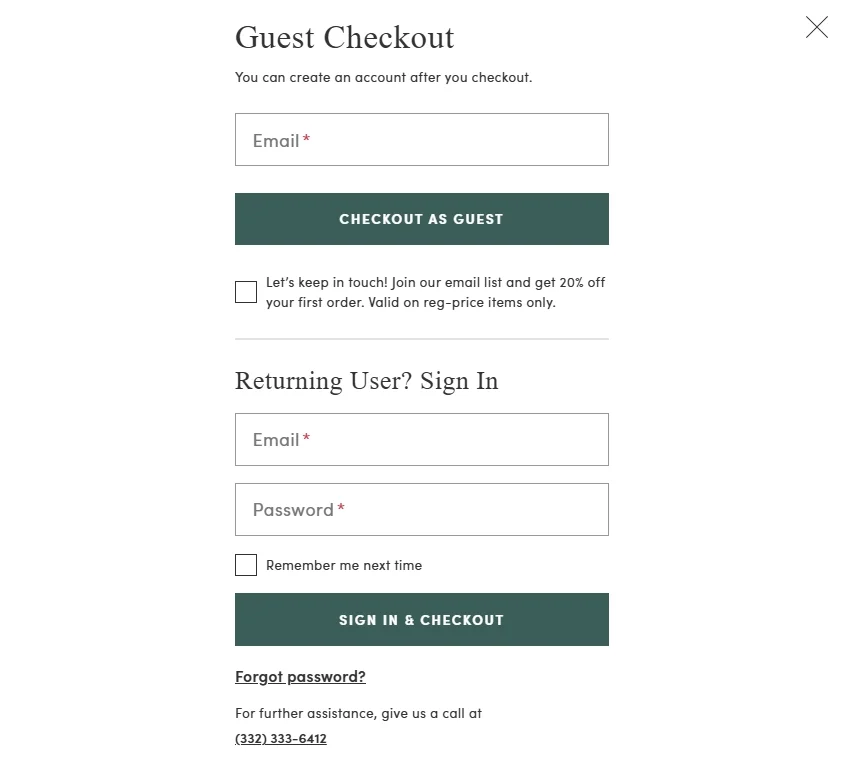
- Don’t hide benefits, but don’t force them: You can still highlight the benefits of creating an account, such as faster future checkouts or order tracking, after the purchase is complete.
#2 Minimize form fields
Long, overwhelming forms are one of the top reasons customers abandon their carts. When shoppers are ready to buy, the last thing they want is to fill out lengthy checkout forms with unnecessary information. That’s why minimizing form fields is a core part of eCommerce checkout optimization since it ensures the process is smooth and user-friendly, preventing any possibility of delay or second thoughts.
Please keep in mind that reducing the number of fields doesn’t mean cutting corners. It means asking only for the information that’s essential to complete the order. This keeps customers focused, lowers cognitive load, and improves the likelihood of conversion.
Consider these tips to optimize online checkout forms effectively:
- Ask only for what’s necessary: Focus on essential details such as name, email, shipping address, and payment information. If a field isn’t absolutely required to fulfill the order, consider removing it.
- Combine fields where possible: Instead of separate fields for “First Name” and “Last Name,” we suggest you offer a single “Full Name” field. Similarly, try combining “Street Address” and “Apartment/Suite” if your shipping carrier allows it.
- Use dropdowns and selectors: For fields like “State,” “Country,” or “Delivery Options,” use dropdown menus or buttons rather than open text fields. This helps prevent user errors and speeds up selection.
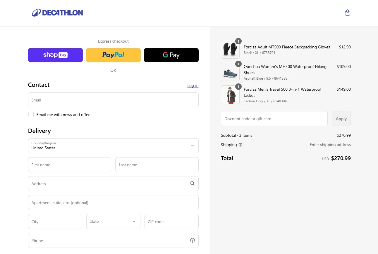
- Mark optional fields clearly: If you do include optional fields (like postal code or company name), label them clearly so customers know they can skip them without worry.
#3 Use autofill and address validation
From what we observed, speed and accuracy are two critical elements of a smooth checkout experience. If customers have to manually type in all of their shipping and billing details, especially on mobile devices, it increases the chances of frustration, typos, and even cart abandonment.
In this case, eCommerce checkout optimization tools like autofill and address validation can make quite a difference. These features help streamline data entry while reducing errors that could lead to delivery issues, failed payments, or support tickets. By adding autofill and real-time validation, you help customers breeze through checkout while minimizing mistakes.
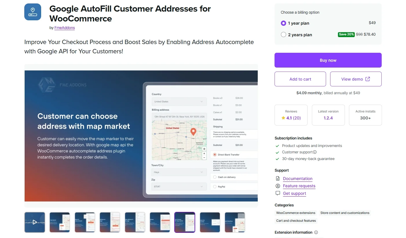
Take a look at these eCommerce checkout best practices below to implement autofill and address validation effectively:
- Enable browser-based autofill support: Most modern browsers can automatically fill in common fields like name, email, phone, and address. To take advantage of this, use standard HTML field names (e.g., name, email, address) so browsers can correctly recognize and autofill them.
- Use third-party address validation tools: Integrate services like Google Places API, Loqate, or USPS address verification to help users find and complete their addresses quickly. As they type, suggestions appear, reducing input effort and ensuring valid addresses.
- Allow corrections without frustration: If a validation tool flags an address as incorrect, give customers the chance to review and fix it manually. Try not to block them from continuing if they’re confident their entry is correct.
#4 Provide a progress indicator
Progress indicators are especially helpful for multi-step checkouts, where users move through pages for shipping, payment, review, and confirmation. It sets clear expectations on how long the checkout will take and guides users step-by-step to the finish line. When customers can see where they are and what’s left, they feel more in control and more willing to complete the process.
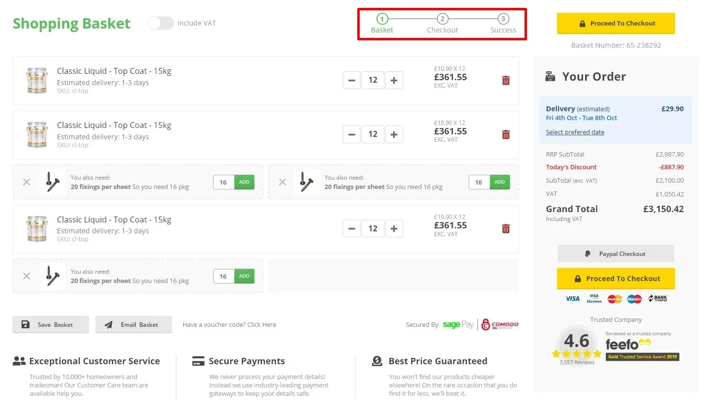
By adding a simple progress indicator to your eCommerce checkout optimization strategy, you can reduce uncertainty and make the process feel faster. This small UX element adds clarity, reduces abandonment, and builds trust, especially with new customers who are unfamiliar with your store.
Below are how you can leverage a progress indicator to optimize checkout page:
- Use a clear, linear design: Your progress bar should follow a left-to-right or top-down flow that matches how users read. Show each step in order, for example: Cart > Shipping > Payment > Review > Confirmation.
- Highlight the current step: Make it visually obvious which stage the customer is currently in. This gives immediate context and reduces confusion.
- Show how many steps are left: Whether it’s a numbered bar or labeled stages, let customers know exactly how far they’ve come and how far they have to go. We believe that “Step 2 of 4” is far more reassuring than a blank page.
- Keep the steps short and purposeful: If your checkout has more than 3–4 steps, it might be worth reviewing whether some stages can be combined. A long progress bar can discourage users rather than help them.
#5 Enable multiple payment methods
Not all customers shop the same way, and that includes how they prefer to pay. Some want to pay by credit card, others prefer PayPal, digital wallets like Apple Pay or Google Pay, or even Buy Now, Pay Later (BNPL) options such as Klarna or Afterpay. If your store only offers one or two payment options, you’re likely missing out on sales.
Therefore, one of the most practical and impactful moves in eCommerce checkout optimization is offering multiple payment methods. By providing several options to meet customers wherever they are, you can build trust, reduce checkout hesitation, and open your store to a wider audience. It’s a low-effort, high-reward upgrade that pays off in both conversion rates and customer satisfaction.
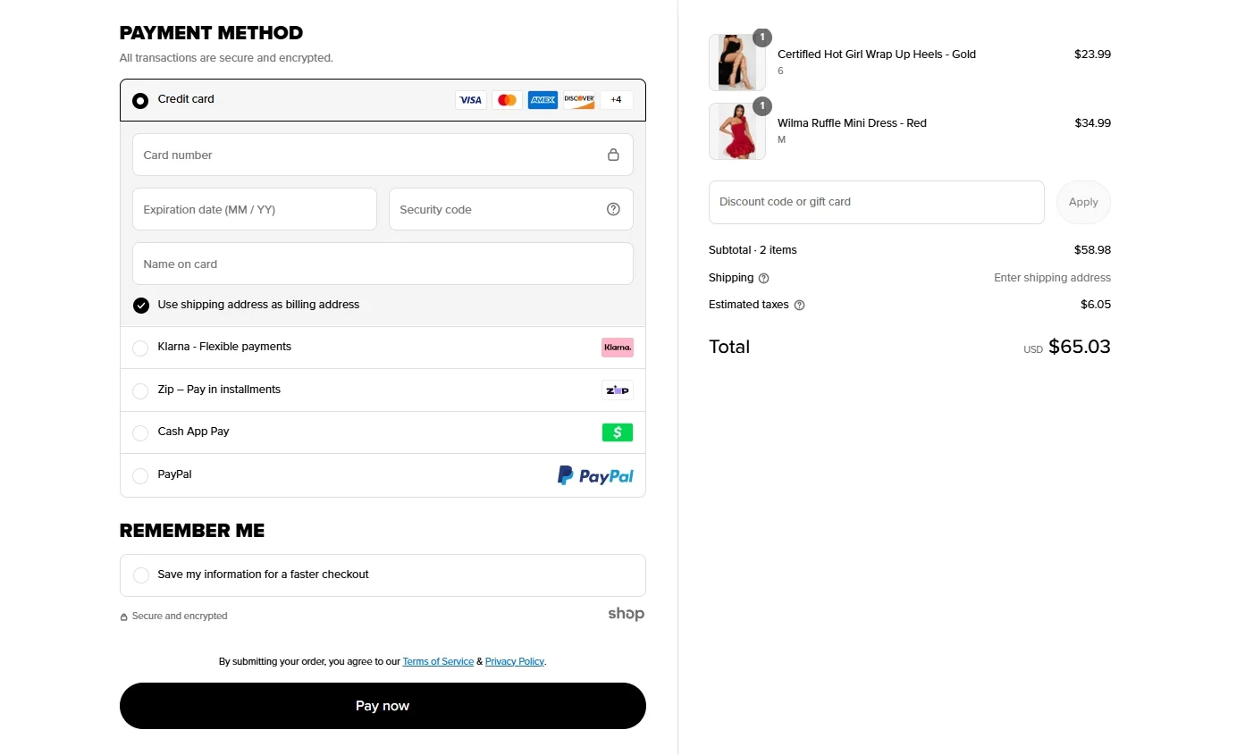
Here’s how to expand your payment methods strategically:
- Start with the essentials: At minimum, offer major credit/debit card options (Visa, Mastercard, AMEX) and PayPal. These are widely trusted and familiar to most online shoppers.
- Add digital wallets: Digital wallets like Apple Pay, Google Pay, and Samsung Pay provide one-tap payment experiences, especially on mobile devices. These can significantly speed up checkout and reduce cart abandonment, so consider these eCommerce checkout solutions as well.
- Consider Buy Now, Pay Later (BNPL) services: BNPL providers like Klarna, Afterpay, and Affirm allow customers to split payments into installments. These services have been shown to increase average order value and conversions, particularly for younger shoppers.
- Ensure clear and secure presentation: Show all payment options at the start of the payment step, not just after customers fill in all their info. Use familiar logos and ensure the payment section looks secure and professional.
#6 Optimize for mobile eCommerce checkout
According to research by Statista, 68% of online shopping orders come from mobile phones, so a mobile-first strategy should not fall short in your eCommerce checkout optimization checklist. By making your mobile checkout experience seamless, you’ll improve conversions and deliver a better experience to the fastest-growing segment of your customer base.
Mobile shoppers expect convenience; this is what we learned from thousands of online merchants partnering with us. Customers want to complete their purchases in seconds, not struggle with zooming, pinching, or retyping information. Therefore, make sure to create a fast, intuitive, and touch-friendly checkout process on any mobile device to reduce cart abandonment and lost sales.
Here’s how to optimize your mobile checkout experience:
- Use responsive design: Your checkout layout should automatically adjust to fit all screen sizes. Test the design on various devices such as smartphones, tablets, and even different browser sizes to make sure everything aligns correctly.
- Use large, tappable buttons: Ensure all CTAs (like “Continue” or “Place Order”) are full-width, high-contrast, and easy to tap with a thumb. Avoid small buttons or links that are hard to press accurately.
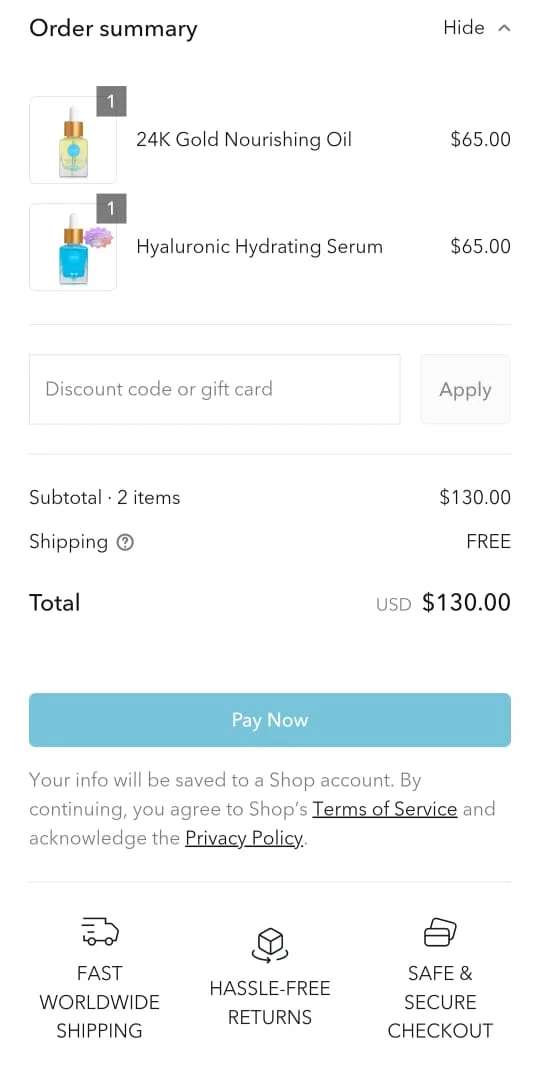
- Enable digital wallets: Apple Pay, Google Pay, and other mobile-friendly payment options allow users to check out with just a tap. These methods eliminate the need to manually enter card details, which is especially helpful on smaller screens.
- Auto-advance between fields: Let the cursor automatically move to the next field once the current one is completed (e.g., from card number to expiration date). This small UX improvement can make the experience feel smoother and faster.
- Minimize distractions: Keep the mobile checkout page clean and clutter-free. Remove unnecessary banners, pop-ups, or navigation links that could pull users away from completing their purchase.
#7 Display trust signals and security badges
Trust is a key factor in getting customers to complete a purchase, especially when they’re shopping from your store for the first time. If shoppers feel unsure about the safety of their payment information or the legitimacy of your business, there is a high chance that they might abandon their cart.
To solve this problem, consider displaying clear trust signals and security badges throughout your checkout process. When customers see visual cues that your site is secure and reputable, they’re more likely to move forward without fear or doubt.
Here’s how to build trust through badges and signals:
- Display SSL security seals and payment provider logos: Show badges from well-known security providers (like Norton, McAfee, or TRUSTe) and payment processors (like Visa, Mastercard, PayPal, or Stripe). These instantly reassure users that their data is protected.
- Use HTTPS and show the padlock: Ensure your site is secured with SSL and always uses HTTPS. Most browsers display a padlock icon in the address bar, which customers recognize as a sign of safety. Don’t overlook this, it’s a must-have for any modern eCommerce site.
- Show secure checkout language and icons: Add reassuring copy like “100% Secure Checkout” or “Your Information Is Safe With Us” near the payment fields. Pair this with lock icons or shield graphics to reinforce the message visually.
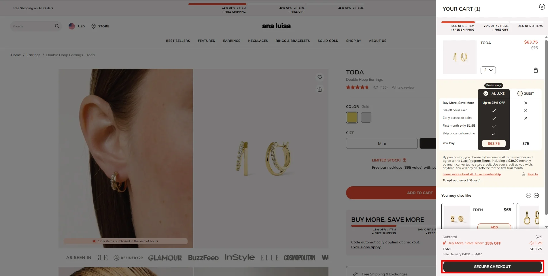
- Include customer reviews and ratings: Social proof is a powerful trust signal. Display a few positive reviews or a high customer rating near the checkout or cart summary. This helps convince buyers they’re making the right choice.
- Avoid overloading the page: While trust badges are important, too many can look cluttered or even suspicious. Therefore, the best eCommerce checkout optimization practice is to choose 2 – 3 credible, recognizable badges and place them where they support the user journey, not distract from it.
#8 Allow easy cart-editing at checkout
Imagine being ready to check out, only to realize you picked the wrong size, added the wrong quantity, or forgot something altogether, but now you can’t make a quick change without starting over. That’s exactly the kind of friction that causes shoppers to abandon their purchases.
Hence, one of the most practical improvements in eCommerce checkout optimization is allowing customers to easily edit their cart directly from the checkout page. This way, by giving users the ability to review and update their order in real time, you can reduce frustration, build trust, and keep them moving forward with confidence.
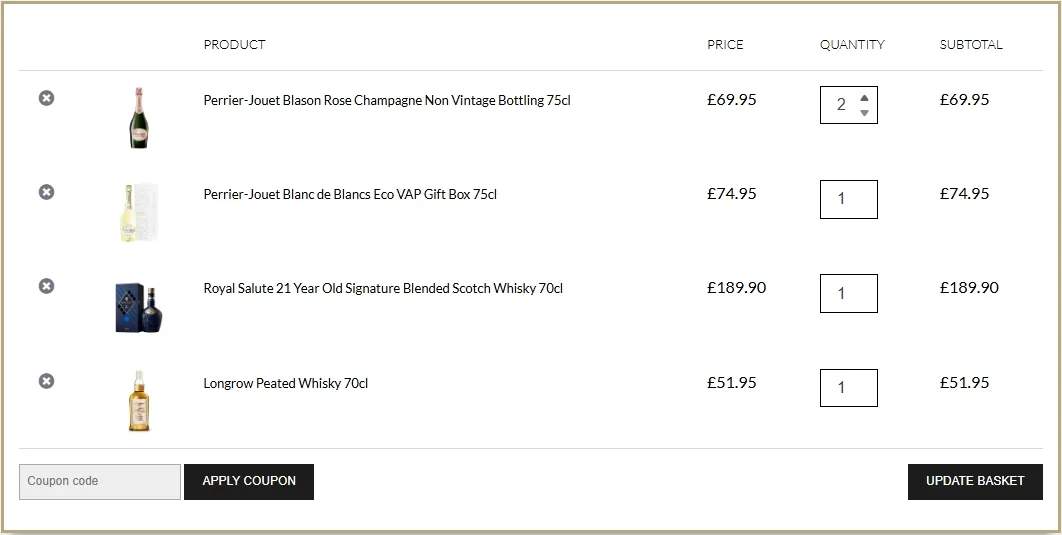
Here’s the best eCommerce checkout optimization practice to make cart-editing easy and effective:
- Show a cart summary throughout checkout: Display a clear, collapsible cart sidebar or summary section that stays visible or accessible during the entire checkout process. This helps customers stay aware of what they’re purchasing and encourages order review.
- Include adjustment buttons next to each item: Let customers easily update quantities, change product variants (like size or color), or remove items with just a click—without leaving the checkout flow.
- Update totals in real-time: When a customer changes an item or quantity, automatically recalculate totals, shipping, and taxes immediately. This prevents confusion or unpleasant surprises at the final step.
#9 Show transparent shipping costs early
Unexpected shipping fees are one of the most common reasons customers abandon their carts, especially when they’re revealed after a customer has already entered all their details. That kind of surprise instantly breaks trust and disrupts the momentum of the purchase. Therefore, as part of effective eCommerce checkout optimization, you should make shipping costs clear, accurate, and visible as early in the process as possible.
Being upfront about shipping not only prevents frustration but also builds confidence and increases conversions. It shows that your business is honest, organized, and respectful of the customer’s time and budget – qualities that go a long way in converting visitors into buyers.
Let’s see how you can display shipping costs early and effectively:
- Show estimated shipping in the cart or on the product page: Before a customer even enters the checkout, provide a shipping cost estimate based on location or offer a “calculate shipping” tool in the cart.
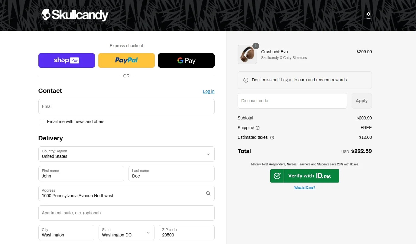
- Offer flat-rate or free shipping when possible: If your margins allow, consider offering simple flat-rate shipping or free shipping above a certain order value. Customers love predictability, and this can encourage higher order values.
- Break down shipping options clearly: Present all available shipping methods, such as standard, express, next-day, etc., with accurate delivery timeframes and pricing. Use plain language and avoid technical courier terms.
- Update totals in real time: As soon as the customer enters their address or selects a shipping option, update the order total dynamically. This prevents last-minute surprises and helps them feel in control.
#10 Allow coupon entry without disrupting flow
Offering discounts and promo codes can be a powerful tool to boost conversions, but if not handled carefully, the way you implement coupon entry can actually backfire. When customers are forced to hunt for a discount box or leave the checkout page to search for a code, it disrupts their momentum. In some cases, they may not return at all.
Hence, to make the most of your offers without harming conversions, your eCommerce checkout optimization strategy should ensure that coupon code entry is seamless and non-intrusive. The goal is to make entering a code feel like a bonus, not a requirement. It should be easy to find, quick to apply, and never pull the shopper away from completing their order.
Below, we will break down some essential eCommerce checkout optimization tips to help you implement coupon entry the right way:
- Make it visible but subtle: Include a small, collapsible or expandable field labeled “Discount code or gift card” near the cart summary or payment section. This keeps it accessible for those who need it without distracting everyone else.
- Support instant code validation: When a customer enters a code, apply it immediately and clearly display the updated total. Let them know it worked with a success message and possibly a checkmark or visual confirmation.
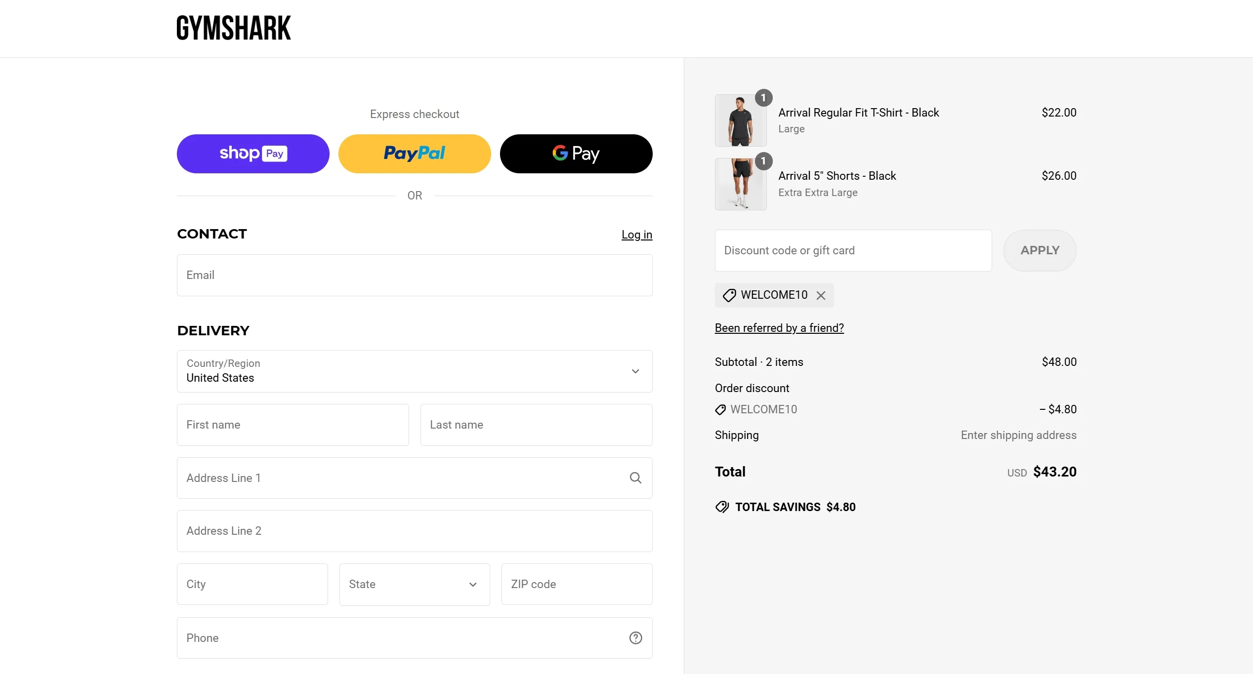
- Auto-apply site-wide codes when possible: If you’re running a universal discount (e.g., 10% off everything), consider auto-applying the code in the background. This saves the customer time and avoids unnecessary steps.
#11 Use exit-intent pop-ups strategically
Even with a well-optimized checkout process, some customers will still hover over the “X” or move their cursor toward the browser’s back button. This is your last chance to save the sale. Exit-intent popups, when used strategically, can act as a final nudge to keep the shopper engaged or even convince them to complete their order on the spot.
In the context of eCommerce checkout optimization, a well-timed exit-intent offer can make the difference between a lost sale and a conversion. When timed correctly and paired with the right offer, they can reduce cart abandonment, boost revenue, and make customers feel like they’re getting something extra just by sticking around a little longer.
Here are the best eCommerce checkout optimization tips to use exit-intent popups effectively during checkout:
- Offer a meaningful incentive: Provide something that gives shoppers a reason to stay, like a small discount, free shipping, or a bonus gift. For example, “Complete your order now and get 10% off!” or “Free express shipping if you finish your order in the next 10 minutes.”
- Keep the message short and focused: Use a clear headline, one call-to-action (CTA), and concise copy. Don’t overwhelm users with too much information. Your goal is to catch their attention fast and guide them back to the action.
- Make it easy to close or ignore: Respect user control by providing a visible close (X) button. If the customer still wants to leave, don’t trap them—it leads to frustration and possibly negative reviews.
#12 Offer live chat or support during checkout
Questions about shipping, payment options, return policies, or even product details can arise at any point during the checkout process. If a customer has a last-minute concern, and there’s no quick way to get an answer, they may hesitate or abandon the purchase entirely.
That’s why offering live chat or real-time support during checkout is a smart and customer-focused eCommerce checkout optimization strategy. Providing live chat or support during checkout shows customers that you're there for them, not just to sell but to serve. It reduces abandonment, resolves hesitation in real time, and strengthens your brand’s reliability and professionalism.
Check out the best eCommerce checkout optimization practices below to implement effective live support during checkout:
- Use a live chat widget that’s visible but not intrusive: Place the chat icon in a corner of the checkout screen where it’s easy to find but doesn’t cover key elements like buttons or forms. Ideally, make it persistent across all checkout steps.
- Staff it with real-time support or use a smart chatbot: During business hours, having a human support agent available is ideal. But if that’s not possible 24/7, set up a chatbot that can answer common questions (like delivery times, promo codes, or payment issues) and escalate to a human if needed.
- Pre-load relevant FAQs into the chat window: You can offer quick-access buttons like “Where is my discount code?” or “What are your shipping options?” to address top concerns without waiting for a live agent.
#13 Provide clear return and refund policies
Customers want to feel safe when making a purchase. A transparent, easy-to-understand return policy helps build trust and reduces perceived risk, especially for new or first-time buyers. It also shows that your brand stands behind its products, which can make a big difference in converting hesitant shoppers.
That’s why including clear return and refund policies is a critical part of eCommerce checkout optimization. Below are our tried-and-true tips to make your return and refund policies work for your checkout:
- Display the policy clearly at checkout: Include a short, reassuring message near the final “Place Order” button or in the order summary. For example: “30-day hassle-free returns” or “Easy refunds guaranteed.”
- Link to your full policy in key areas: Offer clickable access to your full return and refund policy directly from the cart and checkout pages.
- Offer prepaid return labels if possible: Making the process easy and affordable for the customer can build loyalty and lead to repeat purchases, even if the first order doesn’t work out.
- Make the return process trackable: If you use a return portal or system where customers can see the status of their return or refund, highlight that as a benefit.
#14 Optimize checkout page load time
When shoppers reach the final step, they’re expecting an instant, frictionless experience. A slow-loading checkout not only causes frustration but also raises questions about the reliability and professionalism of your store. That’s why improving the checkout page load time is a key pillar of eCommerce checkout optimization since fast checkout pages keep the momentum going and give customers the confidence to complete their purchase.
Here’s how to optimize your checkout page speed effectively:
- Minimize third-party scripts: Every plugin, tracking pixel, or live chat widget adds weight to your page. Audit your checkout for unnecessary third-party scripts and remove anything that doesn’t directly support conversion or functionality.
- Use performance-optimized themes or layouts: If your eCommerce platform supports it, choose a lightweight, mobile-first theme. Avoid overly complex designs or animations during checkout, which can delay load times.
- Reduce server response time: Work with your hosting provider or development team to ensure your checkout environment is fast and stable. Consider server-side caching, upgrading your hosting plan, or using a scalable cloud-based platform if needed.
- Test load time regularly: Use tools like Google PageSpeed Insights, GTmetrix, or Lighthouse to test your checkout page’s performance on desktop and mobile. Monitor load speed as you make changes to ensure you’re moving in the right direction.
#15 Send cart abandonment emails with incentives
Please keep in mind that even with a perfectly optimized checkout experience, some customers will still leave before completing their purchase. That’s where cart abandonment emails come in–a powerful recovery tactic and a vital part of eCommerce checkout optimization. When done right, these emails can bring shoppers back and turn lost revenue into real conversions.
Yet, simply reminding customers they left something in their cart isn’t enough anymore. To truly grab attention and drive action, please follow our proven eCommerce checkout optimization strategy below:
- Send the first email quickly: Timing is everything. Aim to send the first reminder within 30 minutes to 1 hour after abandonment, while the shopping intent is still fresh. Follow up once or twice over the next 24–48 hours if they haven’t returned.
- Personalize the message: Use the customer’s name (if available) and include a photo and description of the exact items they left in their cart. The more specific and relevant the message, the better the response rate.
- Offer an incentive to return: A small discount (e.g., 10%), free shipping, or a bonus item can be the final push the customer needs. For example: “Complete your order in the next 24 hours and get free express delivery.”
- Create urgency with limited-time offers: Include phrases like “Only a few left in stock” or “Offer expires in 12 hours” to add gentle pressure without being too aggressive.
- Use a clear, single call-to-action (CTA): Your email should include one obvious button like “Return to Cart” or “Complete Your Order.” Avoid distractions—focus on making it as easy as possible to pick up where they left off.
eCommerce Checkout Optimization Success Stories
Optimizing your checkout process isn’t just theory; it’s a proven strategy that real brands are using to drive measurable growth.
In this section, we’ll take a look at real-world success stories from eCommerce brands that have implemented powerful eCommerce checkout optimization tactics. Whether through faster one-page checkouts or more flexible payment options, these brands show how smart changes at the final step of the buying journey can lead to impressive business results.
How Monte Carlos boosts their revenue with a simplified checkout experience
Founded in 1984, Monte Carlo has grown into one of India’s most recognized fashion brands, best known for its high-quality woolen and all-weather apparel. With a vast retail network of over 1,400 outlets, the brand had already built strong offline credibility before expanding to the eCommerce realm.
However, as customer behavior shifted rapidly toward online shopping, Monte Carlo quickly realized their problem with clunky checkout experience. The multi-step checkout process was long, slow and lacked flexibility, leading to high cart abandonment and low repeat purchase rates. Additionally, the brand couldn’t perform eCommerce checkout optimization due to their legacy platform’s limitations, which required heavy development resources to make even minor changes.
This was when Shopify Plus came in. After migrating to the new solution, they immediately adopted Shopify’s one-page checkout, and that decision became a game-changer. With this Shopify feature, Monte Carlo was able to perform their eCommerce checkout optimization by:
- Minimizing checkout steps: Monte Carlo condensed the entire checkout flow into a single, scrollable page. This eliminated the need for customers to click through multiple screens, speeding up the process and reducing drop-offs.
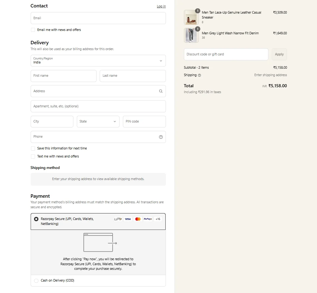
- Enabling guest checkout: Monte Carlo allows their customers to make a payment without logging in or signing up, reducing friction for first-time shoppers and capturing more impulse purchases.
- Optimizing for mobile shoppers: Shopify’s responsive one-page checkout delivers a seamless mobile experience with large buttons, autofill support, and quick load times, helping businesses convert more mobile traffic.
By leveraging Shopify’s one-page checkout, Monte Carlo saw impressive results. Within just three months of switching, the brand experienced a 126% increase in online revenue, a 115% jump in transactions, and a 493% growth in returning customers.
Ready to grow more with Shopify Plus migration?
Join Monte Carlo and thousands of e-merchants to migrate to Shopify Plus today!

How House of Malt increases average order value by offering more ways to pay
House of Malt, a family-owned business based in Northern England, has rapidly ascended to become one of the UK's premier online whiskey retailers since its inception in 2015. Specializing in specialty whiskeys and spirits, the company operates both a physical retail store and a robust online platform powered by WooCommerce.
Recognizing the importance of a seamless checkout experience, House of Malt has performed their eCommerce checkout optimization following these best practices:
- Enabling multiple payment methods: Don’t want to limit customers’ way to pay, House of Malt teamed up with famous names in the industry, including PayPal, Klarna, and WooPayments to provide flexibility. By doing so, they can cater to a wide range of payment preferences and reduce friction during checkout.
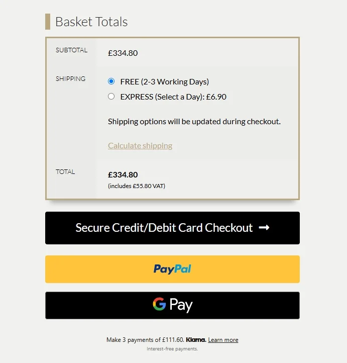
- Leveraging digital wallets for faster mobile checkout: Noticing customers’ tendency to use mobile devices to browse and purchase, House of Malt enabled Apple Pay and Google Pay, allowing for one-tap purchases and significantly improving the mobile checkout experience.
By offering faster, more flexible ways to pay, House of Malt saw a 22% increase in average order value, proving that payment variety and mobile optimization are powerful drivers of revenue growth.
Want to grow like House of Malt?
Migrate to WooCommerce now to unlock more growth on this powerful platform.

eCommerce Checkout Optimization – FAQs
How to speed up checkout?
To perform an eCommerce checkout optimization to speed up your process, you can follow these proven strategies:
#1 Offer guest checkout option
#2 Minimize form fields
#3 Use autofill and address validation
#4 Provide a progress indicator
#5 Enable multiple payment methods
For a full list of best practices to optimize checkout experience, please take a look at our article above.
How do I optimize my Shopify checkout page?
Shopify offers a powerful checkout system by default, but you can still make improvements. Consider these tried-and-true tactics using Shopify apps or Shopify Plus for a more optimized Shopify checkout page:
- Enable express checkout options like Shop Pay, Apple Pay, or Google Pay
- Customize your checkout branding for a consistent experience
- Add trust signals and clear return policy links
- Reduce friction by hiding unnecessary fields
- Enable cart editing and offer clear shipping info early
What is the ideal checkout flow?
An ideal checkout flow is short, intuitive, and reassuring. The most effective sequence typically looks like this: Cart summary > Shipping information > Shipping method selection > Payment details > Order review and confirmation.
Please keep in mind that each step should be clearly labeled, progress should be tracked, and customers should be able to go back and make changes easily without losing progress.
Final Thoughts
To conclude, eCommerce checkout optimization isn’t just about making small tweaks; it’s about creating a seamless, stress-free experience that builds trust and drives conversions. Every element, from faster load times to guest checkout and real-time support, plays a role in removing friction and guiding customers smoothly to the finish line.
If you like this article, don’t hesitate to check out other articles on our LitExtension blogs for more expert tips and insights.
